
12 OG Image Examples With the Layout Logic Explained
Explore twelve original OG image examples and learn how product proof, hierarchy, contrast, crops, photography, metrics, and quotes change the composition.
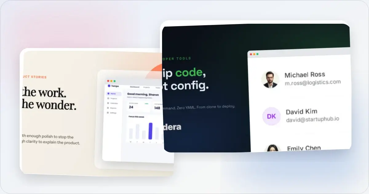
A useful OG image gives someone one clear reason to open the page. It may show the product, establish the subject, state a result, or supply social proof—but trying to do all four usually produces a preview that is unreadable at the size people actually encounter it.
The twelve OG image examples below are original Screenhance template outputs. They are design studies, not measured conversion winners. Fictional brand names, people, ratings, quotes, and metrics are placeholder content. Never publish a testimonial, percentage, or customer identity unless it is real, attributable, and approved.
Open Graph metadata tells compatible services which image represents a page. The image may still be resized or cropped by the receiving surface, so the safest design has a strong focal point, useful contrast, and breathing room around essential copy. See the OG image size guide for dimensions and the OG image checker to inspect a real URL.
1. Editorial split: one idea and one piece of proof
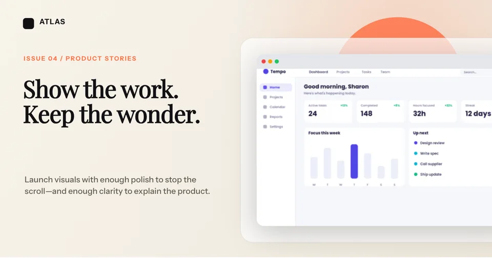
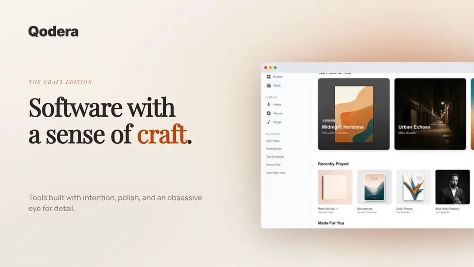
This composition gives the headline and product screenshot separate territories. The left side carries the idea; the right side proves that a real interface exists. A soft background and restrained accent shape connect the two without competing with either.
Use an editorial split when the page needs both point of view and product evidence. Keep the screenshot large enough to read as a product, even if its tiny labels are not legible.
2. Product beneath the claim: make the relationship immediate
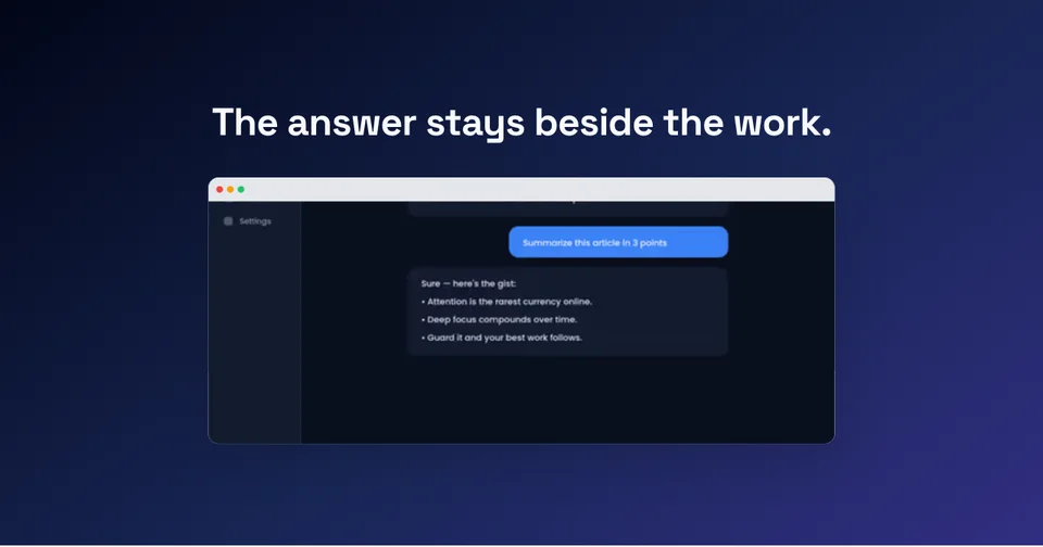
Here the claim sits directly above the interface that demonstrates it. The alignment creates an obvious reading order: statement first, screen second. The blue response control inside the product becomes the visual accent for the whole frame.
This works well for feature announcements and how-to pages. Crop the interface to the state that proves the headline instead of shrinking an entire application window into the canvas.
3. Interface gallery: show breadth without building a collage of noise
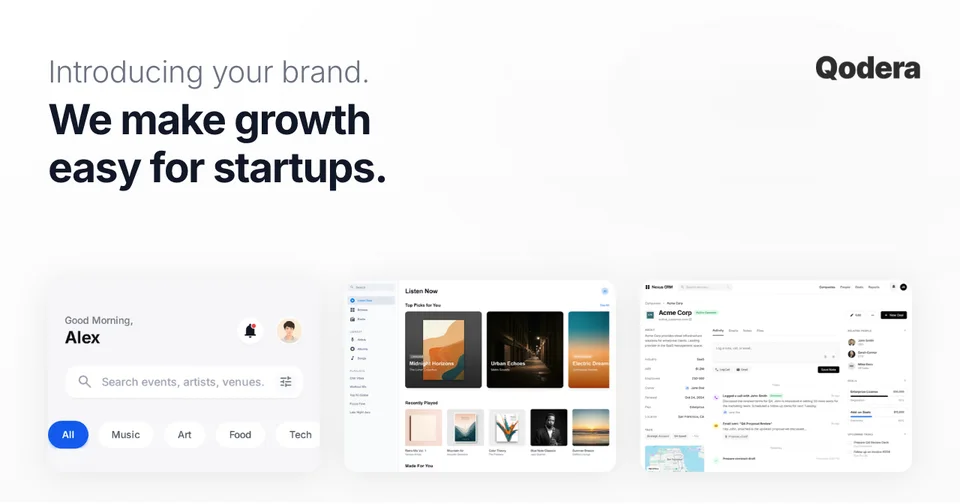
The gallery example uses three different interface fragments, but they are aligned to one baseline and kept inside a quiet white field. That discipline makes the breadth feel intentional rather than accidental.
Choose a gallery when the page is about a platform, suite, or collection. Keep the samples visually related and let one headline explain why they belong together.
4. Product mosaic: present a coordinated system
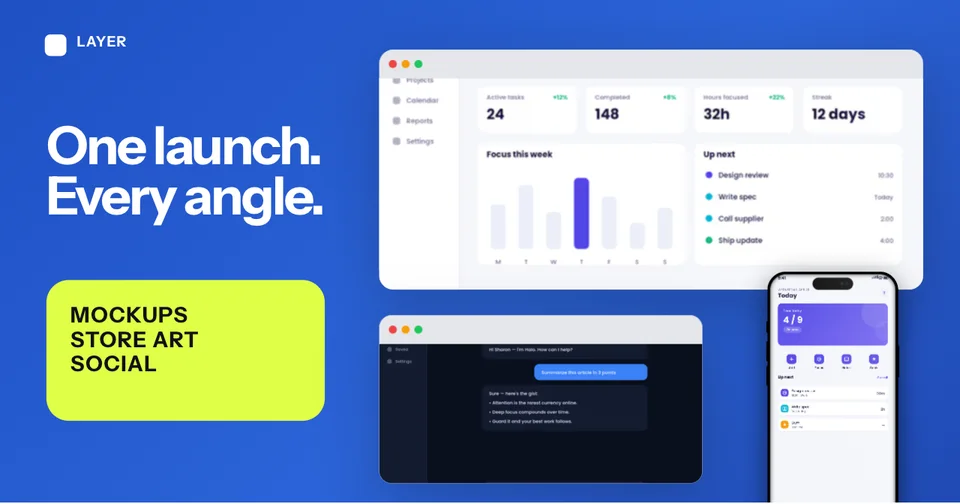
The mosaic makes several surfaces feel like one launch system. The strong blue field and fixed device crops prevent the individual screenshots from becoming separate stories. A high-contrast lime block holds the supporting category words.
This is effective when the page genuinely covers several deliverables. For a single feature, the same layout would overstate the scope and add unnecessary detail.
5. Single product crop: clarity through restraint
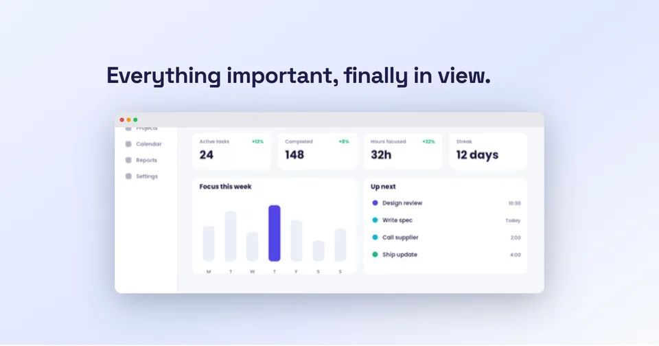
One interface, one headline, one pale background. The screenshot has enough scale to reveal the information shape—navigation, summary numbers, chart, and tasks—without asking the viewer to read the data.
Use this pattern for documentation, changelogs, product updates, and pages where the interface itself is the most credible image. It is also one of the easiest layouts to keep readable across different preview sizes.
6. Branded still life: establish a visual point of view
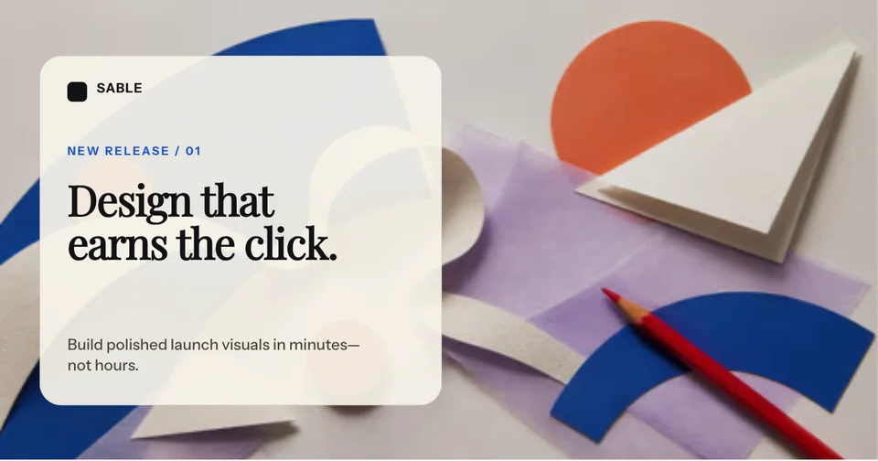
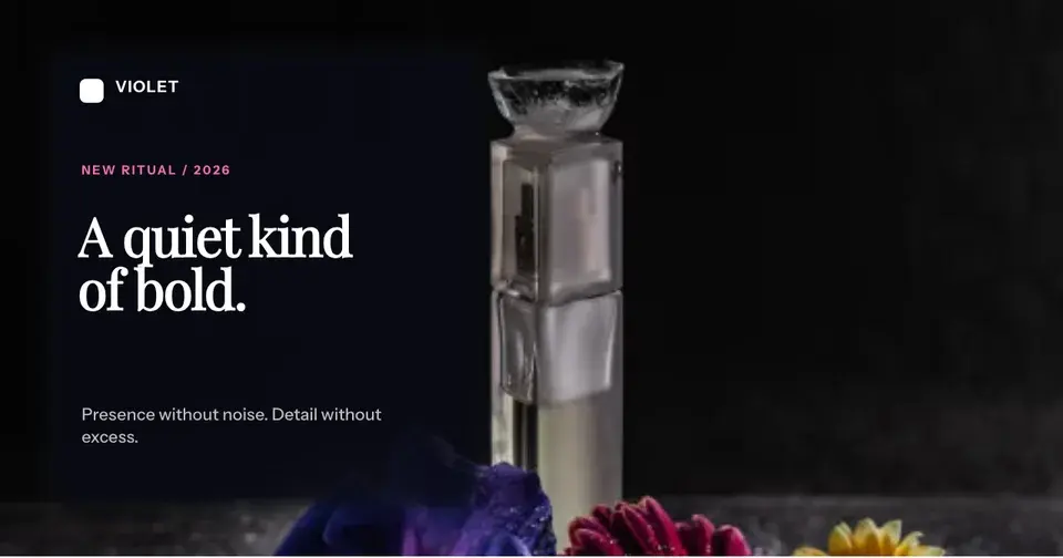
This example does not show a screen. It uses a distinctive still life, translucent card, and editorial type to establish the character of a design release.
That can be the right choice for a brand essay, creative announcement, or visual-trend article. It is a weaker fit for a product feature page where the visitor needs proof of the interface.
7. Metric and evidence: useful only when the number is real
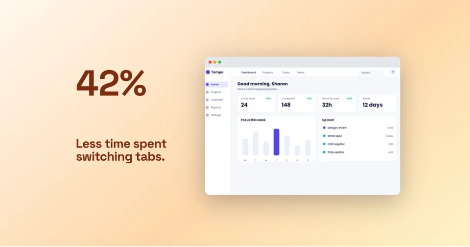
The oversized number creates an immediate focal point, while the dashboard supplies context. The composition is simple because the metric is doing most of the persuasive work.
This layout has a strict evidence requirement. State the population, time period, and measurement behind the number on the page. If the metric is not defensible, use a benefit headline instead of turning an assumption into visual proof.
8. Dark split: maximise contrast between message and product
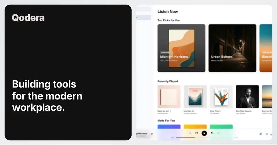
The split creates two bold blocks: black for the message and white for the interface. The crop lets the product run beyond the right edge, which makes the screenshot feel larger than its half of the canvas.
Use a high-contrast split when the product screenshot is bright and the copy needs a reliable reading surface. Check that the crop does not remove the one control or result that explains the page.
9. Photography with a protected text zone

Full-bleed photography can work when the image contains a naturally quiet area. Here the darker foreground supports white type, while the distant canyon remains the visual subject.
Do not assume a text shadow will rescue any photograph. Choose the crop for the copy, add a deliberate overlay when needed, and keep essential text away from visually busy detail.
10. Developer-specific composition: signal the audience quickly
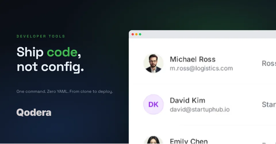
The vocabulary, dark field, green accent, and cropped software interface all point to a developer audience. Nothing in the composition depends on a generic illustration of code.
Good audience signalling is specific but not theatrical. Borrow the visual language of the work—terminal colour, data density, system type, or actual product output—without turning the image into a costume.
11. Quote card: let a real voice be the visual
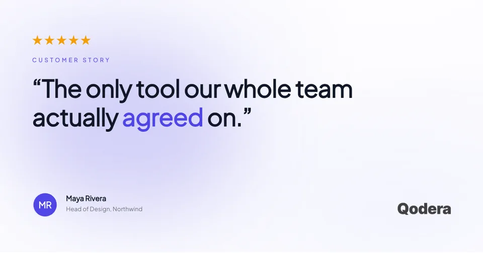
The quote fills most of the canvas, with the speaker and brand acting as attribution rather than decoration. A single highlighted word creates emphasis without competing with the sentence.
Use this only with a genuine quotation and permission to show the person's identity, role, and organisation. A fabricated quote is not a harmless placeholder once the image is published.
12. Editorial photo split: combine brand colour with atmosphere
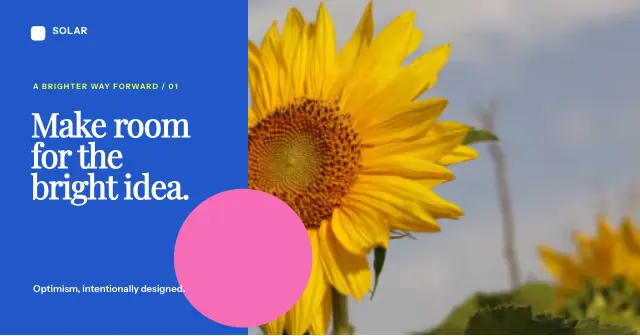
The final example reserves a solid blue panel for the message and half the frame for photography. The oversized sunflower remains recognisable after reduction, while the pink circle bridges the two halves.
This pattern suits reports, campaigns, and editorial pages that need atmosphere plus dependable text contrast. Choose one bold photograph; several small lifestyle images would lose their impact in a preview.
Choose the composition from the page's job
| Page job | Strong starting layout | What must be real |
|---|---|---|
| Product feature | Product beneath the claim or single crop | The interface state and capability |
| Platform overview | Interface gallery or product mosaic | The breadth of the actual product |
| Research or case study | Metric and evidence | The number, method, period, and source |
| Customer story | Quote card | The quote, identity, role, and permission |
| Brand essay | Branded still life or photography | The page's actual subject and visual identity |
| Developer page | Audience-specific split | The workflow and interface being shown |
Generate a social-ready OG image free
A six-step OG image review
Before publishing, reduce the image to a small preview and ask:
1. Can you identify the focal point without zooming?
2. Is the primary line still readable?
3. Does the image represent this exact page rather than the whole company?
4. Is every screenshot, quote, person, logo, and number legitimate to publish?
5. Does the composition survive a modest crop around its edges?
6. Does the page emit the intended image in its actual Open Graph metadata?
You can build these patterns in the OG image generator, start from the OG image template collection, and use the OG image checker before sharing the URL.
Frequently asked questions
What should an OG image contain?
It should contain the smallest useful combination of subject, message, and evidence for the specific page. A product page may need an interface; a report may need its finding; an editorial page may be better represented by one strong photograph.
Does every OG image need text?
No. A distinctive product image or photograph can work without text. Add copy only when it contributes meaning that the image cannot supply by itself.
Can I reuse the same OG image across every page?
You can use a fallback brand image when a page has nothing more relevant, but important pages are better represented by an image made for their subject. Reusing one generic preview makes different links harder to distinguish.
How can I check which OG image a page publishes?
Inspect the page's `og:image` metadata or paste the public URL into an OG preview checker. Also test the shared link on the platforms that matter to you, because their caching and crop behaviour can differ.
See how your link looks when shared
Paste any page URL. We fetch its Open Graph tags and show the exact preview that appears on X, LinkedIn, Slack, and Facebook, then flag what is off.
Screenhance examples
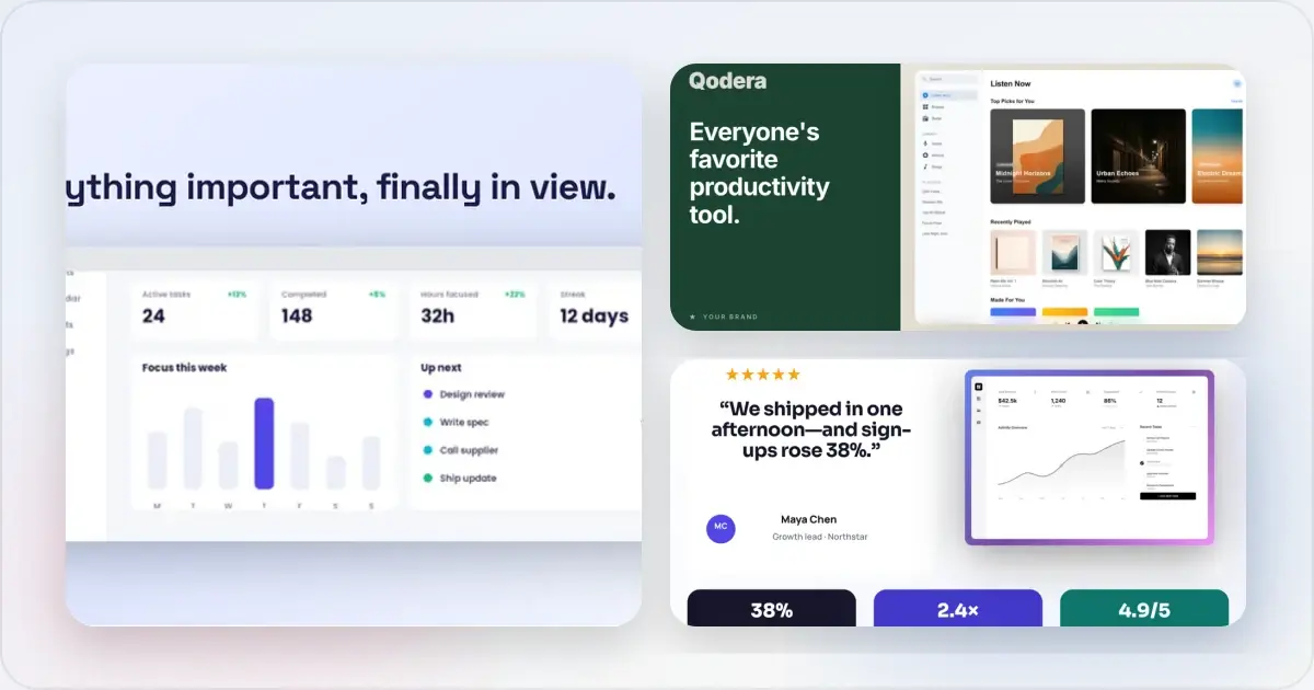
Two editable starting points from the Screenhance library, selected for this social and web guide.
Generate a social-ready OG image free
Free to start. No credit card required.
Keep reading
Related, product-tested guides from Screenhance.
OG Image A/B Testing: How to Measure What Gets More Clicks
A practical framework for testing social share images, controlling variables, and measuring clicks without assuming a universal winner.
7 Feb 2026 · 7 min read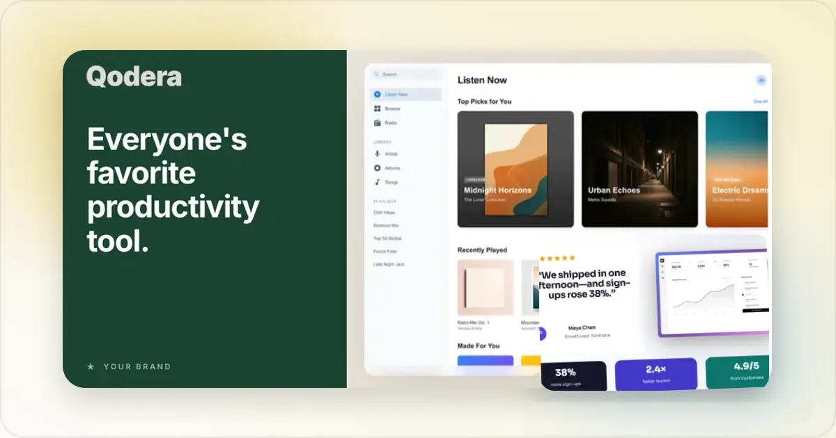
OG Image Best Practices in 2026: What Gets Clicked on X, LinkedIn, and Slack
Design readable OG images, preview them across platforms, and measure whether headline and layout changes improve clicks for your own audience.
7 Feb 2026 · 11 min read
12 Instagram Mockup Examples for Better Product Launches
Explore 12 original Instagram mockup examples for feed posts, carousels, Reels, Stories, profiles, reviews, launch graphics, and product scenes.
1 Sept 2026 · 9 min read