Use Cases
Create launch-ready gallery images that make your Product Hunt page stand out. ready-made templates pre-sized to 1270×760, device mockups, and beautiful backgrounds.
Loved by 2,000+ creators
Pre-sized to 1270\u00d7760. Pick a template, drop in your screenshots, and export your gallery.
Your gallery is the first thing hunters see. Make every image count.
The first image is your hero. Show the most compelling view of your product in a device frame with a clean background.
Each image should highlight a different feature or benefit. Guide viewers through your product flow.
Large, readable headlines work best. Avoid cramming too much text — let your product screenshots do the talking.
Stick to your brand colors and one background style across all gallery images for a cohesive look.
A Product Hunt gallery is a set of up to 8 images (1270×760 pixels each) that showcase your product on its launch day. These are the first visuals visitors see on your Product Hunt page — they need to instantly communicate what your product does and why it matters.
A strong gallery typically starts with a hero shot of your product in a device frame, followed by feature highlights, a comparison or before/after, and ends with a pricing or CTA slide.
1270 × 760 px
Dimensions
8 gallery slots
Max images
PNG or JPEG
Format
Create professional mockups in three simple steps. No design skills required.
Drag and drop or select any screenshot, design, or image from your device.
Pick from iPhone, iPad, MacBook, browser frames and beautiful gradient backgrounds.
Download as PNG, WebP, JPEG, GIF, or video. Ready for marketing in seconds.
Two capabilities that separate Screenhance from every other mockup tool in 2026: animated exports and App Store screenshot localization.
Template-driven motion — float, reveal, parallax. Export animated mockups at Product Hunt, landing-page, and Twitter/X dimensions. Most mockup tools are static-only.
One master design, per-locale captions, every required Apple and Google Play size per language. RTL and CJK support. Apple reports localized listings drive 2-3x install lifts.
iPhone 17 Pro Max (1320×2868), iPhone Air (1260×2736), iPad Pro M4 (2064×2752), and the full Google Play set — exported from one design in a single pass.
Pick a template, drop in your screenshot, export. No Figma, no Photoshop, no learning curve. Free tier covers 3 exports a month; $6 Week Pass unlocks unlimited for a launch.
Purpose-built for Product Hunt launches vs. general design tools.
| Feature | Screenhance | Canva | Figma | Photoshop |
|---|---|---|---|---|
| Pre-sized 1270×760 templates | Yes | No (manual resize) | No (manual) | No (manual) |
| Design skills needed | None | Basic | Advanced | Advanced |
| Device frames built in | Yes (40+) | Limited clipart | Manual setup | Manual |
| Gallery set export (8 images) | One-click batch | One by one | One by one | One by one |
| Time to complete gallery | ~15 min | 1-2 hours | 2-4 hours | 3-5 hours |
| Animated slides (GIF) | Yes | Limited | No | Yes (complex) |
| Free plan | 3 exports/month | Free tier | Free tier | No free plan |
| Price (paid) | $6/week or $8/month | $13/month | $15/month | $23/month |
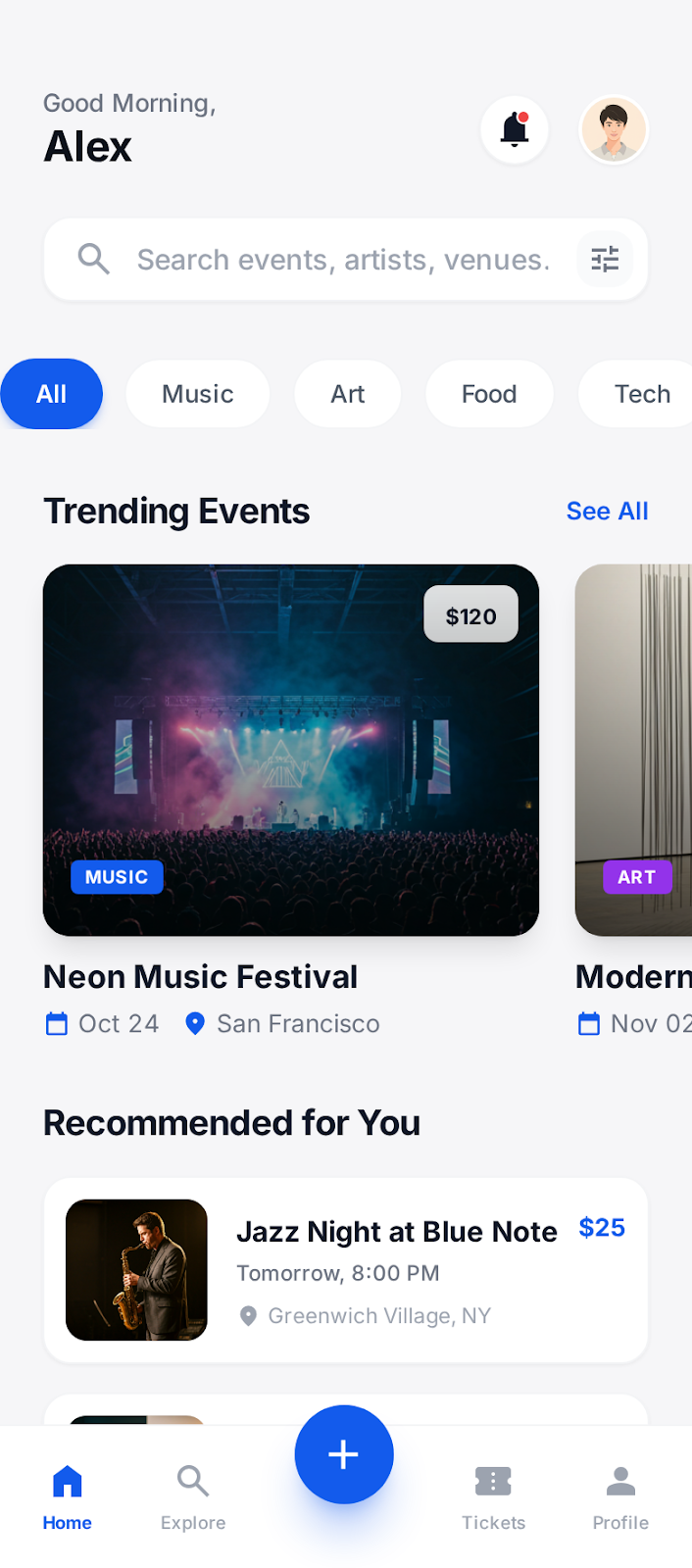
The first image in a Product Hunt gallery does most of the conversion work. It's what shows in the product card on the homepage, in the leaderboard, in social shares, and in newsletter mentions. If it doesn't make someone curious within the first second of scanning, they don't click \u2014 and if they don't click, they don't upvote. Every other piece of your launch strategy is downstream of whether image one stops the scroll.
The test we use: show your first gallery image to five people who've never heard of your product, for exactly one second each, and ask them to describe what they saw. If three out of five can correctly describe what the product does \u2014 "it's a calendar app," "it's a screen recorder," "it's an AI writing tool" \u2014 the image is doing its job. If they describe the visual style ("a screenshot with a gradient background") instead of the function, the image is decorative, not informative.
The most common failure mode is composition that prioritizes aesthetics over clarity. A beautiful gradient with a tiny device mockup in the corner photographs well in isolation but fails the one-second test because the actual product is too small to read. The fix is usually to size up the screenshot, simplify the background, and treat the device frame as a delivery mechanism for the UI inside, not the hero element itself.
The second most common failure is leading with a logo or wordmark. Your product's name and logo mean nothing to people seeing it for the first time. Lead with what the product does \u2014 the actual UI showing the core action \u2014 and save brand assets for later slides where context already exists. Many top-voted Product Hunt launches don't show their logo until slide three or four.
Across launches we've worked with in 2025 and 2026, animated gallery slides (typically GIF or short looping video) consistently outperformed static ones for any feature that involves a state change, interaction, or workflow. The pattern is clearest for productivity tools, AI products, and anything where the value lives in "watch what happens when you do this." Static screenshots of these products feel inert by comparison.
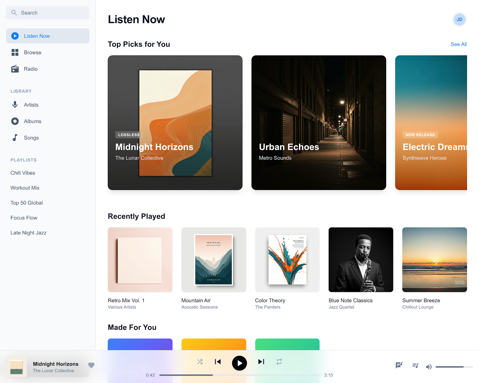
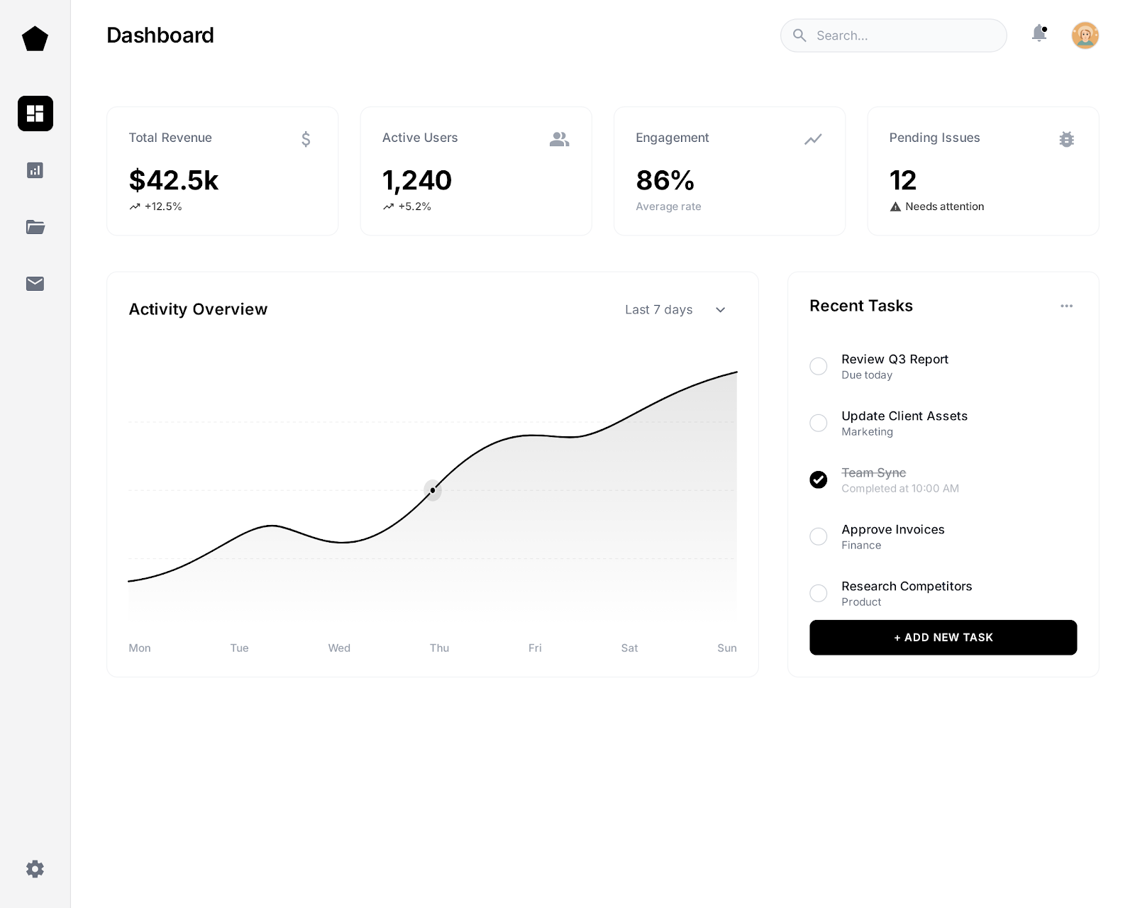
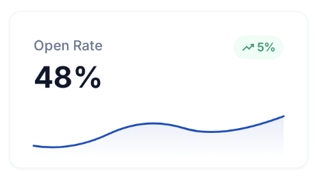
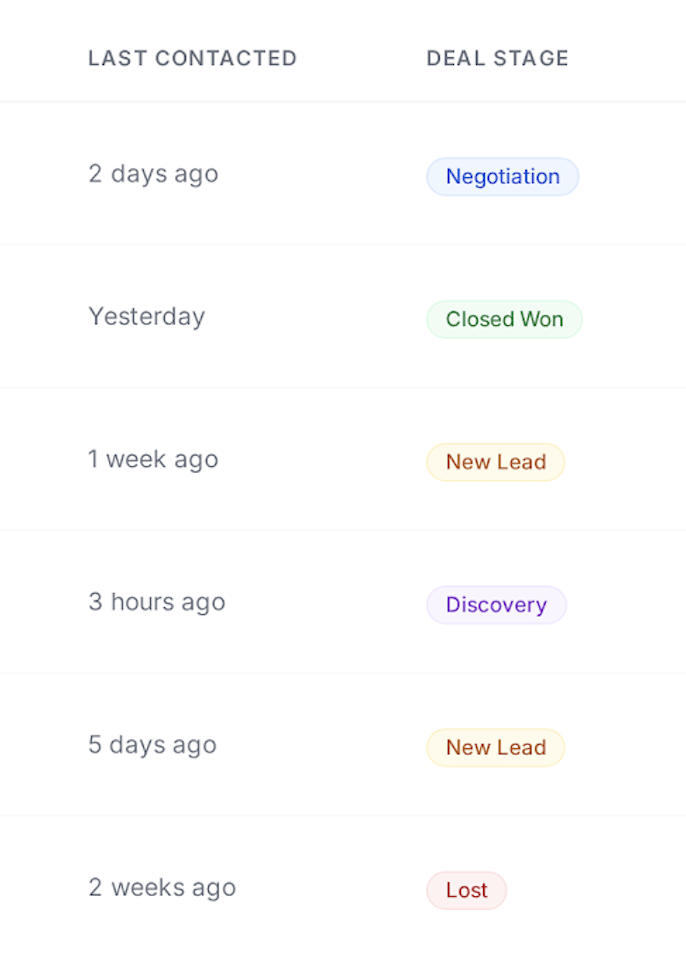
The opposite holds for products with stable visual end-states: a dashboard, a generated report, a finished design. For these, a polished static screenshot beats an animation because the animation introduces visual noise without revealing additional information. Looping a static-looking dashboard with a cursor moving across it doesn't add value \u2014 it just gives the eye something to track without payoff.
Specifically for Product Hunt galleries, the optimal mix in our experience is one or two animated slides interspersed with static ones, not an all-animated gallery. Eight consecutive animations exhaust attention by slide three. A static hero, an animated feature demo at slide two or three, a few static feature highlights, another animation showing a different workflow, then static social proof and CTA \u2014 that pacing keeps people scrolling through the whole gallery.
On file size, keep animated slides under 8MB to avoid Product Hunt's upload limits and to prevent the gallery from feeling slow. WebM compresses dramatically better than GIF at the same visual quality, so if your launch audience is largely on modern browsers \u2014 and Product Hunt's is \u2014 WebM is the default. Pair the gallery with consistent social media mockups and OG images so the launch feels coordinated across every surface where people encounter your product.
Product Hunt gallery images should be 1270×760 pixels. You can upload up to 8 images. Screenhance templates are pre-sized to this exact format so you never have to worry about dimensions.
Product Hunt allows up to 8 gallery images. We recommend using all 8 slots: start with a hero shot, then show key features, social proof, and end with a CTA.
Yes! Screenhance includes 43 device frames — iPhone, MacBook, iPad, browser, and more. Place your app screenshots inside realistic device frames to make your gallery look professional.
Yes, Screenhance offers a free plan with 3 exports per month — enough to create your launch gallery. Pro plans unlock higher resolution exports and additional features.
Show it to five people who've never heard of your product for exactly one second each, then ask them to describe what they saw. If at least three can correctly identify what the product does, the image is doing its job. If they describe the visual style instead of the function, the image is decorative — rebuild it to lead with the UI.
Yes for products where value comes from interaction, state changes, or workflows — productivity tools, AI apps, anything where 'watch what happens' is the point. No for products with stable visual end states like dashboards or generated reports where motion adds nothing. The sweet spot is one or two animated slides mixed with static ones, not an all-animated gallery.
WebM if your launch audience is largely on modern browsers, which Product Hunt's audience is. WebM compresses dramatically better than GIF at the same visual quality. Use GIF as a fallback for older platforms or contexts where WebM isn't supported. Keep individual files under 8MB regardless of format.
Usually no. Your logo means nothing to people seeing your product for the first time. Lead with the actual UI showing the core action — that's what tells people what you do. Save the logo for slide three or four where context already exists. Many top-voted Product Hunt launches follow this pattern intentionally.
Explore more ways to create stunning visuals with Screenhance.
Launch-ready visuals for startups
Try it freeMockups for investor decks
Try it freeVisuals for product changelogs
Try it freeNewsletter and campaign visuals
Try it freeCreate viral-worthy screenshot posts
Try it freeScreenshots tuned for App Store SEO
Try it freeThe top-voted products on Product Hunt all have one thing in common: stunning gallery images. Create yours in minutes.