Use Cases
Turn any website into a mockup in 30 seconds. Screenshot the site, drop it into a browser or MacBook frame, add a background, and export a visual that looks designed, no design skills needed.
Loved by 2,000+ creators
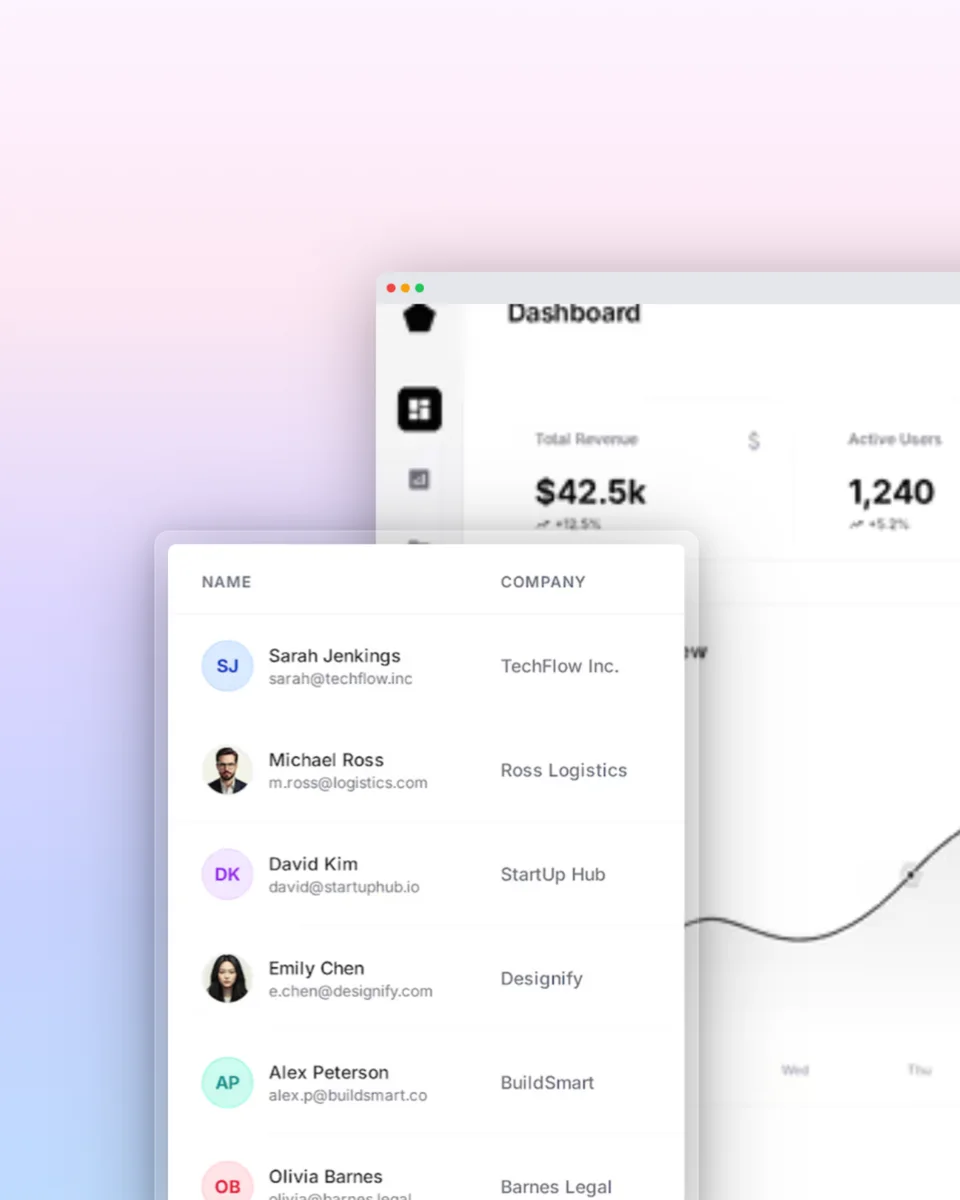
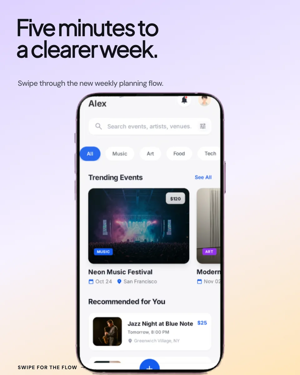
Browser windows, MacBook frames, and multi-device layouts. Pick one and swap in your site.
Website to mockup is a three-step flow. No plugins, no design tools.
Capture the site in a clean browser window. For anything longer than one screen, use your browser's built-in full-page capture (Chrome: DevTools → “Capture full size screenshot”; Firefox: “Take Screenshot” → “Save full page”). Capturing it yourself means you control the state: logged in, dark mode, no cookie banner.
Upload the screenshot and pick a frame: a browser window for instant “this is a website” context, a MacBook for premium hardware feel, or a laptop-plus-phone layout to show responsiveness. Then choose from 100+ backgrounds to match the site's palette.
Download as PNG for decks and docs or WebP for the web, at 1x, 2x, or 3x resolution. Started from a screen recording instead? Export an animated GIF or WebM with the same frames.
The frame decides how the mockup reads. All of these are included.
Address bar, traffic lights, familiar chrome: the fastest way to say “website”. See the dedicated browser mockup generator for Chrome, Safari, and Arc styles.
Hardware context that makes portfolio and agency work feel premium. The MacBook mockup generator has every current frame.
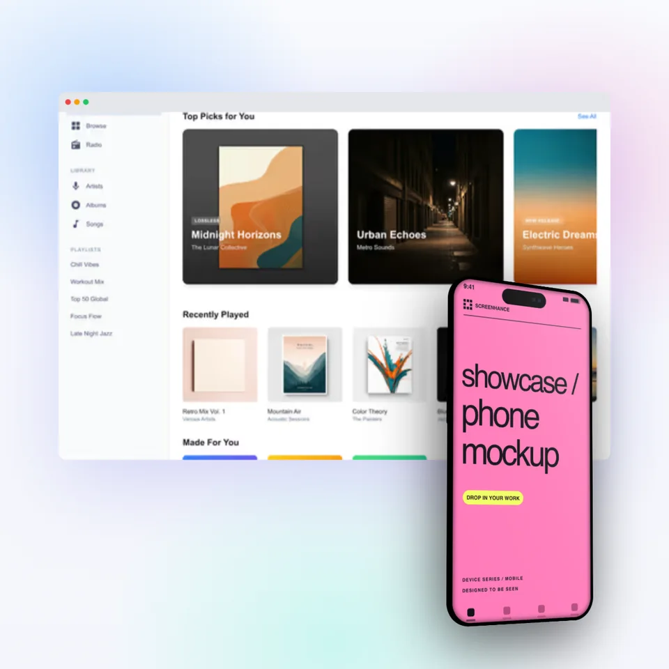
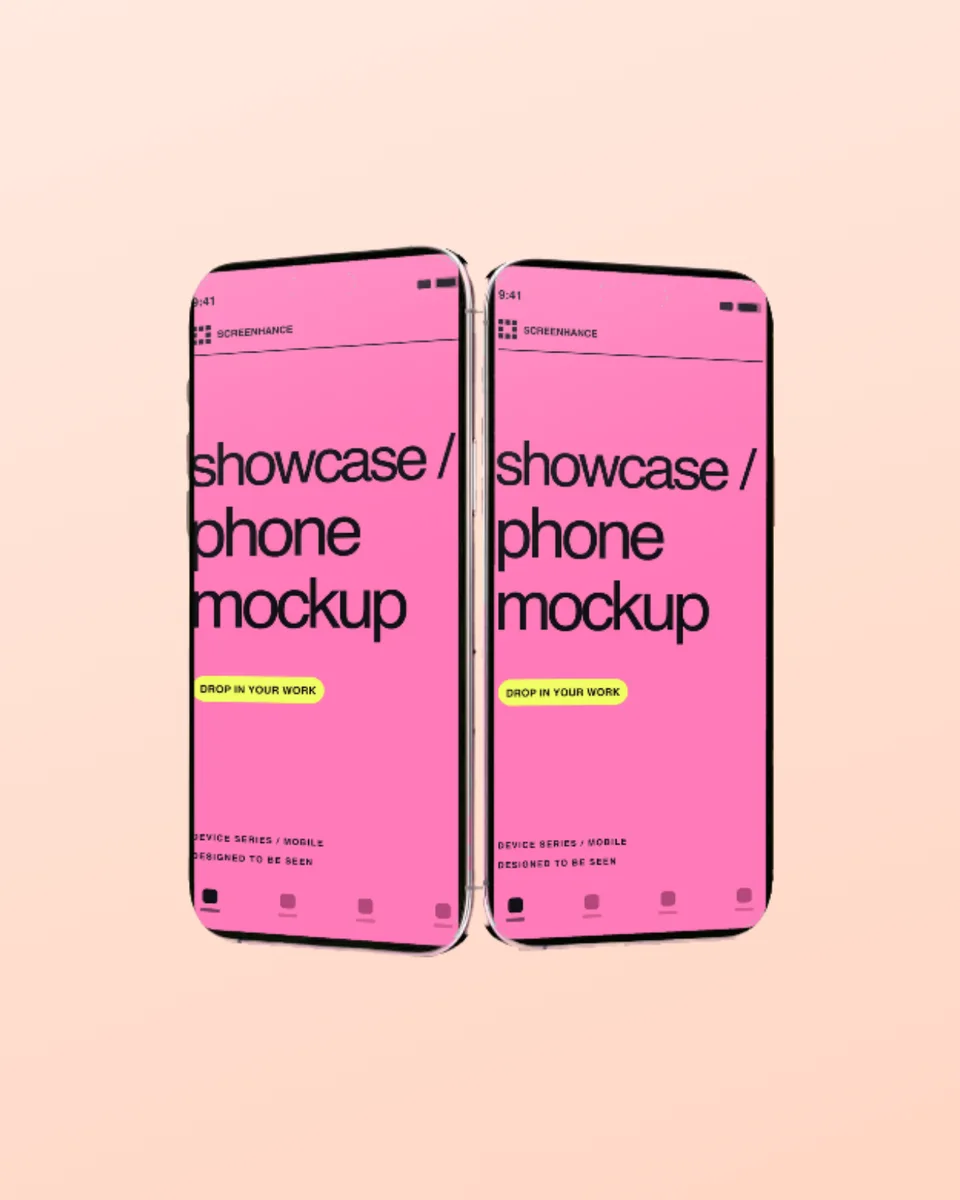
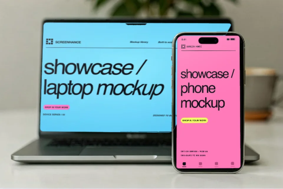
One image that shows the desktop and mobile versions side by side. The standard way to communicate “fully responsive” in a single visual.
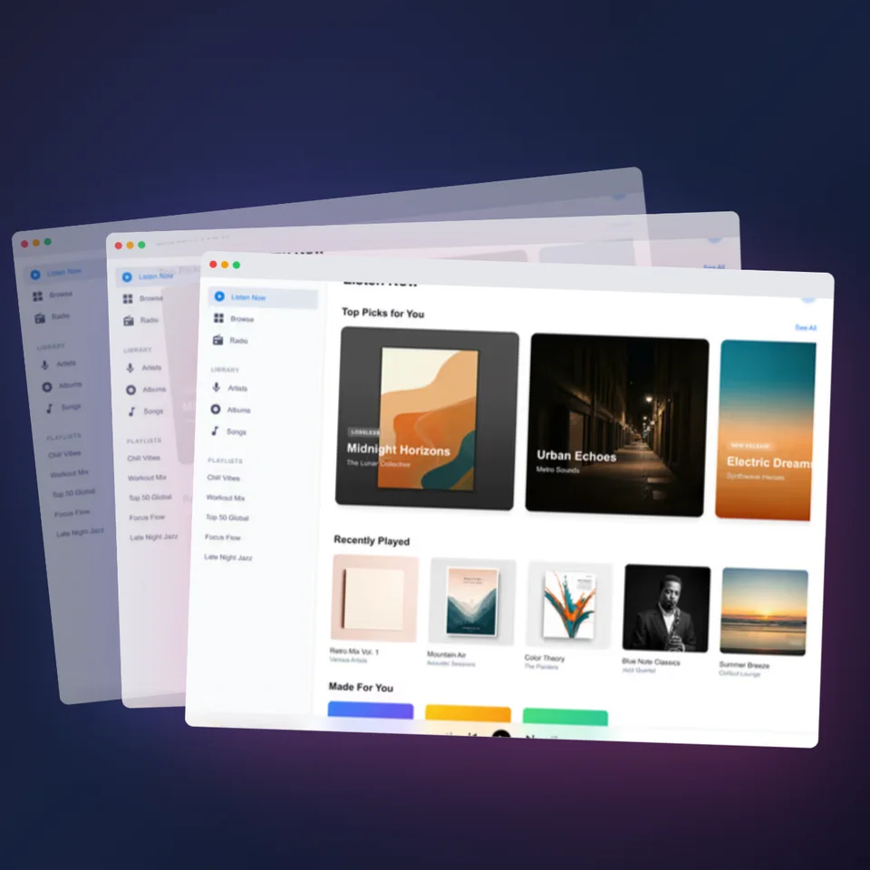
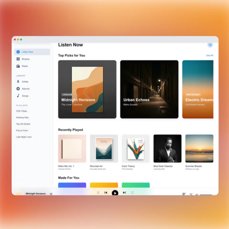
A clean window with a soft shadow over a gradient: minimal, modern, and the go-to for hero sections and social posts.
Framed shots of client sites look intentional and let you keep a consistent visual style across every project.
Present a redesign concept next to the current site: two framed mockups communicate the before/after instantly.
Product Hunt galleries, Twitter/X threads, and LinkedIn posts all reward a polished framed visual over a bare capture.
Screenshot a customer's live site and frame it when you showcase who's using your product or theme.
Feature sections and comparison pages read better when every website shot shares one frame and background system.
A framed website mockup on a brand-colored background signals craft. A raw browser capture signals rush.
Building a landing page hero specifically? The landing page mockup generator covers that flow end to end, and the device mockup generator handles app screenshots and every other device.
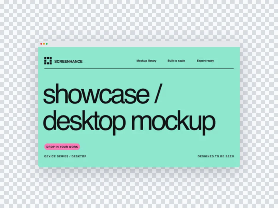
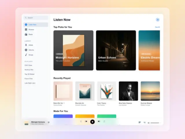
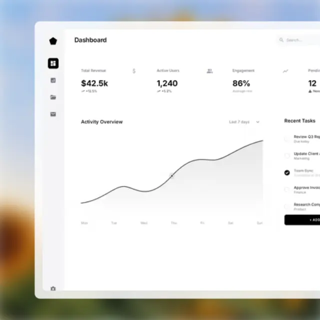
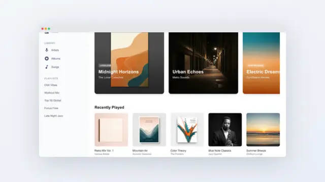
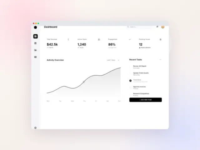
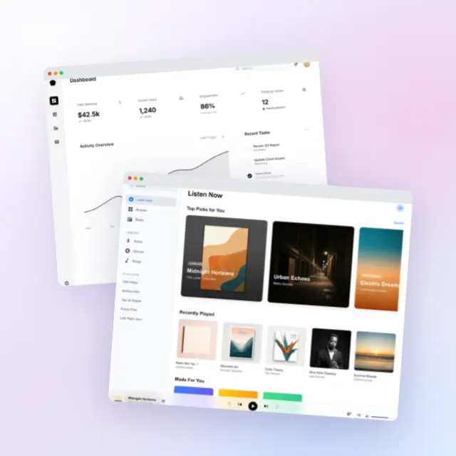
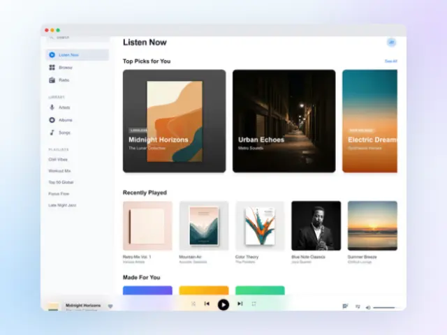
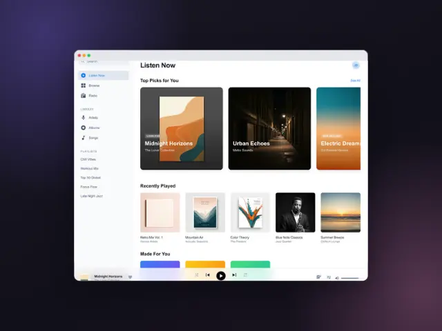
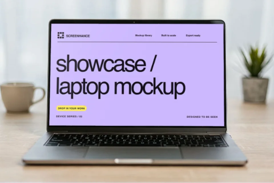
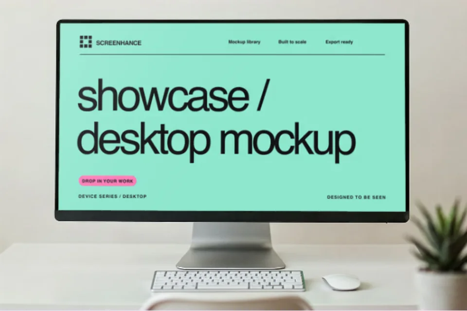
Real browser and desktop photographs with your site composited onto the screen. Click one to open it in the editor.
4 templates
Move from source material to a polished launch asset without rebuilding the design in another tool.
Choose a visual template, a store-listing set, a Launch Kit, or an empty canvas for full control.
Add screenshots, photo scenes, device frames, text, icons, annotations, backgrounds, layers, and motion in the browser editor.
Download PNG, WebP, JPEG, GIF, WebM, or MP4, or export organized iOS, Google Play, and Chrome screenshot ZIPs.
Screenhance covers the full path from a raw screenshot or screen recording to coordinated, editable launch assets.
Use current device frames, stylized treatments, or photorealistic placements across phones, tablets, laptops, watches, TVs, print, apparel, and outdoor media.
Start with a complete composition for mockups, Product Hunt, OG images, website heroes, Play feature graphics, or Chrome Web Store promo assets, then edit every layer.
Create iOS, Google Play, and Chrome Web Store screenshot sets from 100+ set templates, edit localized copy across 16 languages, and export organized PNG ZIPs, including fastlane-ready iOS folders.
Animate layers with 18 motion styles and export GIF or WebM, or record and polish a product demo in Studio with frames, cursor motion, captions, audio, and MP4/WebM export.
Screenshot the website, upload the screenshot to Screenhance, pick a device frame and background, and export. The whole flow takes about 30 seconds. You don't need Photoshop or Figma. The frames, shadows, and backgrounds are already designed.
Screenhance works from a screenshot rather than crawling the URL for you, which keeps you in control of exactly what state the page is captured in (logged in or out, light or dark mode, with or without cookie banners). Modern browsers make the capture step trivial: Chrome, Edge, and Firefox can all screenshot a full page without extensions.
In Chrome or Edge: open DevTools, press Cmd/Ctrl+Shift+P, type “screenshot”, and choose “Capture full size screenshot”. In Firefox: right-click the page and choose “Take Screenshot” → “Save full page”. In Safari: File → Export as PDF, or use a capture tool. Then drop the image into Screenhance.
A browser frame is the default choice: it reads instantly as “this is a website”. A MacBook frame adds a premium hardware feel for portfolio and agency work. A multi-device layout (laptop + phone) is best when you want to show the site is responsive.
Yes. Capture the site at a mobile viewport (or use your browser's device emulation), then use an iPhone or Android frame, or a multi-device template that pairs the desktop and mobile captures in one image.
Yes. The free plan includes 3 exports per month with access to every template and device frame. The $6 Launch Pass or Pro removes the watermark.
Filter by what your design goes on, exactly like in the editor. Click any template to open it with your own screenshot.
14 templates
Explore more ways to create stunning visuals with Screenhance.
Put your design or app on a photorealistic billboard
Try it freePrint your graphic onto a real t-shirt photo
Try it freeFrame your artwork as a poster on a real wall
Try it freeNewsletter and campaign visuals
Try it freeCreate viral-worthy screenshot posts
Try it freeScreenshots tuned for App Store SEO
Try it freeScreenshot it, frame it, ship it. Website to mockup in 30 seconds, free to start.