Use Cases
Create eye-catching social cards for Twitter, LinkedIn, and Facebook. Professional templates sized for every platform. Upload your screenshot, pick a style, and export.
Loved by 2,000+ creators
Pre-sized for every platform. Pick a template, add your screenshots, and create cards that get clicks.
A social card is the preview image that appears when someone shares your link on social media. It's the visual that shows up in Twitter timelines, LinkedIn feeds, Facebook posts, Slack messages, and Discord channels before anyone clicks through to your site.
On Twitter/X, social cards appear as large image previews below a tweet. On LinkedIn, they show as the link preview when you share an article or URL. On Facebook, they display as the image in shared link posts. Each platform renders them slightly differently, but they all pull from the same Open Graph and Twitter Card meta tags on your website.
A well-designed social card with a clear headline, bold visuals, and your product screenshot can dramatically increase click-through rates compared to a generic placeholder or auto-generated preview.
Read the guide: How to Create Social Cards That Get Clicks →
Every platform has slightly different dimensions. Here are the exact sizes you need.
Twitter / X
1200×628
Summary large image card
1200×627
Link share preview
1200×630
Shared link preview
Discord
1200×675
URL embed preview
Slack
Variable
Adapts to og:image aspect ratio
Use vibrant, high-contrast colors that stand out in crowded social feeds. Dark backgrounds with bright accents perform especially well on Twitter and LinkedIn.
Keep your text large and readable. Social cards render small on mobile devices, so limit copy to a single headline and one line of supporting text.
Include a real screenshot or mockup of your product. People are more likely to click when they can see exactly what they’re getting before visiting your site.
Use your brand colors, logo, and typography across all social cards. Consistency builds recognition and trust as people scroll through their feeds.
Create professional mockups in three simple steps. No design skills required.
Drag and drop or select any screenshot, design, or image from your device.
Pick from iPhone, iPad, MacBook, browser frames and beautiful gradient backgrounds.
Download as PNG, WebP, JPEG, GIF, or video. Ready for marketing in seconds.
Two capabilities that separate Screenhance from every other mockup tool in 2026: animated exports and App Store screenshot localization.
Template-driven motion — float, reveal, parallax. Export animated mockups at Product Hunt, landing-page, and Twitter/X dimensions. Most mockup tools are static-only.
One master design, per-locale captions, every required Apple and Google Play size per language. RTL and CJK support. Apple reports localized listings drive 2-3x install lifts.
iPhone 17 Pro Max (1320×2868), iPhone Air (1260×2736), iPad Pro M4 (2064×2752), and the full Google Play set — exported from one design in a single pass.
Pick a template, drop in your screenshot, export. No Figma, no Photoshop, no learning curve. Free tier covers 3 exports a month; $6 Week Pass unlocks unlimited for a launch.
See how Screenhance compares to other social card tools.
| Feature | Screenhance | Canva | Adobe Express | Figma |
|---|---|---|---|---|
| Pre-sized social templates | Yes | Yes | Yes | Manual setup |
| Design skills needed | None | Basic | Basic | Advanced |
| Device frames | Yes (40+) | No | No | Plugin required |
| Custom backgrounds | 100+ gradients, glass, mesh | Yes | Yes | Manual |
| Screenshot mockups | Built-in | Limited | No | Plugin required |
| Dynamic text overlays | Yes | Yes | Yes | Yes |
| Export formats | PNG, WebP, JPEG | PNG, JPG | PNG, JPG | PNG, SVG, PDF |
| Free plan | 3 exports/month | Free tier | Free tier | Free tier |
| Price (paid) | $6/week or $8/month | $13/month | $10/month | $15/month |
The OG card playbook that worked in 2022 has aged badly. Back then a centered logo, a tagline, and a soft gradient was enough to pass for “designed.” In 2026 that aesthetic reads as a template that someone bought on Gumroad. Feeds are denser, screens are sharper, and the bar for a single 1200×630 image has moved.
Three things have shifted. First, the title text inside the card matters more than the title tag of the page. Slack, Discord, iMessage and LinkedIn all crop and resize the preview, and the only thing that survives at small sizes is bold typography baked into the image itself. If your headline lives in the og:title and not in the pixels, half your audience will never read it.
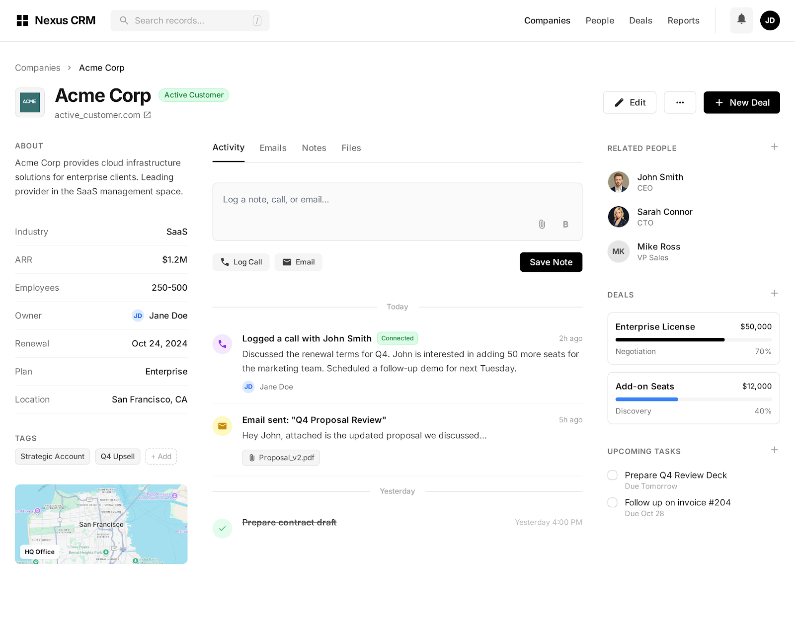
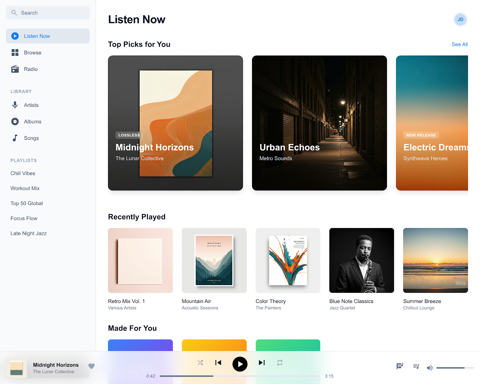
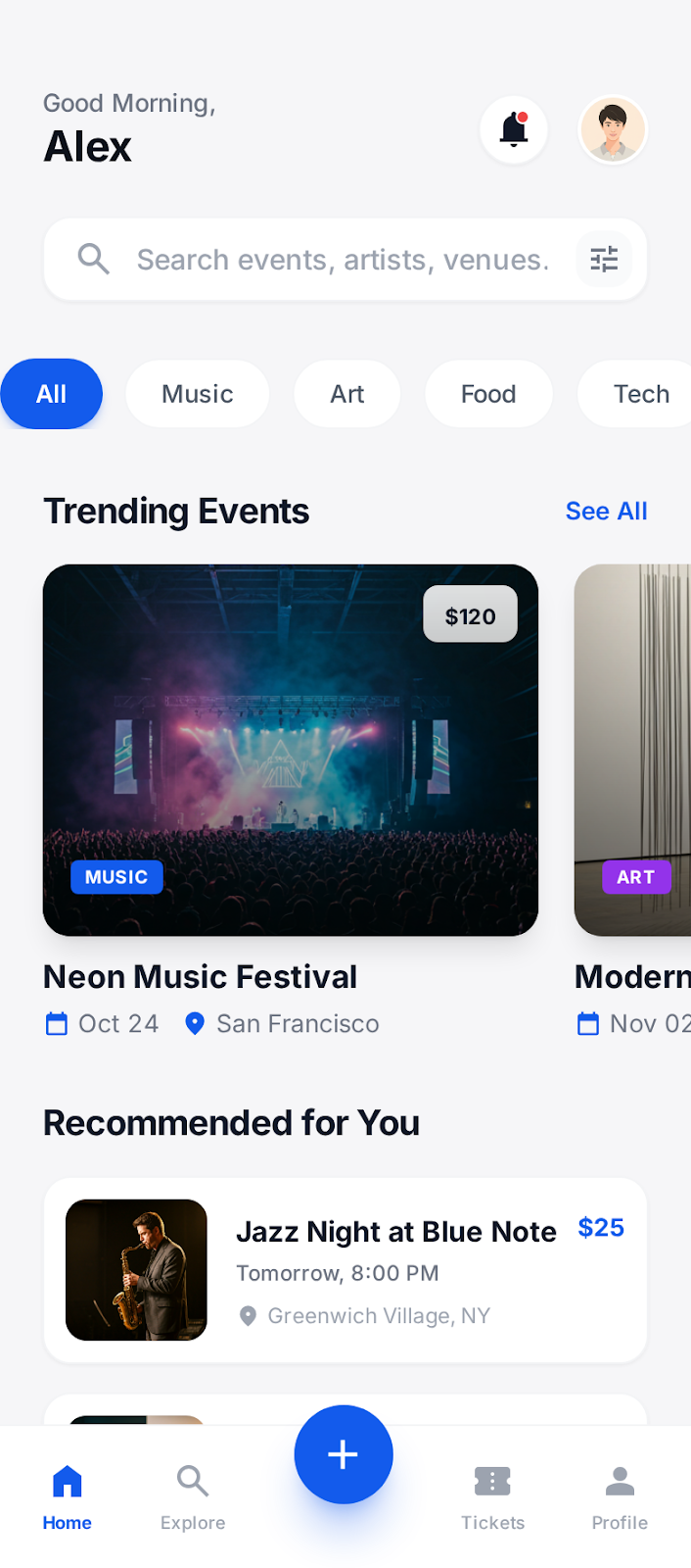
Second, product surface area beats logo placement. The cards that earn clicks in 2026 show the actual UI — a real screenshot of the dashboard, the editor, the feature being announced — framed in a browser or device chrome. Logo lockups in the corner are fine. Logos as the focal point are over.
Third, dark backgrounds are a deliberate choice, not a default. With most feeds defaulting to light mode and most users on light-mode browsers, a stark dark card stands out in the scroll the same way black-and-white film stood out in a magazine. Use it on purpose, not as a fallback for “modern.”
There are two camps. The per-template camp generates a single beautiful OG card and uses it as the default across every page on the site — one investment, one image, deployed everywhere. The per-page camp generates a unique card for every post, every doc, every landing page, with the page title and a relevant screenshot composited in. Both are defensible. Picking the wrong one for your site wastes either time or click-through rate.
The per-template approach wins when your traffic is concentrated on a small number of pages and your brand identity does the heavy lifting. A landing page, a pricing page, an about page — three URLs that account for 80% of shares. One excellent card is enough. You spend an hour in Screenhance, ship it, and move on.
The per-page approach wins when you publish — blog posts, changelog entries, documentation, customer stories. Each piece of content has a different headline, and a generic card erases that difference in the feed. The fix is usually a templated OG image pipeline driven by page metadata: same layout, dynamic title, dynamic screenshot. Screenhance templates let you build the base composition once and swap the screenshot and headline per page.
The mistake we see most often is the worst of both worlds: a generic card on a content site. Forty blog posts that all share the same OG image guarantee that none of them stand out when shared. Pick a side.
The most common social card size is 1200×630 pixels, which works across most platforms. Twitter uses 1200×628, LinkedIn uses 1200×627, and Facebook uses 1200×630. Screenhance templates are pre-sized to these dimensions.
Yes! While most platforms accept the standard 1200×630 size, you can create platform-specific cards in Screenhance. Each template can be customized and exported separately for Twitter, LinkedIn, Facebook, and more.
Social cards don’t directly affect search rankings, but they significantly impact click-through rates from social media. Higher engagement on social platforms can indirectly boost SEO through increased traffic and brand visibility.
PNG is the most universally supported format for social cards. All major platforms accept PNG, JPG, and WebP. Screenhance lets you export in all three formats. Keep file sizes under 5MB for best results.
Absolutely! Screenhance specializes in placing your product screenshots inside device frames like iPhones, MacBooks, and browsers. Adding a real product screenshot to your social card increases click-through rates significantly.
Yes, Screenhance offers a free plan with 3 exports per month. You get access to all templates, device frames, and backgrounds. Pro plans unlock higher resolution exports and additional features.
Only if your traffic is concentrated on a handful of pages. For content sites with active blogs, changelogs, or docs, a unique per-page card consistently outperforms a single template. The fix is a dynamic OG image pipeline that swaps the headline and screenshot per page while keeping the base layout fixed.
Slack, Discord, and iMessage all crop the preview down to a much smaller box than 1200×630. Headlines under 40 characters in a heavy weight (700 or 800) survive the resize. Anything thinner than 500 or longer than 50 characters becomes mush at thumbnail scale.
A small lockup in a corner is fine and helps with brand recognition for follow-up shares. A logo as the focal point is a 2022 idea. In 2026 the focal point should be the screenshot or the headline — the thing that earns the click.
The card itself does not adapt to the viewer's theme. A dark card on a light feed and a light card on a dark feed both create contrast, which is usually what you want. Just avoid mid-grey backgrounds that blend into both themes — they vanish in the scroll.
Explore more ways to create stunning visuals with Screenhance.
Generate compliant App Store screenshots
Try it freeResolve the App Store Connect wrong-dimensions error
Try it freePolish app screenshots for any store
Try it freeAndroid-ready Google Play visuals
Try it freeiOS-specific screenshot sets
Try it freeLaunch-ready PH gallery images
Try it freeA great social card turns every share into a click. Create yours in minutes with Screenhance.