
12 Instagram Mockup Examples for Better Product Launches
Explore 12 original Instagram mockup examples for feed posts, carousels, Reels, Stories, profiles, reviews, launch graphics, and product scenes.
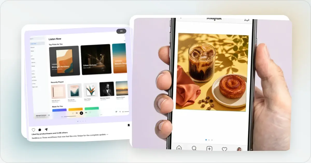
An Instagram mockup can mean two different things. It can be a graphic you intend to publish on Instagram, or it can show how that content will look inside the Instagram interface. Choosing the wrong one creates a polished image that still does not answer the question at hand.
The twelve examples below cover feed posts, carousels, Reels, Stories, profiles, customer proof, product launches, comparisons, metrics, and photographed scenes. Every image is an original Screenhance template output, and every preview opens the exact editable template. Start with the Instagram post mockup generator if you would rather browse the complete collection.
Names, likes, review copy, and metrics shown inside the templates are editable sample content. Replace them with real, approved material before publishing.
First, choose the right kind of Instagram mockup
That distinction is practical. A social designer may need the finished post asset; a client may need to approve the native feed context; a case study may need the profile view; and a landing page may need a photographed phone scene.
| What you need to decide | Best starting point | What the mockup should show |
|---|---|---|
| How a post will appear in Instagram | Native-interface mockup | Profile row, media crop, caption, and relevant actions |
| What image or carousel to publish | Post design | The actual creative, without Instagram interface chrome |
| How a whole account will feel | Profile mockup | Bio, profile details, and a coordinated grid |
| How to present the idea outside Instagram | Photographed scene | A phone or setting that gives the post physical context |
Create an Instagram mockup with your own content
1. Native single-image post: show the real feed context
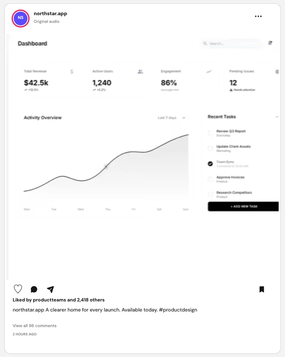
This example surrounds one product screenshot with the familiar structure of an Instagram feed post. The account name, avatar, media, caption, likes, comments, and save action are all part of the composition, so the result answers “what will the post feel like in context?” rather than merely showing the upload.
Use a native post mockup for client approval, portfolio work, a launch deck, or a case study. If the screenshot is the final asset you plan to upload, export the media itself instead of posting the interface around it.
2. Native carousel post: make the sequence visible
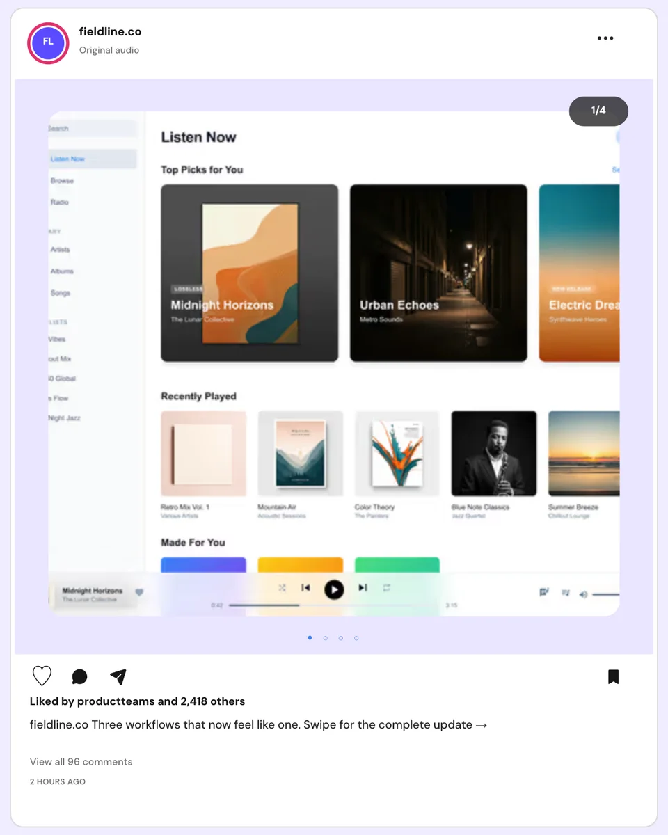
The carousel counter and pagination dots make the format immediately clear. That matters when the story depends on a sequence—such as problem, workflow, result—or when a reviewer needs to understand that the cover is only the first part of the post.
Treat the first slide as a promise, not a summary of every slide. It should give someone a reason to continue while leaving enough space for the product to remain recognisable at feed size.
3. Reel preview: frame motion before the edit is finished
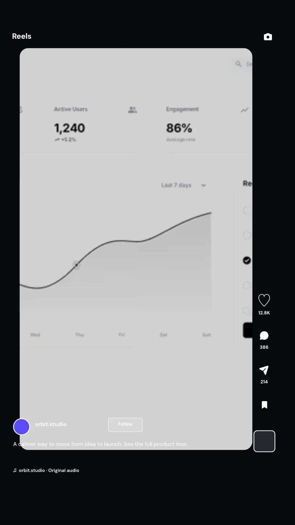
A Reel preview helps you judge the cover and interface together before the final video is ready. The important design question is not whether every tiny product label can be read; it is whether the cover communicates the feature, keeps its subject clear, and still works beneath the surrounding controls.
Use this for a storyboard, campaign review, or pitch deck. For the published Reel itself, pair a strong cover with motion that actually demonstrates the interaction. Screenhance can also turn a product flow into a polished demo video when a still cannot explain the change.
4. Collab post: make the partnership the focal point
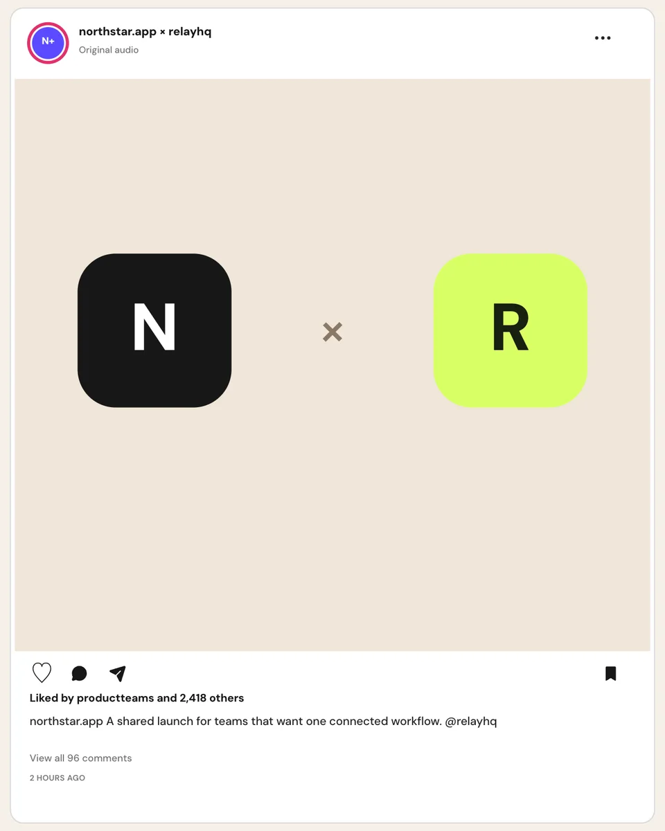
This composition gives both collaborators equal visual weight. The relationship is understood before the viewer reads the caption, which makes it a useful structure for integrations, co-marketing announcements, partnerships, or a shared event.
Keep the joint visual simple. Two marks, one clear connector, and one line of context are usually stronger than squeezing both products, both value propositions, and a long announcement into the same frame.
5. Customer review post: turn one real voice into the idea
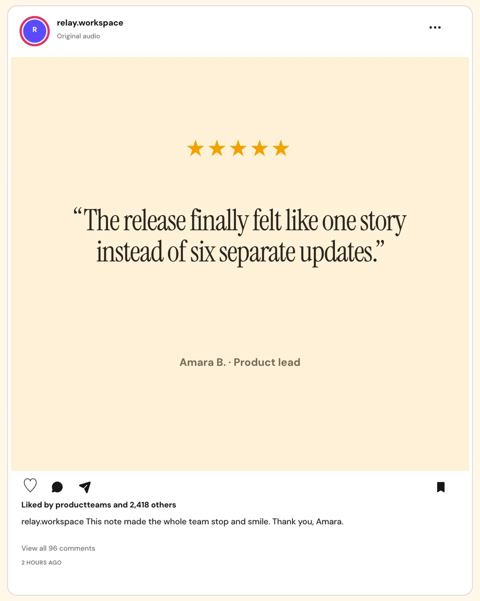
The review fills the image while the native post shell supplies account context. This works when the quotation itself is the story and the attribution can stay short enough to read without shrinking the type.
Replace the sample review with a genuine comment you have permission to use. Preserve the meaning when editing for length, and avoid turning a general compliment into a specific performance claim the customer did not make.
6. Story poll: design the interaction, not just the background
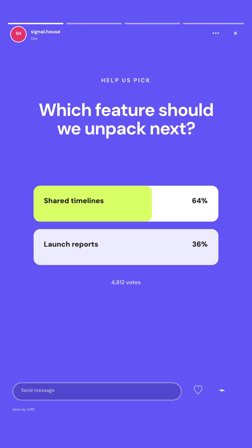
The poll is the visual centre of this Story. The question, choices, and surrounding breathing room are more important than decorative elements because the interaction must remain obvious on a phone.
Use this pattern to collect a real preference, preview two directions, or invite the audience into a product decision. Ask one question with two distinct answers; if the options need paragraphs of explanation, the Story is trying to do too much.
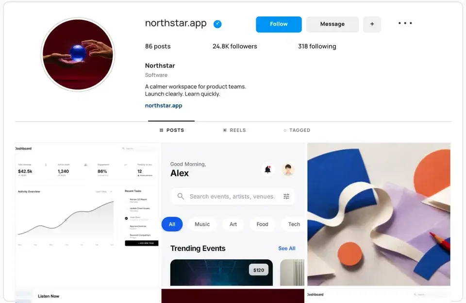
7. Instagram profile mockup: review the account as a system
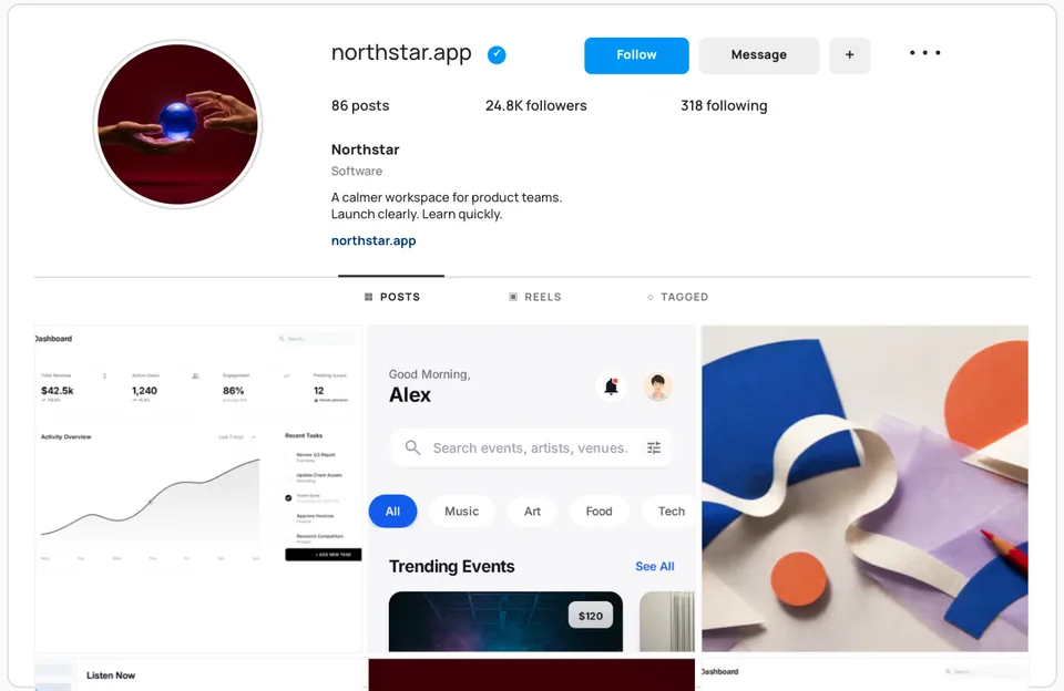
A profile mockup changes the unit of design from one post to the whole account. It exposes whether the bio, profile image, featured details, and grid tell one coherent story—or whether each post looks good alone but unrelated beside the others.
Use it for a rebrand, a launch plan, a social media proposal, or a portfolio case study. Build the grid from posts you can realistically publish rather than designing an attractive nine-tile concept that cannot survive the next update.
8. Product launch graphic: publish the creative itself
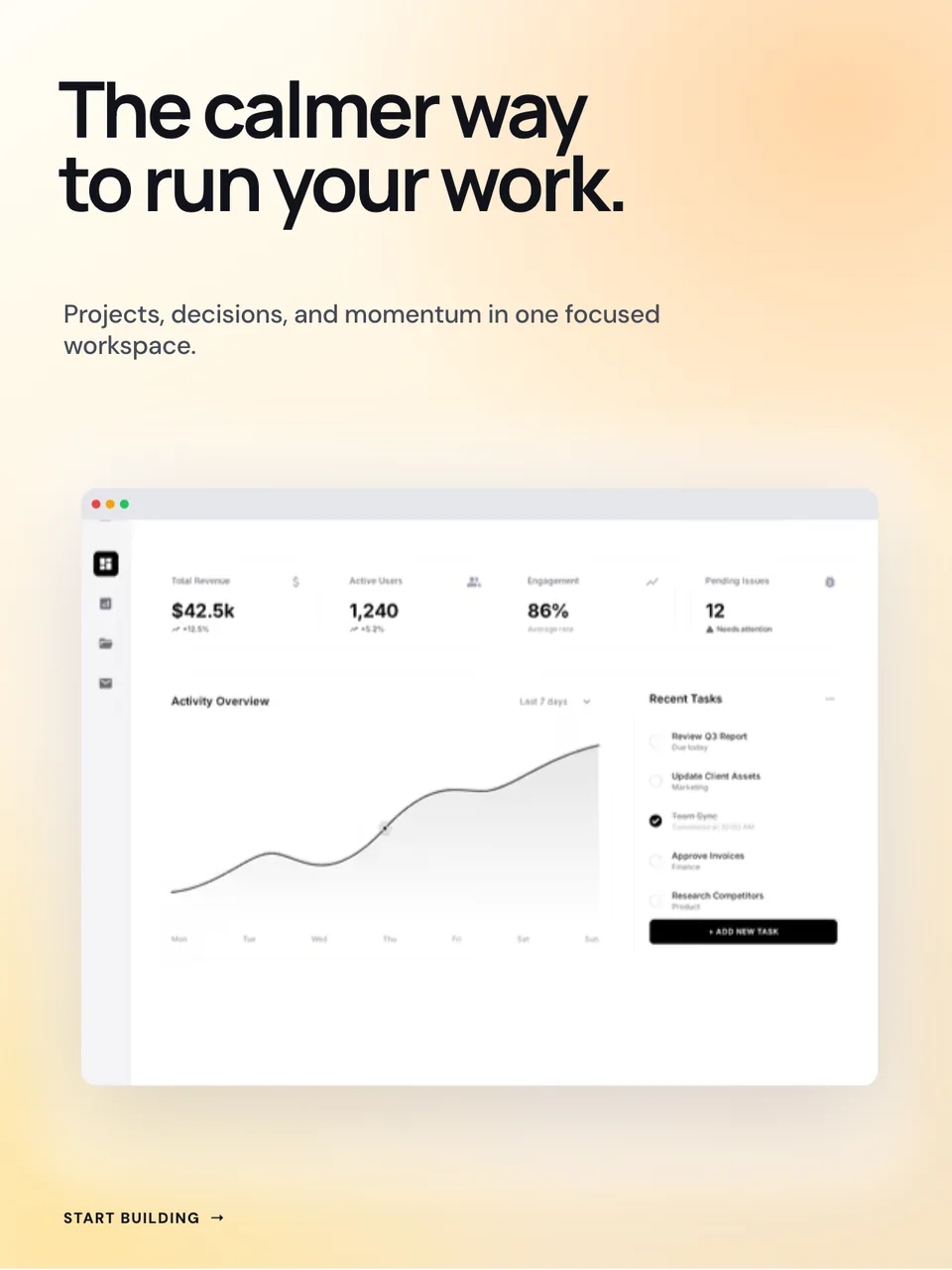
Unlike the native examples above, this is the actual campaign creative. The headline establishes the promise, the supporting line adds context, and the browser crop proves there is a product behind the message.
Use this structure when a launch needs a clear statement and one representative screen. Do not reduce the whole interface to a tiny window: crop to the part that supports the headline and let the caption carry the detail.
For a repeatable type system across feed graphics, store images, and the launch page, use the font guide for app screenshots and launch graphics to choose a readable base family and one purposeful display face.
9. Designed carousel: give each slide one job
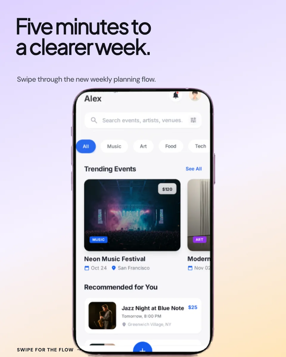
This three-page carousel separates the hook, product proof, and benefits instead of compressing them into one poster. The cover creates curiosity, the second slide shows the interface, and the last slide can resolve the story.
A useful carousel advances one argument. Write the slide roles before polishing them: hook → evidence → takeaway is often enough. Repeating the same claim over three backgrounds creates more swiping without adding information.
10. Before-and-after post: make the comparison fair

The equal split, matching device scale, and explicit labels let the viewer compare two states without decoding the layout first. This can explain a redesign, feature improvement, workflow change, or visual transformation in one frame.
Keep the comparison honest: use equivalent crops and representative states. If the “before” is deliberately made smaller, duller, or messier, the design loses credibility even when the underlying improvement is real. The before-and-after mockup guide covers the comparison in more depth.
11. Metric post: pair the number with product evidence
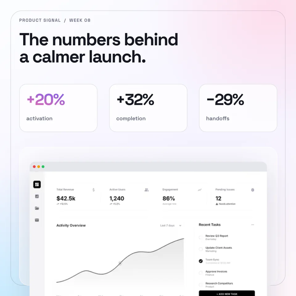
Three compact metric cards sit above the product that gives them context. The layout is useful for a launch recap, milestone, research finding, or changelog when the numbers are the main message.
Replace every sample metric with a result you can explain. Add the timeframe and comparison point in the caption or supporting slide, and separate observed change from assumed cause. If the evidence is not ready, lead with the product change instead of a percentage.
12. Photographed phone scene: give the post a physical setting
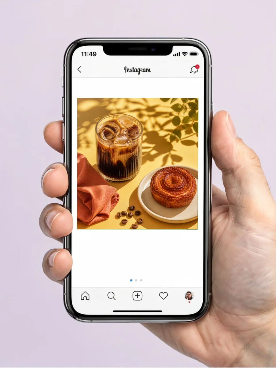
The final example is not meant to imitate a feed screenshot. It places an Instagram post inside a photographed phone scene, making it useful on a landing page, campaign moodboard, presentation, or portfolio cover where a flat interface capture would feel too literal.
Choose a scene that supports the content. The café setting works because the post is about food and drink; the same setting would distract from a cybersecurity dashboard or enterprise workflow.
A practical way to choose among the twelve
Start with the decision your mockup needs to support:
- Approving a feed post: use the native single-image or native carousel mockup.
- Planning motion: use the Reel preview, then create the actual recording separately.
- Announcing a partnership: use the collab post and keep both parties legible.
- Publishing customer proof: use the review layout with a real, approved quotation.
- Collecting audience input: use the Story poll with one focused question.
- Planning an account refresh: use the profile mockup to inspect the grid as a system.
- Shipping a launch asset: use the product launch graphic or designed carousel.
- Explaining a change: use the before-and-after layout with comparable states.
- Sharing a result: use the metric post with a clear source and timeframe.
- Presenting the campaign elsewhere: use a photographed scene that matches the subject.
A five-minute review before export
1. Reduce the design to phone size. Can you still identify the product and the main message?
2. Check whether you are exporting the creative or a mockup of the creative. They serve different purposes.
3. Replace every sample account, quote, number, screenshot, and caption that does not belong to the real campaign.
4. Keep important copy and UI away from edges that may be covered or cropped in the destination.
5. Preview the final asset in the live post composer before publishing.
Frequently Asked Questions
What is an Instagram mockup?
An Instagram mockup is either a visual simulation of content inside the Instagram interface or a presentation scene showing Instagram content on a device. People also use the term for editable Instagram post designs, so check whether you need the publishable asset, the native context, or a presentation image.
What should an Instagram post mockup include?
For native context, include only the interface details needed to understand the placement: account identity, the media area, caption, and relevant actions. For a publishable post design, remove the interface and focus on the message, product proof, and crop.
Should I use a square or portrait Instagram mockup?
Choose the ratio that fits the specific concept and preview it in the destination. The examples in this article include square 1:1, portrait 4:5 and 3:4, and vertical 9:16 canvases; each template opens at its authored ratio so the composition remains intact.
Can I use an Instagram mockup in a portfolio or pitch deck?
Yes. Native-interface, profile, and photographed-device mockups can make the intended context easier to understand. Use your own work, respect third-party identities and content, and label concepts clearly when they were not actually published.
Are the Instagram mockup templates editable?
Yes. The twelve Screenhance examples above open as editable templates. You can replace screenshots and sample content, adjust the design, and export the result for the appropriate placement.
Make an Instagram mockup with your own content
Choose the example that matches the decision you are making, then replace the sample product, copy, account details, and evidence. The Instagram mockup maker brings the native posts, campaign designs, profiles, and photographed scenes into one browsable workflow.
Screenhance examples
Two editable starting points from the Screenhance library, selected for this social and web guide.
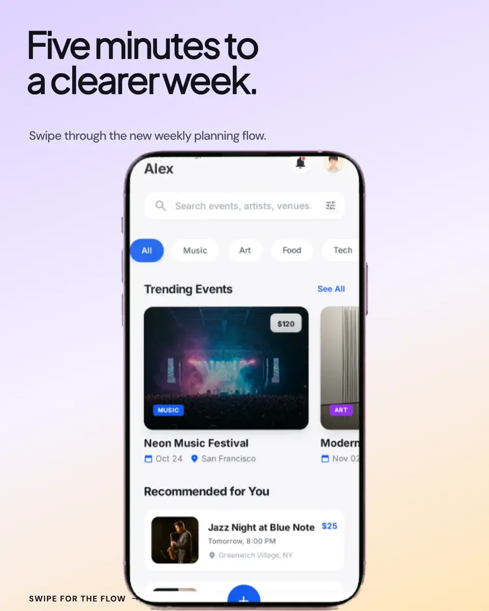
Create an Instagram mockup with your own content
Free to start. No credit card required.
Keep reading
Related, product-tested guides from Screenhance.
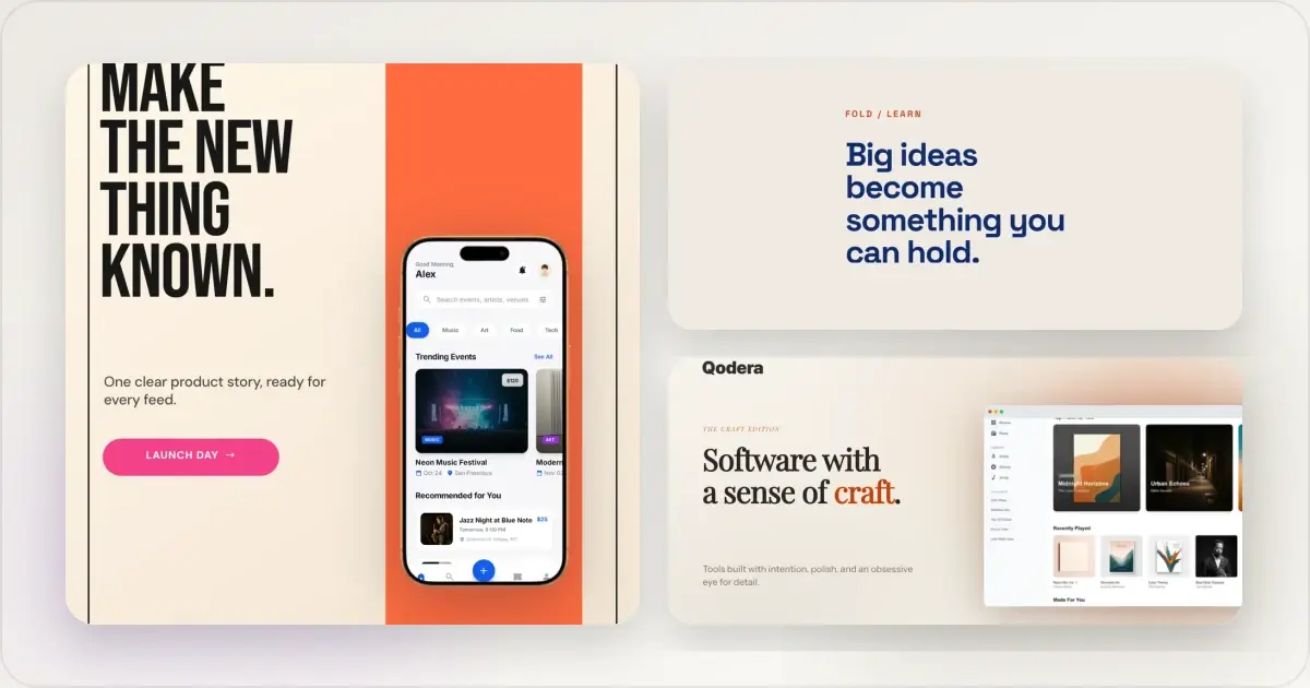
14 Best Fonts for App Screenshots and Launch Graphics
Choose readable fonts for App Store screenshots, Google Play graphics, social posts, and launch visuals, with practical pairings and editable examples.
1 Sept 2026 · 10 min read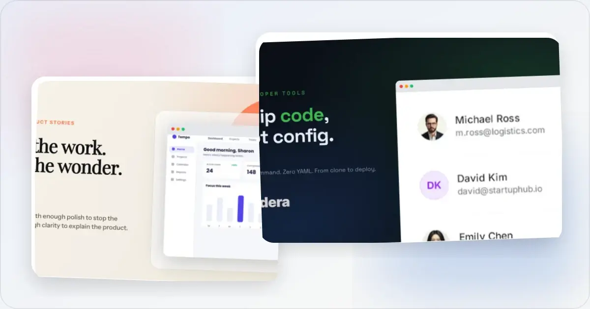
12 OG Image Examples With the Layout Logic Explained
Explore twelve original OG image examples and learn how product proof, hierarchy, contrast, crops, photography, metrics, and quotes change the composition.
20 Aug 2026 · 7 min read
How to Blur Part of a Screenshot (and When to Redact Instead)
Blur emails, names, and API keys in a screenshot in your browser, free. When blur is enough, when to redact instead, and the two-minute workflow.
2 Jul 2026 · 4 min read