ScreenhanceBeta

Social Media Mockup Generator

Create scroll-stopping visuals for Twitter, LinkedIn, Instagram, and more. Turn plain screenshots into posts that get likes, shares, and comments.

Olivia RhyePhoenix BakerLana SteinerDemi WilkinsonDrew Cano
4.9

Loved by 2,000+ creators

Social media ready screenshot mockup with eye-catching gradient background

Social Media Templates

Optimized for Twitter, LinkedIn, Instagram, and more. Pick a template and start creating.

Start from scratch
Use this template

Watch + Phone Duo

Use this template

Watch Trio

Use this template

Iphone Trio

Use this template

Iphone Duo

Use this template

MacBook Hero

Use this template

MacBook Floating Hero

Use this template

Candy Glass

Use this template

Solo glass phone

Use this template

Glass Outline

Use this template

Minimal glass mockup

Use this template

Device Ecosystem

Screenshot
Use this template

3D iPhone Hero

Screenshot
Use this template

3D iPad Showcase

Use this template

Device Float

Use this template

Single Iphone

Use this template

Minimal Phone

Use this template

iPad Showcase

Use this template

Dark Phone Trio

Design with confidence
Create beautiful interfaces that convert
Get started →
Use this template

Clean White OG

The future of product design
Join 50,000+ designers already using our platform
✦ INTRODUCING
Use this template

Bold Gradient OG

ELEVATE YOUR VISION
Use this template

Botanical Hero

Reimagine how you build products
Use this template

Open Sky

Shaping the Future of Digital Innovation.
Use this template

Editorial Overlay

Introducing your brand.
We make growth easy for startups.
Use this template

Clean Gallery

Building tools for the modern workplace.
Use this template

Dark Split

★★★★★ Loved by 10,000+ teams
Use this template

Product Showcase

Tools your team will actually love using.
Use this template

Hero Headline

Everyone's favorite productivity tool.
★ YOUR BRAND
Use this template

Teal Split

Make complex work feel simple
Use this template

Minimal Product

Use this template

Bold Color

Ship faster
when things break
Use this template

Dark Glow Hero

Use this template

Vivid Gradient

Start building something amazing...
Build apps and websites with AI
Use this template

Dark Aurora

Build something people love
The modern platform for creators
NEW RELEASE
Use this template

Glow OG

Use this template

Stacked Cards

Use this template

Browser Stack

Use this template

Gradient Duo

Use this template

Browser Showcase

Use this template

Orange Browser Showcase

Use this template

Warm Duo

Use this template

Soft Duo

Use this template

Mosaic Scatter

Win complex deals with smarter workflows
Use this template

Scenic Backdrop

Use this template

Warm Stacked

Use this template

Pastel Overlay

Optimized for Every Platform

Twitter/X

16:9 or 1:1

LinkedIn

1.91:1 or 1:1

Instagram

1:1 or 4:5

Product Hunt

16:9

How It Works

Create professional mockups in three simple steps. No design skills required.

Step 1

Upload your screenshot

Drag and drop or select any screenshot, design, or image from your device.

Step 2

Choose frame & background

Pick from iPhone, iPad, MacBook, browser frames and beautiful gradient backgrounds.

Step 3

Export & share

Download as PNG, WebP, JPEG, GIF, or video. Ready for marketing in seconds.

Why Choose Screenhance?

Two capabilities that separate Screenhance from every other mockup tool in 2026: animated exports and App Store screenshot localization.

Animated GIF & WebM exports

Template-driven motion — float, reveal, parallax. Export animated mockups at Product Hunt, landing-page, and Twitter/X dimensions. Most mockup tools are static-only.

App Store localization in 80+ languages

One master design, per-locale captions, every required Apple and Google Play size per language. RTL and CJK support. Apple reports localized listings drive 2-3x install lifts.

Every required Apple & Google size

iPhone 17 Pro Max (1320×2868), iPhone Air (1260×2736), iPad Pro M4 (2064×2752), and the full Google Play set — exported from one design in a single pass.

30 seconds, zero design skills

Pick a template, drop in your screenshot, export. No Figma, no Photoshop, no learning curve. Free tier covers 3 exports a month; $6 Week Pass unlocks unlimited for a launch.

Why Beautiful Screenshots Win

2.3x

More Engagement

Posts with polished visuals get significantly more likes and comments.

47%

More Clicks

Professional mockups drive more traffic to your landing pages.

3x

More Shares

Beautiful content gets shared, spreading your reach organically.

10 sec

To Create

Upload, style, and download. Faster than opening Figma.

Perfect For Any Content

Product Updates

Feature Launches

Before/After

Tutorials

Testimonials

Analytics Wins

UI Showcases

Bug Fixes

Changelog Posts

Platform-specific aspect ratios that actually work

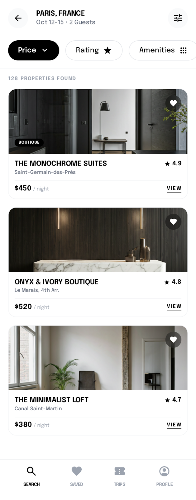
Twitter/X auto-crops most uploads to 16:9 in the timeline preview, but the full image is visible when someone taps in. That means the safe design zone \u2014 the part that survives any crop \u2014 is the centered 16:9 region of whatever you upload. Build your headline and product screenshot inside that zone and treat anything outside as decorative padding that may or may not show. Square 1:1 uploads also work and tend to take more vertical screen real estate in mobile feeds, which is generally a win.

LinkedIn renders link previews at roughly 1.91:1 and standalone image posts at 1.91:1 or 1:1 depending on context. For organic posts where the image carries the message, square images outperform landscape because LinkedIn's feed gives them more vertical pixels. For external link shares, the OG image at 1200\u00d7630 is what controls the preview \u2014 you have less flexibility, but you can still build it inside Screenhance and embed via your site's meta tags.

Instagram squeezes more performance from vertical content. The 4:5 portrait ratio (1080\u00d71350) takes maximum vertical space in the feed without crossing into the awkward 9:16 territory reserved for Reels and Stories. Square 1:1 still works but cedes about 20% of available real estate compared to 4:5. For Stories and Reels specifically, design for 1080\u00d71920 with the safe zone in the middle 60% \u2014 top and bottom get covered by interface chrome.

TikTok is 9:16 full-bleed. Unlike Instagram Stories, TikTok doesn't reserve as much chrome at the bottom, but the right edge holds the like/comment column and will visually conflict with anything you place there. Keep critical content centered and away from the rightmost 200 pixels. Static screenshots rarely perform on TikTok regardless of aspect ratio \u2014 the platform expects motion.

Animated social mockups: when they're worth it

Animated screenshots \u2014 a short loop showing a UI interaction, a hover state, or a feature in motion \u2014 outperform static images on Twitter, LinkedIn, and Product Hunt almost universally. The catch is that "animated" doesn't mean "animated for the sake of it." A loop that adds nothing beyond visual movement usually underperforms a clean static image because the eye reads it as noise. The animation has to communicate something the static frame can't.

The strongest use cases are: showing a state change that's hard to convey in still frames (a chart filtering, a modal opening, a search auto-completing), demonstrating a multi-step flow that needs to compress to four or five seconds, and signalling interactivity in a UI that looks static otherwise. If you can describe the value in a single sentence under a still screenshot, the still screenshot is probably better \u2014 adding motion just costs file size and viewer attention.

Format matters. WebM and MP4 autoplay on Twitter, LinkedIn, and most modern social platforms. GIFs are larger files and lower quality, but they preview better in messaging apps and on platforms that disable autoplay. Export both formats when the animation is central to the post, and use the WebM for primary distribution.

Keep loops short \u2014 three to six seconds usually \u2014 and design the first and last frame to be nearly identical so the loop doesn't jump visibly. Pair animated mockups with a strong static fallback (the first frame of the loop) for platforms or contexts where autoplay is disabled. If you're building a launch campaign, our Product Hunt gallery generator and OG image generator share the same animated export pipeline so you can deploy consistent motion across every social surface.

Frequently Asked Questions

What sizes work for social media?

Common sizes include 1200×630 for OG images, 1080×1080 for Instagram, 1200×675 for Twitter, and 1080×1920 for Stories. Screenhance templates support all formats.

Which platforms are supported?

Create visuals for Twitter/X, LinkedIn, Facebook, Instagram, Pinterest, Product Hunt, and more. Templates are pre-sized for each platform.

Can I add text to my social media images?

Yes. Add headlines, captions, and descriptions directly in the editor. Choose from multiple fonts, sizes, and colors to match your brand.

Is this social media mockup generator free?

Yes. The free plan includes 3 exports per month with all templates. Pro plans unlock higher resolution and additional export formats.

What's the best aspect ratio for Instagram?

4:5 portrait at 1080×1350 takes the most vertical space in the feed without crossing into Reels territory. Square 1:1 still works but cedes roughly 20% of real estate compared to 4:5. For Stories or Reels, design 1080×1920 with critical content in the middle 60% of the frame.

Do animated mockups actually outperform static ones?

Almost always on Twitter, LinkedIn, and Product Hunt — but only when the motion communicates something the still frame can't. A chart filtering, a modal opening, a multi-step flow compressed to five seconds. Adding motion for its own sake costs file size and attention without paying back in engagement.

What format should I use for animated social posts?

WebM or MP4 for Twitter, LinkedIn, and most modern platforms — they autoplay and compress well. GIF for messaging apps and platforms that disable autoplay. Export both when the animation is central, and always design a clean first frame that works as a static fallback.

How do I keep social posts visually consistent across platforms?

Build one master design and adapt it for each platform's primary aspect ratio. Lock the color palette, typography, and screenshot framing across versions. Save the result as a template so future posts in the same campaign reuse the same composition instead of drifting.

Make Your Posts Stand Out

Stop posting plain screenshots. Start creating content that gets noticed.