Screenhance

Hero Image Generator

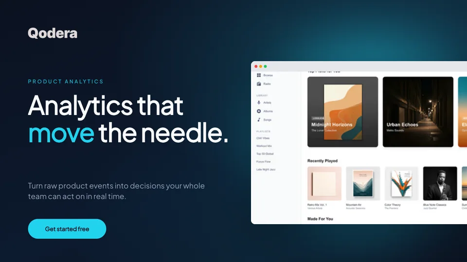
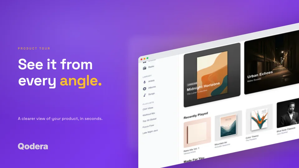
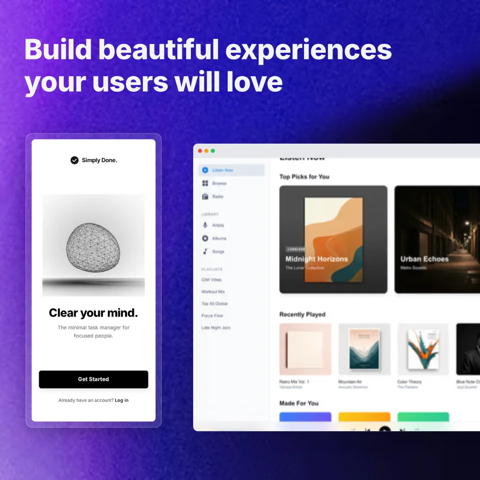
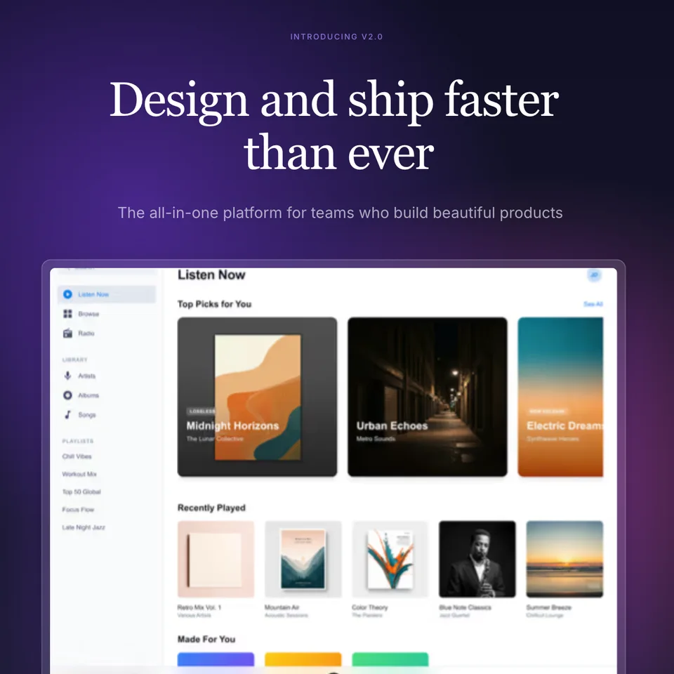
Create stunning hero images for your landing page in minutes. Professional templates with device mockups, gradient backgrounds, and text overlays. Make your above-the-fold section convert.

4.9 · 2,000+ ratings

Loved by 3,000+ creators

Hero Image Templates

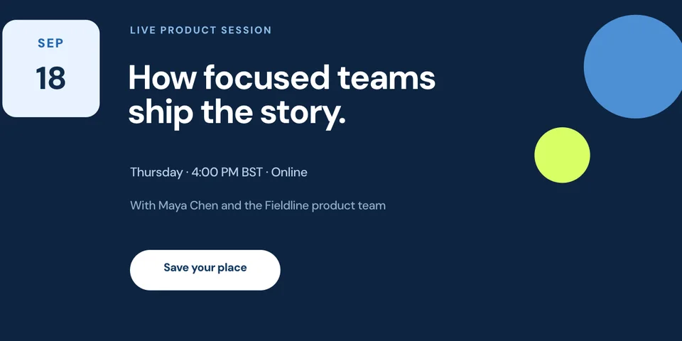
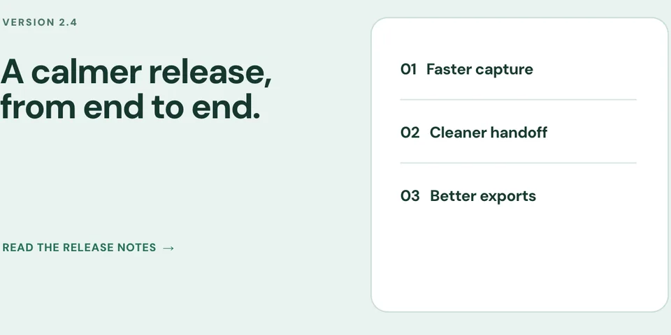
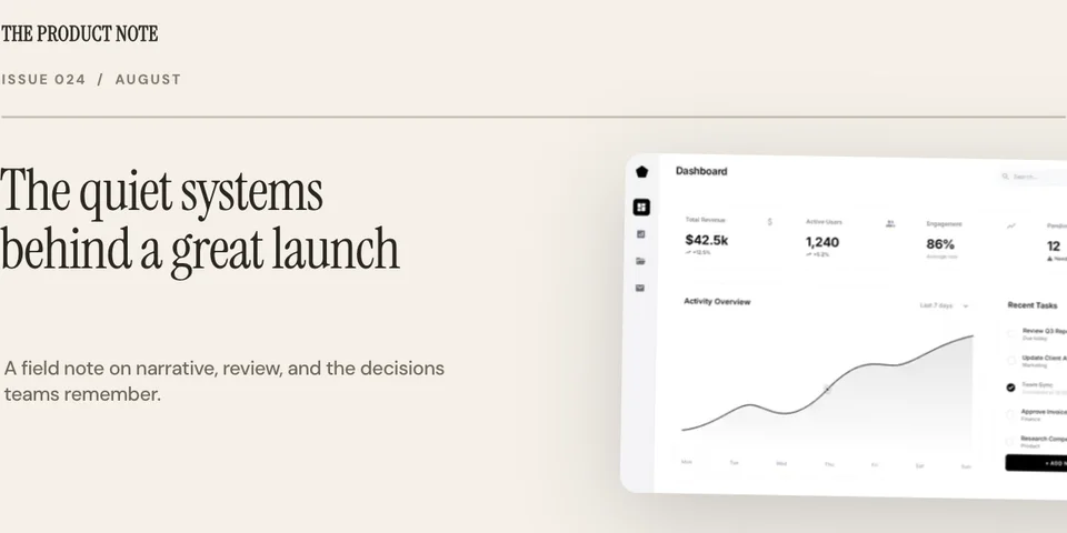
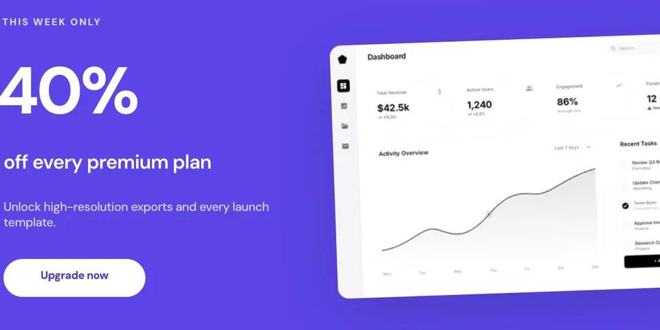
Full-width hero sections, split layouts, and multi-device spreads. Pick a template and start customizing.

What Is a Hero Image?

A hero image is the large, prominent visual at the top of your landing page — the first thing visitors see when they arrive. It's the most important visual on your entire site because it sets the tone, communicates your product's value, and determines whether visitors stay or bounce.

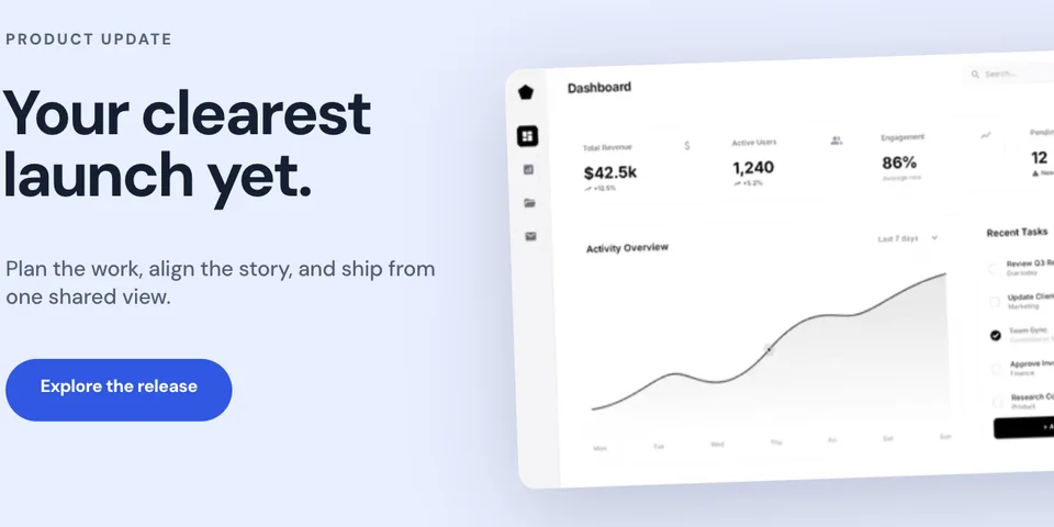
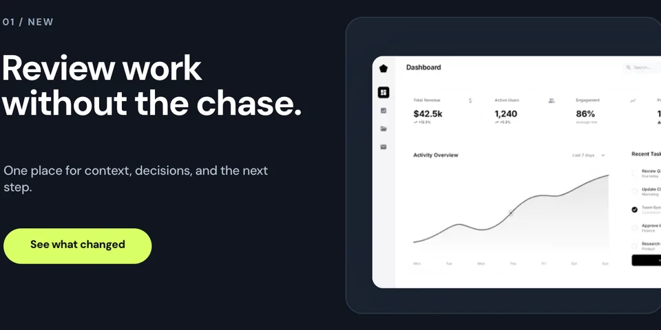
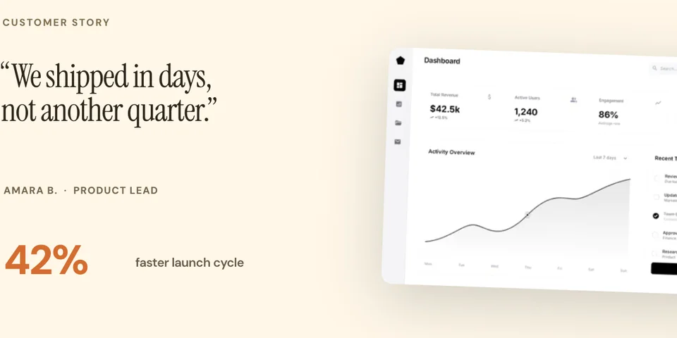
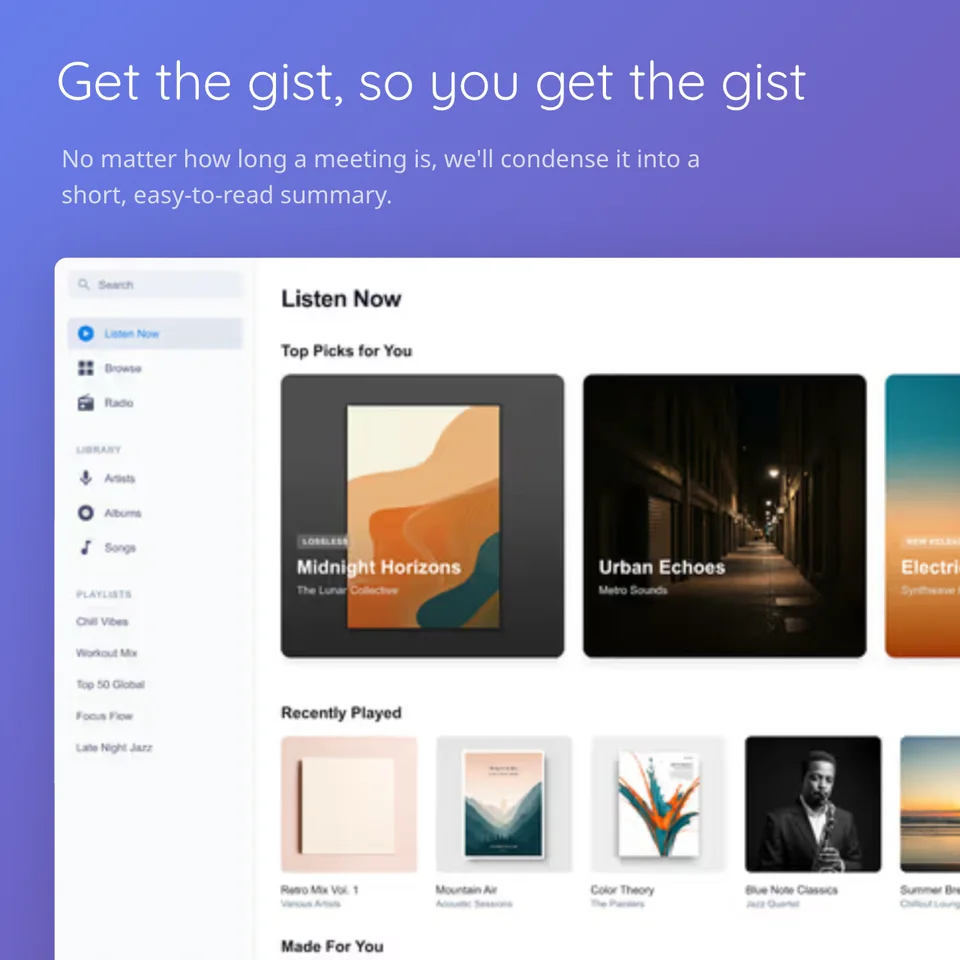
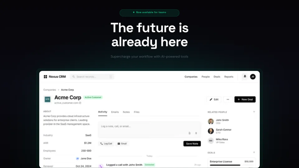
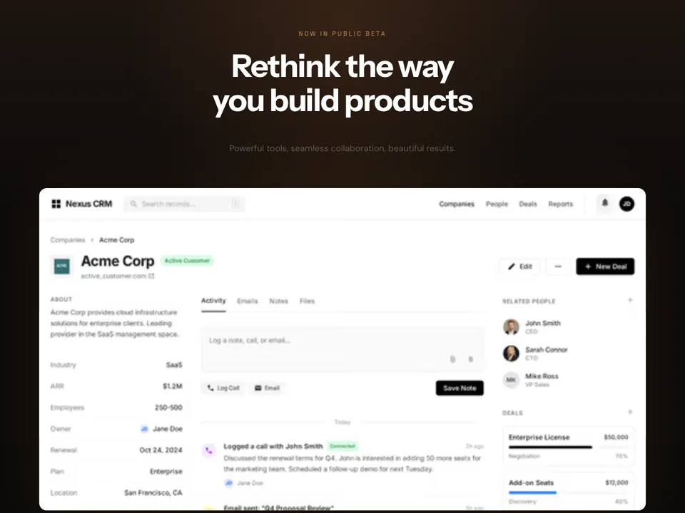
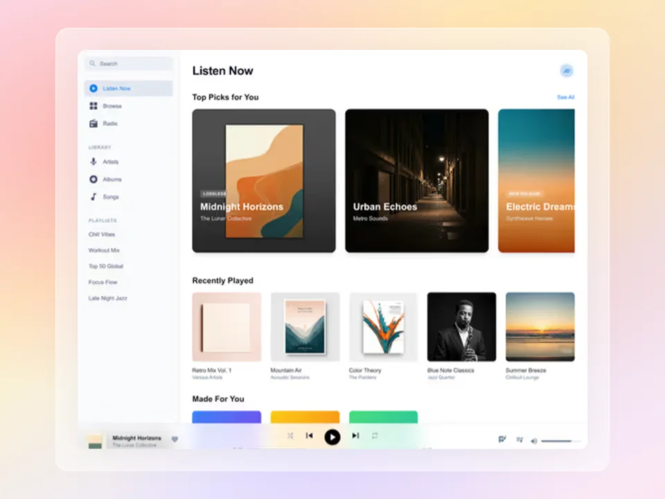
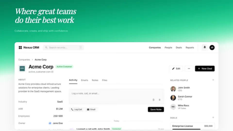
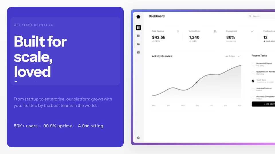
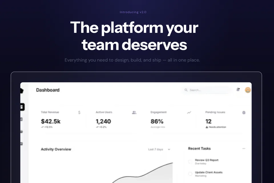
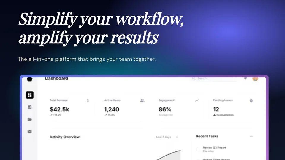
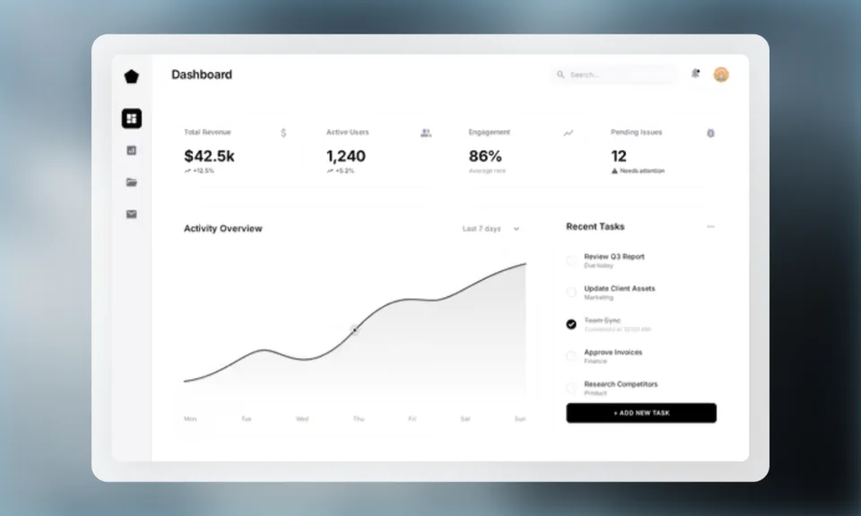
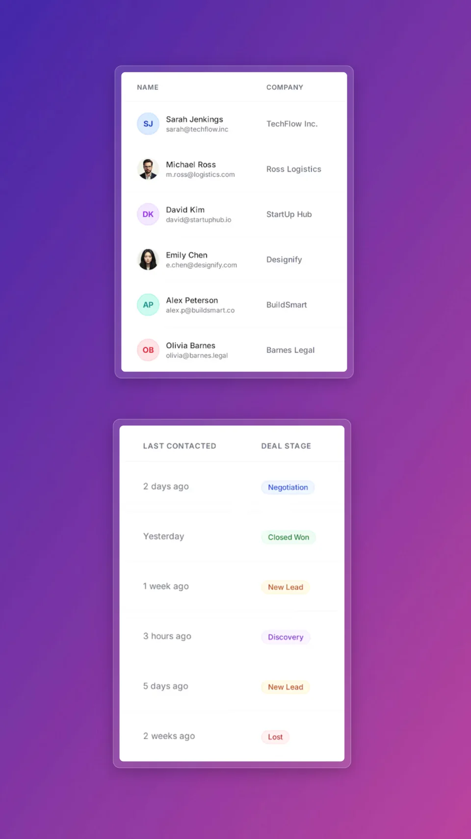
Visitors should be able to connect the headline with the visual quickly. A clear product screenshot can show what the interface looks like and which workflow the page is describing; a decorative image should support that message rather than compete with it.

Showing the actual product in context can reduce uncertainty, but no composition guarantees a conversion lift. Check mobile readability, loading performance, and downstream behaviour for your own page.

Read the guide: How to Create a Landing Page Hero Image That Converts →

Hero Image Sizes & Aspect Ratios

Choose the right dimensions for your hero section. Screenhance templates support all common sizes.

Full-width

1920×1080

Standard full-width hero for desktop. The most common choice for above-the-fold sections.

Standard

1600×900

Slightly narrower layout that works well in max-width containers and centered designs.

Wide

1440×600

Panoramic format for hero sections that need to leave room for text below the fold.

Mobile

750×1334

Portrait-oriented hero for mobile devices. Essential for responsive landing pages.

Retina 2x

3840×2160

Double-resolution export for Retina and HiDPI displays. Crisp on every screen.

Hero Image Layout Patterns

Choose a layout that matches your landing page design and messaging style.

Centered mockup

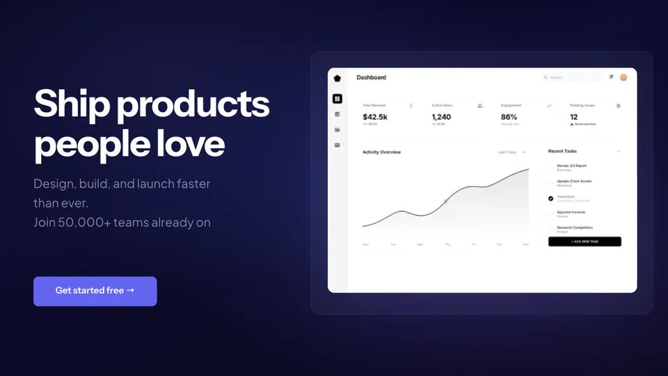
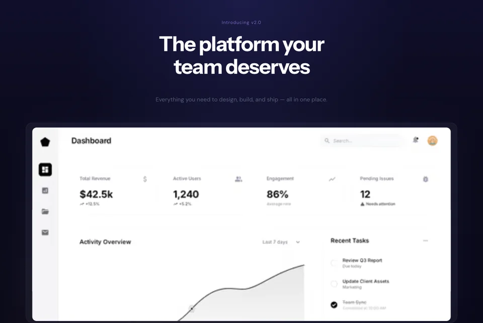
A single device frame front and center with a gradient background. Clean, focused, and effective. Best for simple products with a clear UI.

Split screen

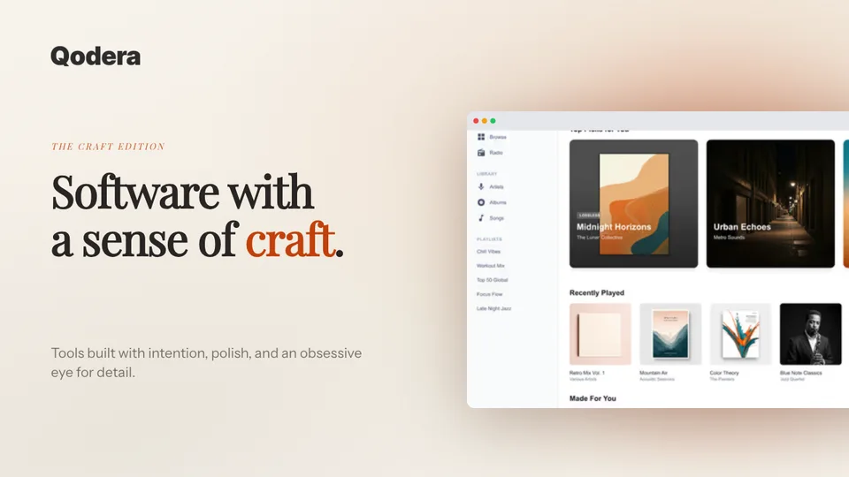
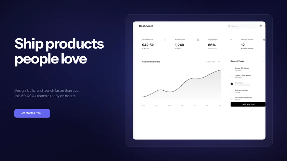
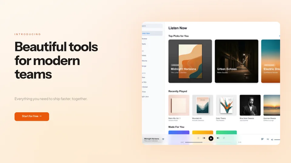
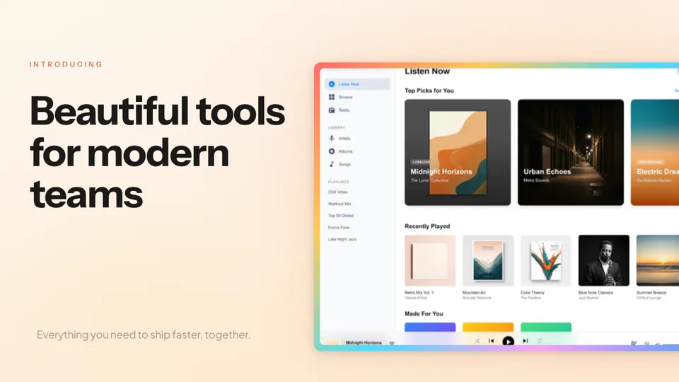
Text on the left, product mockup on the right. The classic SaaS layout that balances messaging with visual proof. Great for headline-driven pages.

Multi-device spread

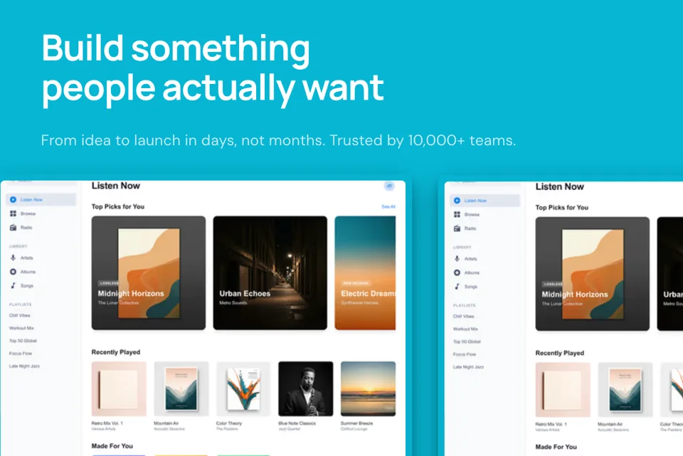
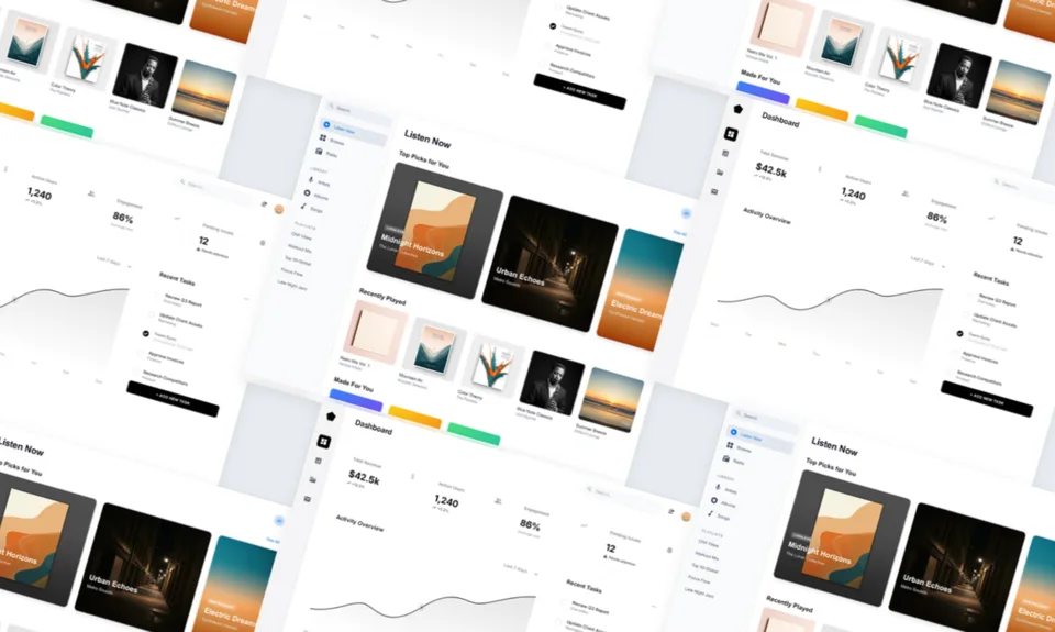
Show your product across laptop, tablet, and phone simultaneously. Communicates cross-platform support and builds confidence in your product.

Floating UI elements

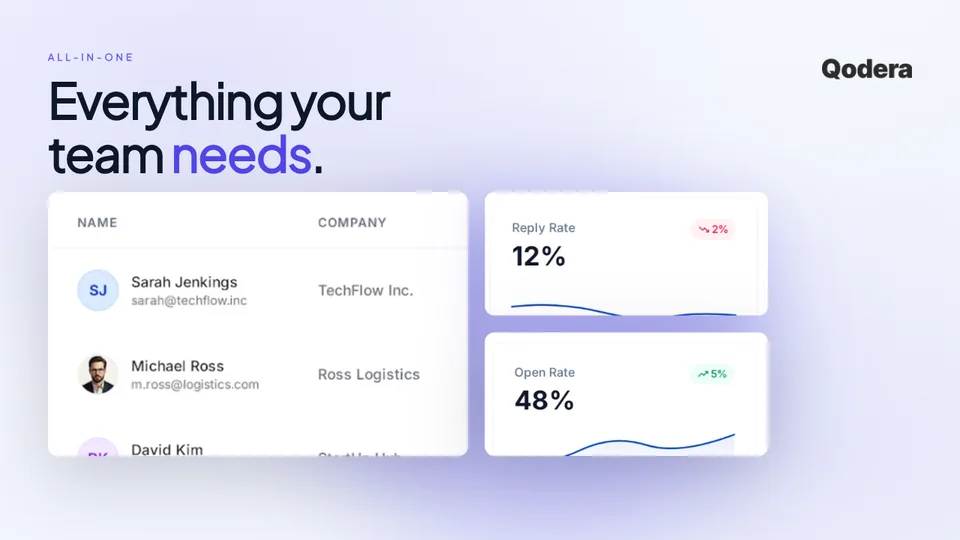
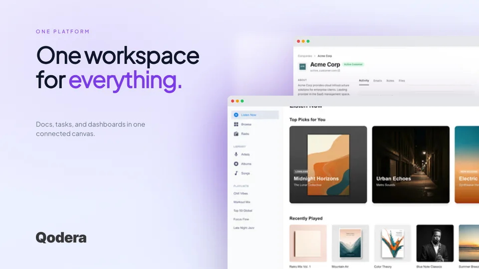
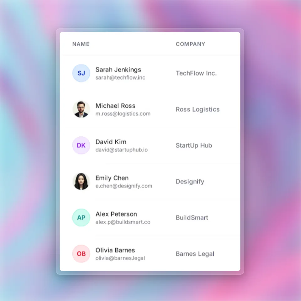
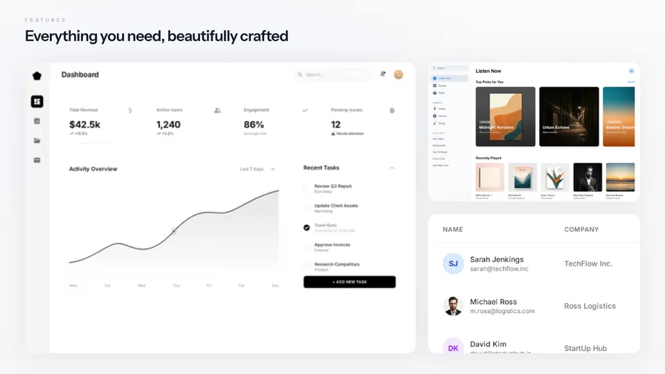
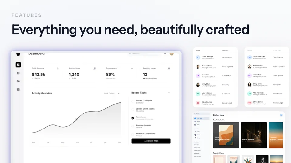
Product screenshot with floating cards, notifications, and UI components. Creates depth and highlights specific features within the hero.

Practical Hero Image Checks

Use these checks to explain the product clearly and keep the visual usable across screen sizes.

1

Show the product immediately

Don’t hide your UI behind abstract illustrations. Visitors want to see what they’re getting. A real product screenshot in a device frame builds trust faster than any stock photo.

2

Use device frames for context

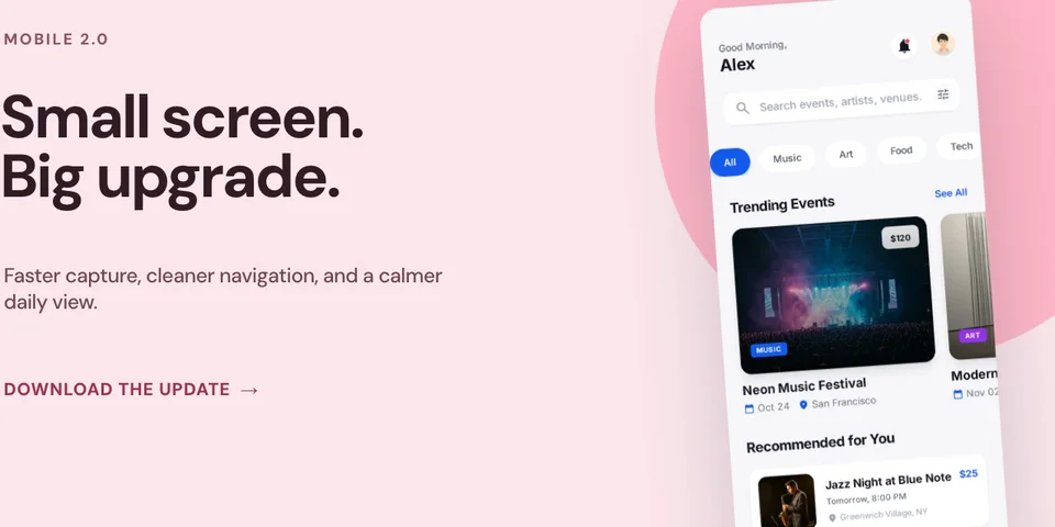
A raw screenshot looks unfinished. Placing it in a MacBook, browser, or iPhone frame gives it context and makes it feel like a real, polished product.

3

Match your brand palette

Your hero image background should complement your brand colors. Use gradients that align with your color scheme to create a cohesive, professional look.

4

Optimize for mobile

Mobile visitors see a much narrower composition. Create a separate mobile version of the hero image with a tighter crop and larger UI elements.

5

Keep load times fast with WebP

Hero images are the largest visual element on your page. Export as WebP to reduce file size by 25–34% without visible quality loss. Your Lighthouse score will thank you.

How It Works

Move from source material to a polished launch asset without rebuilding the design in another tool.

Step 1

Start from a template or blank

Choose a visual template, a store-listing set, a Launch Kit, or an empty canvas for full control.

Step 2

Build the complete composition

Add screenshots, photo scenes, device frames, text, icons, annotations, backgrounds, layers, and motion in the browser editor.

Step 3

Export for the real destination

Download PNG, WebP, JPEG, GIF, WebM, or MP4, or export organized iOS, Google Play, and Chrome screenshot ZIPs.

Why Choose Screenhance?

Screenhance covers the full path from a raw screenshot or screen recording to coordinated, editable launch assets.

Frames + photorealistic scenes

Use current device frames, stylized treatments, or photorealistic placements across phones, tablets, laptops, watches, TVs, print, apparel, and outdoor media.

editable visual templates

Start with a complete composition for mockups, Product Hunt, OG images, website heroes, Play feature graphics, or Chrome Web Store promo assets, then edit every layer.

Store-listing sets and localization

Create coordinated iOS, Google Play, and Chrome Web Store screenshot sets, edit localized copy across supported languages, and export organized PNG ZIPs, including fastlane-ready iOS folders.

Motion and product video

Animate layers with editable motion styles and export GIF or WebM, or record and polish a product demo in Studio with frames, cursor motion, captions, audio, and MP4/WebM export.

How Screenhance Compares for Hero Images

See how Screenhance compares to other tools for creating hero visuals.

FeatureScreenhanceFigmaCanvaPhotoshop
Purpose-built for hero imagesYesGeneral designGeneral designPhoto editing
Design skills neededNoneAdvancedBasicExpert
Device frames40+ (MacBook, browser, iPhone, iPad)Manual setupLimited clipartManual PSD mockups
Professional backgroundsgradients, glass, auroraDesign your ownBasic templatesManual creation
Time to create hero imagePreset workflowManual workflowManual workflow1+ hours
Retina export (2x, 3x)YesYesNoManual
WebP exportYesNoNoYes
Text overlaysYesYesYesYes
Free plan3 exports/monthFree tierFree tierNo free plan
Price (paid)$6 Launch Pass or $12/month$15/month$13/month$23/month

Frequently Asked Questions

What is the best size for a hero image?

The most common hero image size is 1920×1080 pixels for full-width layouts. For standard sections, 1600×900 works well. Always export at 2x resolution (3840×2160) for Retina displays. Screenhance templates support all these sizes out of the box.

Should hero images include the actual product?

A real product screenshot in an appropriate frame can communicate the interface more directly than an abstract illustration. Test both approaches, and check mobile readability, loading performance, and whether the image supports the page headline.

How do I optimize hero images for mobile?

Use a separate mobile-optimized hero image at 750×1334 pixels. Keep the focal point centered so it works in both portrait and landscape. Export as WebP for smaller file sizes. Screenhance lets you export at multiple resolutions from the same template.

What format should I use for hero images?

Use WebP for the best balance of quality and file size. It’s supported by all modern browsers and can reduce file sizes by 25–34% compared to PNG. Screenhance exports in both PNG and WebP formats.

Can I create animated hero images?

Yes. Screenhance supports animated exports as GIF and WebM. You can create scroll animations, hover effects, and product walkthroughs that play automatically in your hero section.

Is the hero image generator free?

Yes. The free plan includes three 1× watermarked PNG exports per month. You can use the templates and frames while editing. The $6 Launch Pass includes 10 clean static image exports over 7 days; Pro adds unlimited clean exports and motion formats.

Ship a Beautiful Hero Section Today

Your hero image is the first thing visitors see. Make it count with professional device mockups and gradient backgrounds — created in minutes with Screenhance.