
9 App Design Examples That Explain the Product Clearly
Study nine original app design concepts and the specific hierarchy, screenshots, contrast, and story decisions that make each product easier to understand.
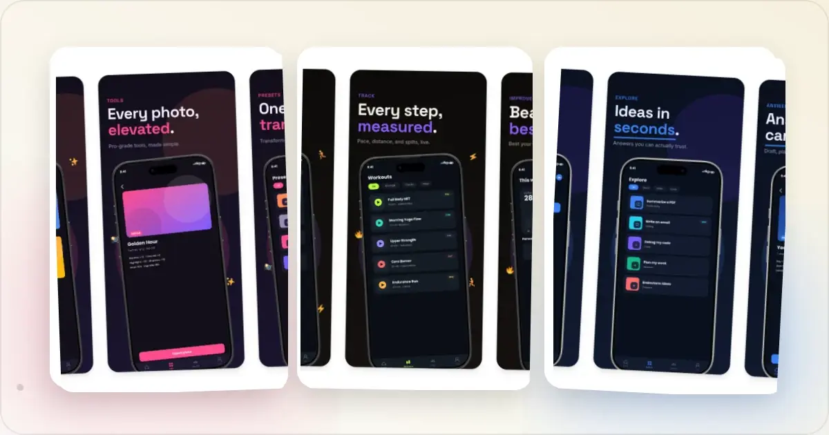
The best app design examples do more than look polished. They make the product legible. A reader should be able to glance at the first image, understand the job the app performs, and see enough of the interface to believe the promise.
This review uses nine fictional concept apps made for the Screenhance template library. They are not ranked customer apps, award winners, or conversion case studies. That distinction matters: the useful material here is the visible design decision, not an invented performance claim. Ratings, download counts, names, and people shown inside the concepts are placeholder demo copy.
We reviewed each concept using five practical questions:
1. Is the product category clear without reading every word?
2. Does the interface prove the headline?
3. Does the sequence move from promise to action to outcome?
4. Does the design remain readable as a small store thumbnail?
5. Can a team extend the system without every slide becoming identical?
If you are preparing a real listing, start with the App Store screenshot generator, browse the editable app-store templates, or look through the wider App Store screenshot gallery.
1. Atlas Travel: lead with the outcome, then reveal the route
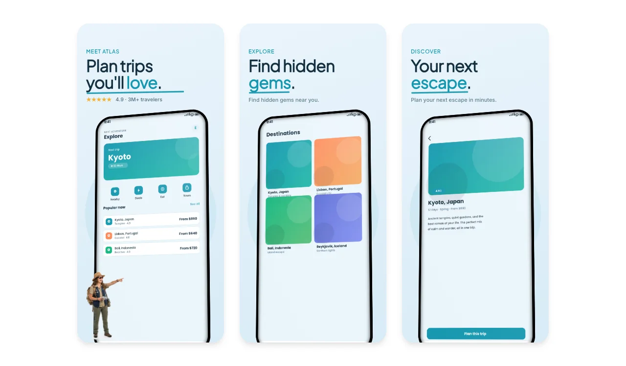
Atlas opens with the outcome: “Plan trips you'll love.” Only after that does the sequence explain how—find a destination, inspect the detail, and plan the trip.
The strongest decision is the order. The first slide is not a settings screen or a feature inventory. It gives the reader the category and emotional result, while the following slides supply product proof. A consistent cyan accent ties the headline emphasis, interface controls, and destination cards together without flooding the whole composition with colour.
Borrow this pattern when your app has a clear journey. State the result first, show discovery second, and put the decisive action or detail view third.
2. Halo AI: give each slide one job
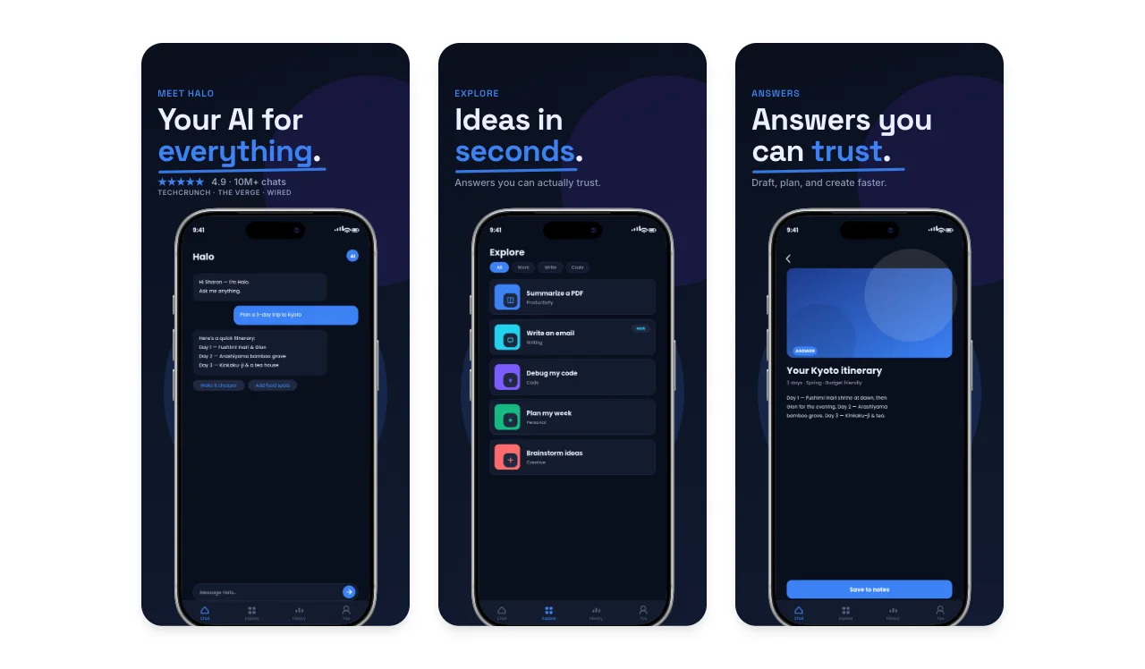
AI products often try to demonstrate everything at once. Halo avoids that by assigning one role to each slide: introduce the assistant, show a menu of useful tasks, then show the resulting answer.
The dark palette lets the blue controls and selected phrases carry the hierarchy. More importantly, the interface shown beneath each headline matches the promise above it. “Ideas in seconds” sits over task choices; “Answers you can trust” sits over an answer view. That alignment makes the story feel specific even though the concept covers several use cases.
For a real AI product, replace broad category language with the task your product performs unusually well. The visual system can stay broad; the proof should not.
3. Clarity Analytics: turn dense data into a visible hierarchy
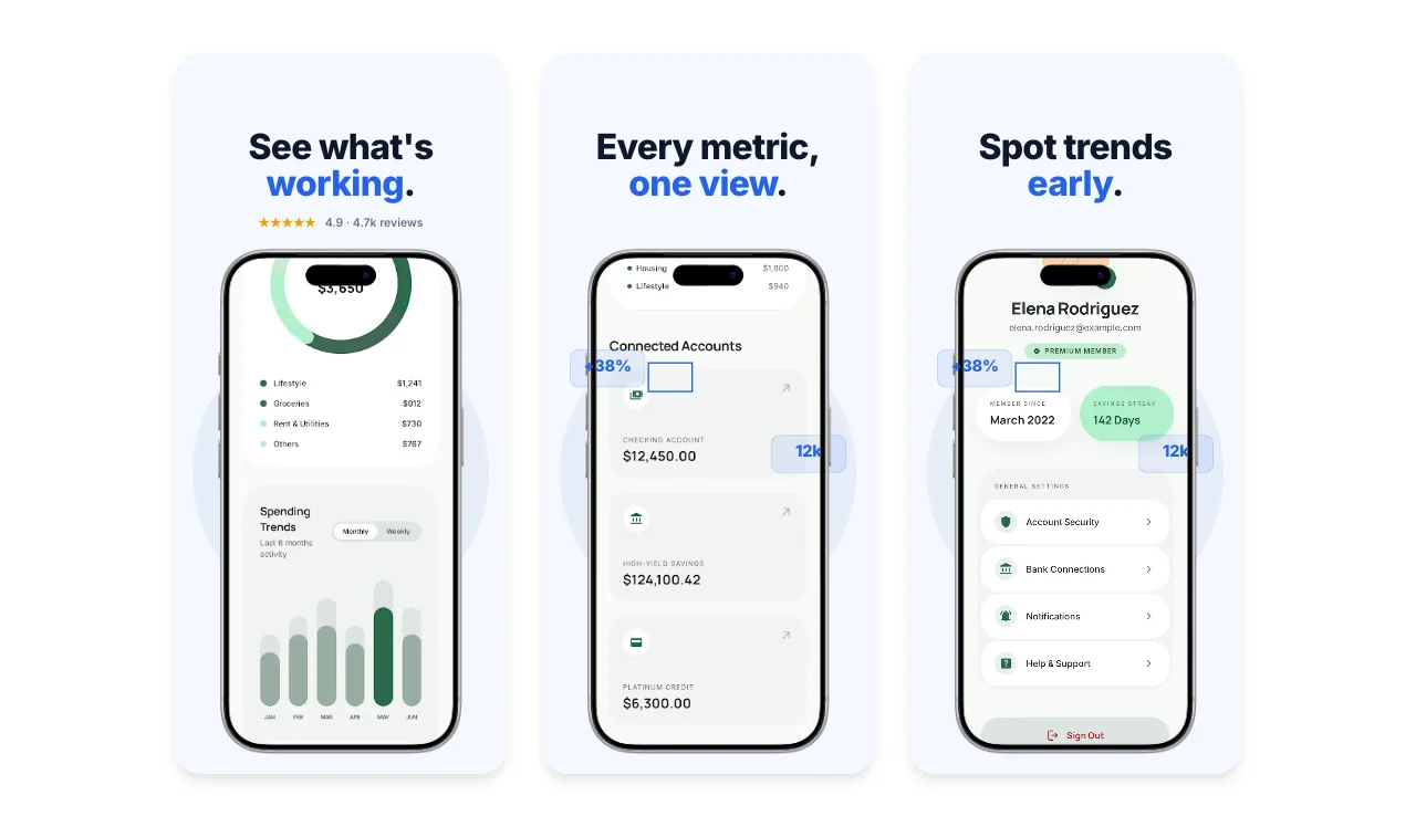
Analytics interfaces contain more information than a store screenshot can explain. Clarity handles that tension by using short benefit headlines and letting one dominant number or chart carry each phone screen.
The interface remains mostly neutral, while blue and green identify the important change. Small floating metric chips add energy around the device without obscuring the product. The sequence also escalates sensibly: understand what is working, see everything together, then spot a trend early.
The reusable lesson is subtraction. Choose the one chart, balance, or change that proves the headline. A store image is not the place to reproduce the entire dashboard.
4. Pace: make progress feel like motion
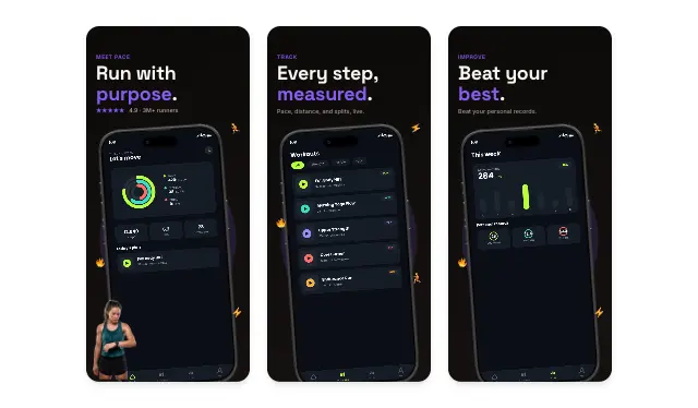
Pace uses a black canvas and bright activity colours to make progress visible before the reader has parsed the interface. The slightly tilted devices and small running markers reinforce movement without turning the layout into a sports poster.
The three-part story is especially useful for habit-forming products: purpose, measurement, improvement. It shows the reader why to begin, what happens during use, and how success appears later.
If your app depends on repeated use, show the loop rather than three unrelated features. A streak, plan, or progress view usually explains retention better than a generic home screen.
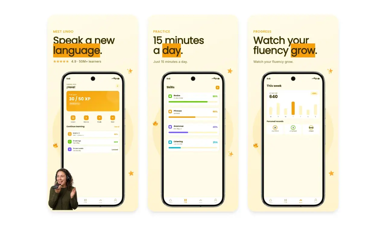
5. Lingo: make the message itself demonstrate the interaction
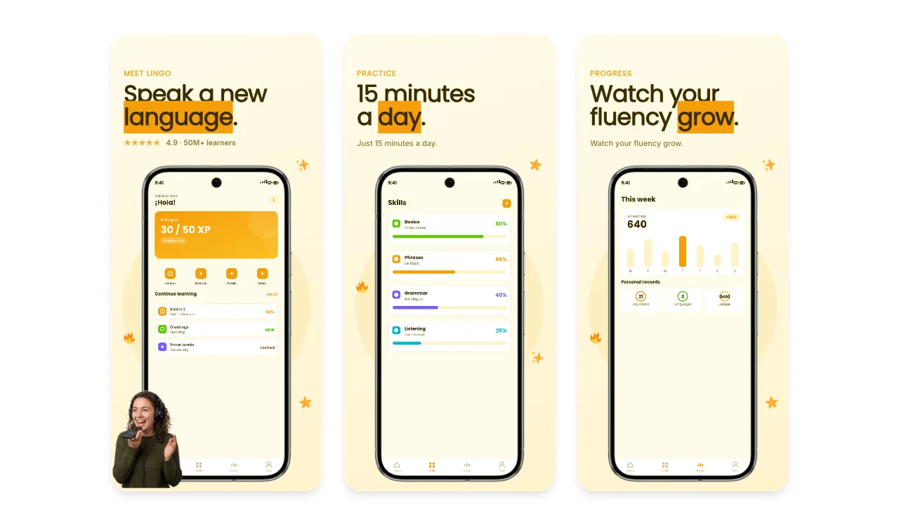
Lingo highlights part of every headline with an orange block that resembles a text selection or vocabulary card. The decoration is not arbitrary: it behaves like the product idea.
The warm background keeps the set approachable, while the changing phone screens move from daily lesson to skills and progress. This gives the set consistency without repeating one layout three times.
This is a strong model for products with a recognisable interaction. Let the headline styling borrow from the interface—provided the effect still reads clearly at thumbnail size.
6. After Dark: let the category establish the atmosphere
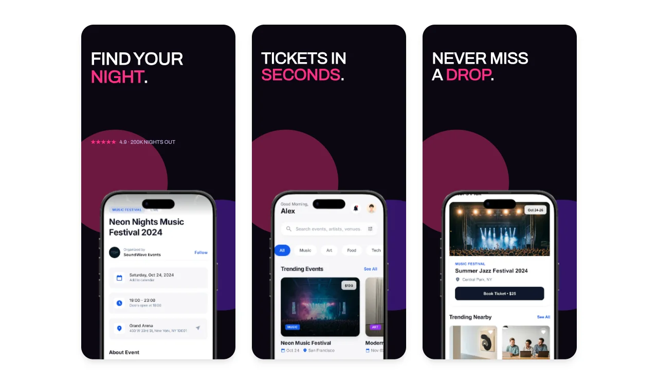
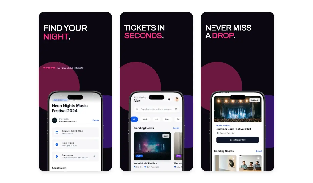
After Dark looks like an events product before the reader reaches the phone. The black background, magenta accent, cropped devices, and large circular forms create the atmosphere of a night listing.
The copy remains functional: find an event, get tickets, keep up with drops. That balance is important. A strong aesthetic can establish the category, but the sequence still needs to show the work the product performs.
Use this approach when the audience expects a distinctive mood—music, fashion, food, photography, or entertainment. Keep the actions plain enough that style does not hide the product.
7. Sprout: repeat a visual grammar, not the exact layout
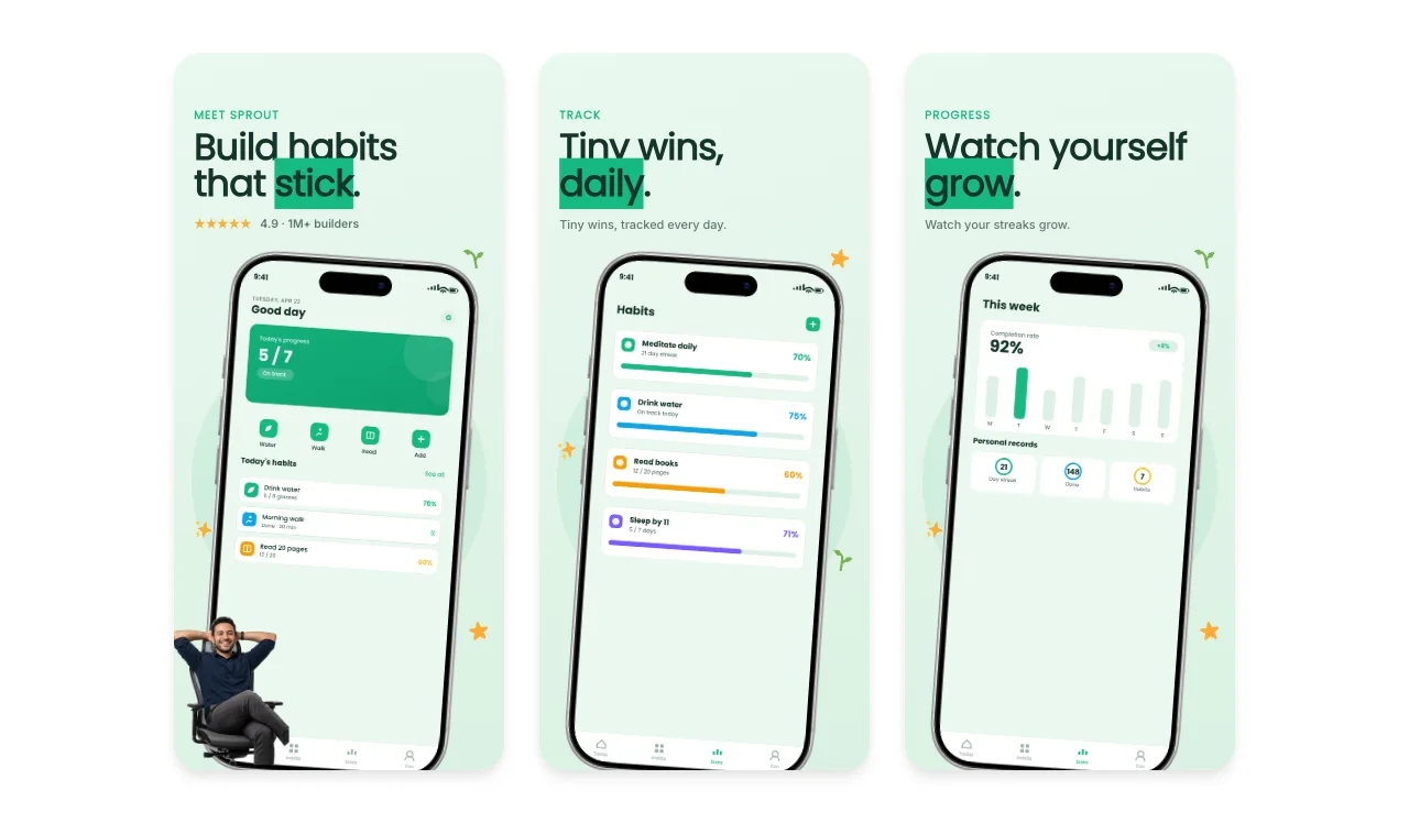
Sprout repeats a light green field, tilted device, dark green type, orange details, and small human cutout. Within that grammar, each slide changes what it proves: today's plan, progress across habits, and weekly completion.
That is the difference between a system and a clone. The slides feel related because their visual rules are stable, not because every object occupies the same coordinates.
When building a longer set, define the constants first—type scale, background family, device treatment, accent colour, and spacing—then allow the product evidence to determine each composition.
8. Aperture: let product content drive the palette
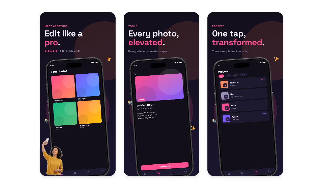
Aperture uses a nearly black canvas so the colourful preset artwork becomes the loudest element. Pink emphasis in the headlines echoes the app controls, while small camera and sparkle marks add category cues without competing with the screenshots.
This set works because the surrounding design does not introduce a second visual story. The content being edited supplies most of the colour.
For creative tools, avoid placing an expressive interface inside an equally expressive frame. Decide whether the product output or the marketing composition should lead, then quiet the other layer.
9. Aurora Tablet: show the product on the device it was designed for
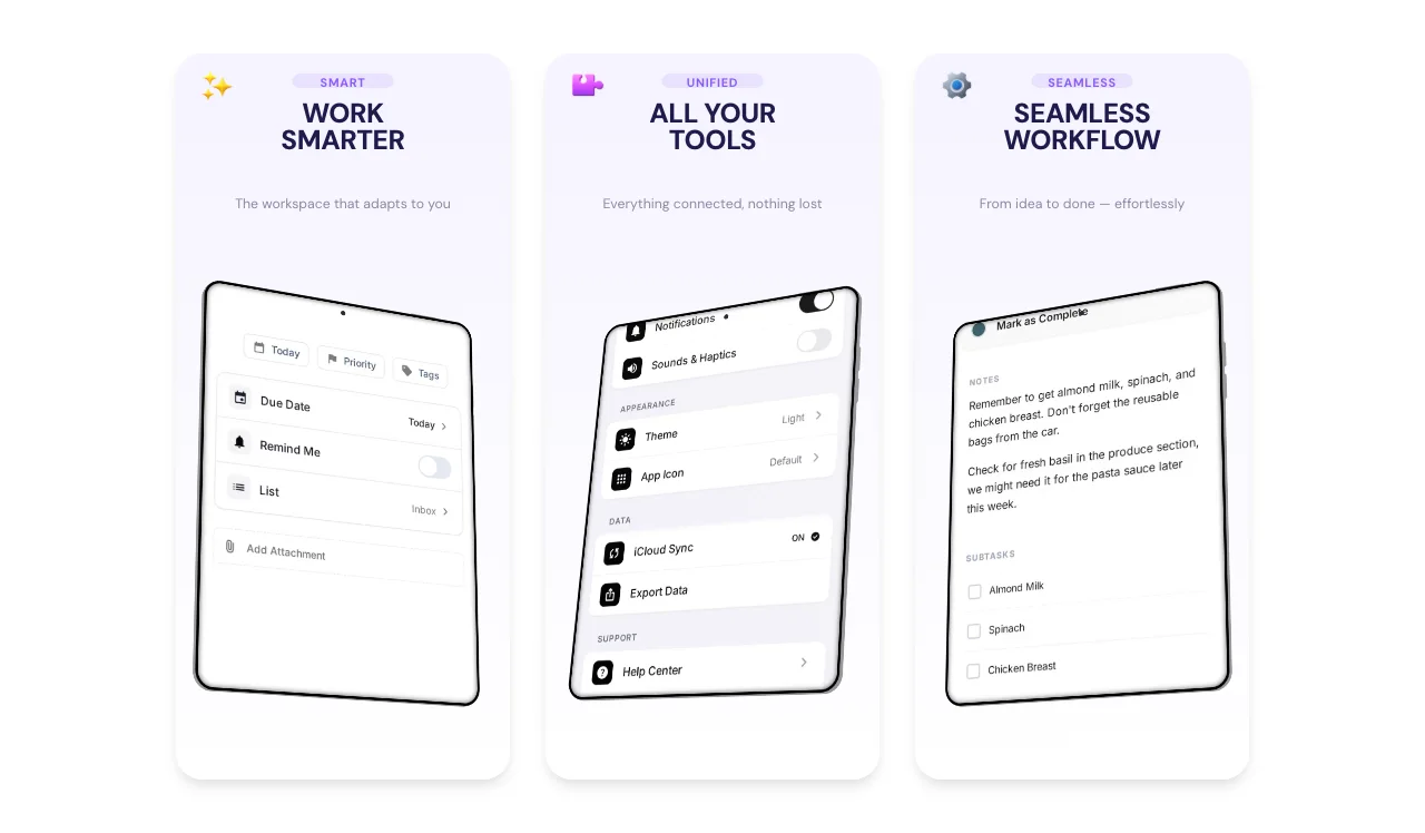
Aurora uses tablet-shaped screens rather than forcing a spacious productivity interface into a phone. The angled devices add movement, but the large white field keeps the controls readable.
This sounds obvious, yet it is a common source of weak app presentation: the marketing frame is chosen before the real interface. A desktop, tablet, watch, or landscape product should be shown in the context that preserves its information architecture.
Start with the truthful surface. Add the dramatic angle, crop, or scene only after the interface remains understandable.
What these app design examples have in common
| Decision | Why it works | Weak version to avoid |
|---|---|---|
| One message per slide | The reader can scan the set quickly | A headline containing three features |
| Interface matched to the claim | The product visibly proves the copy | A generic home screen under every message |
| Promise → action → outcome | The set tells a complete story | Three disconnected feature screens |
| Stable visual grammar | The set feels coherent | Copying the exact layout across every slide |
| Product-specific colour | Branding and interface support each other | A fashionable palette unrelated to the app |
| Truthful device context | The interface keeps its intended hierarchy | Squeezing a tablet or desktop UI into a phone |
Ready to create stunning visuals?
A practical sequence for your own app
You do not need nine concepts or a large campaign to use these lessons. A focused five-image listing can follow this sequence:
1. Category and outcome: what the app helps someone accomplish.
2. Primary action: the core interaction or shortest path to value.
3. Product proof: the screen that makes the promise believable.
4. Reason to return: progress, collaboration, personalisation, or saved work.
5. Closing differentiator: the capability that separates the product from an obvious alternative.
Use real interface states, keep temporary and private data out of the capture, and check the complete set at small size. The first image should still work when the remaining slides are not visible.
For more listing-specific advice, read the App Store screenshot examples guide and the ASO screenshot best-practices guide.
Frequently asked questions
Are these real apps?
No. They are fictional concept apps created for editable Screenhance templates. They are used here to analyse visible design decisions, not to claim customer results, awards, ratings, or download numbers.
How many screenshots should an app listing use?
Use enough images to explain the product's main story without padding the set. Store limits and accepted formats can change, so confirm the current requirements for each platform before export rather than treating an old maximum as a design target.
Should every app screenshot use the same layout?
No. Keep the typography, colour, spacing, device treatment, and image style consistent, then adapt each composition to the interface and message it needs to show.
Should the first screenshot show the home screen?
Only when the home screen is the clearest proof of the product's value. A focused result, interaction, or transformed state is often more informative than a general dashboard.
Screenhance examples
Two editable starting points from the Screenhance library, selected for this app stores guide.
Ready to create stunning visuals?
Free to start. No credit card required.
Keep reading
Related, product-tested guides from Screenhance.
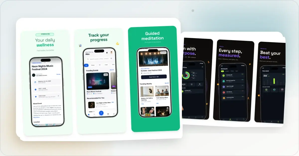
32 App Store Screenshot Layout Patterns for 2026
A practical library of 32 App Store screenshot layouts for finance, productivity, health, and games, with notes on when each pattern fits.
13 May 2026 · 9 min read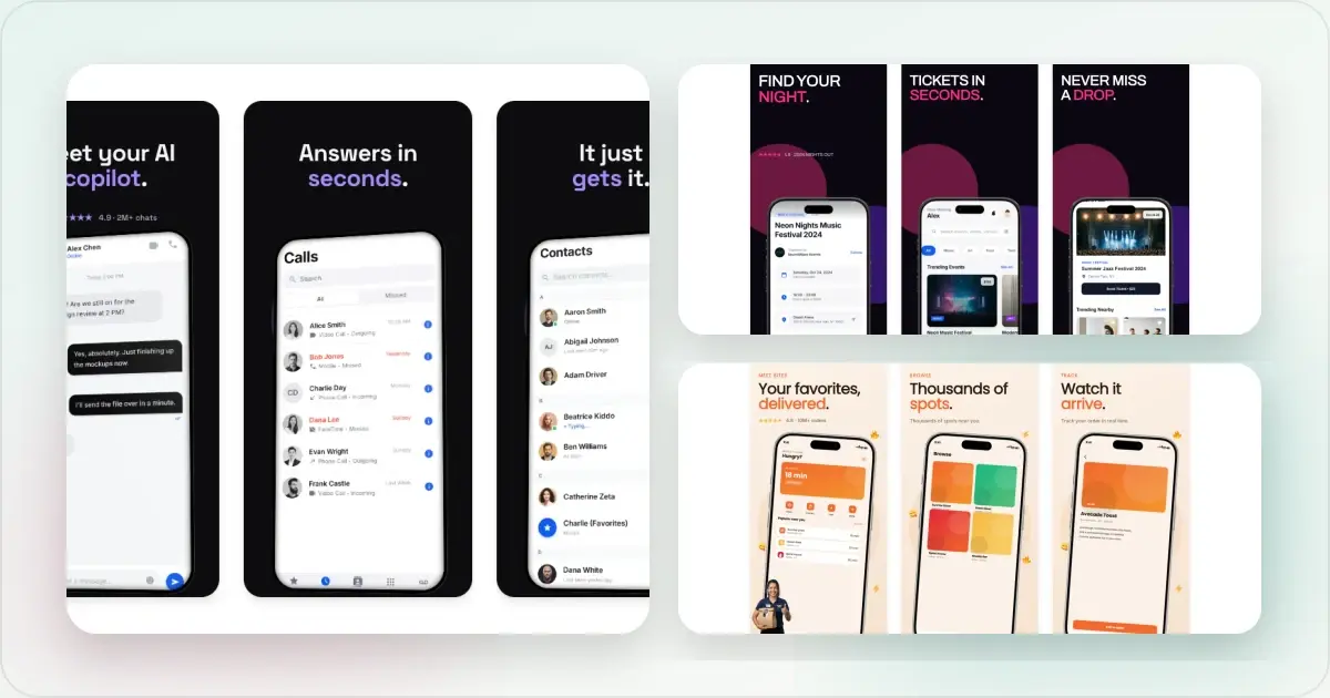
How to Make App Store Screenshots That Convert in 2026
A practical guide to accurate App Store screenshot sizes, clear visual storytelling, localization and Product Page Optimization testing.
21 Mar 2026 · 10 min read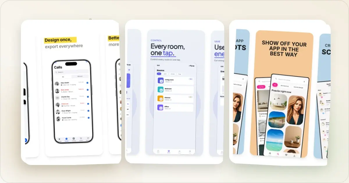
The State of App Store Screenshots in 2026: Requirements and Testing
A current, source-linked guide to App Store screenshot requirements, localization, Product Page Optimization, and the checks to run before upload.
4 Jul 2026 · 3 min read