
32 App Store Screenshot Layout Patterns for 2026
A practical library of 32 App Store screenshot layouts for finance, productivity, health, and games, with notes on when each pattern fits.
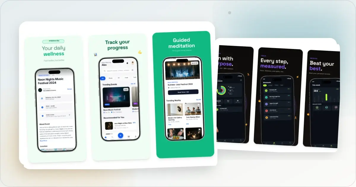
There is no universal App Store screenshot layout that wins for every product. A useful set makes the app legible, keeps its claims grounded in the interface, and gives each slide a distinct job. The 32 patterns below are starting structures for finance, productivity, health and wellness, and games—not promised conversion formulas.
Do not copy a layout simply because a well-known app uses it. Pick only the structures that fit the product story, adapt them to real screens and defensible copy, then use an App Store screenshot generator to prepare the sizes your listing needs. Measure any material redesign against the current set in App Store Connect.
Finance and money apps (8 patterns)
1. The single big number
A large, verifiable currency value leads the slide, with the relevant product UI underneath. Use this only when the number is produced by the feature shown and the timeframe is explicit.
2. The redacted bank list
A list of connected accounts can demonstrate aggregation, but use fictional names and numbers in the capture. Blur is not a substitute for removing real financial data from the demo account.
3. The split bill screen
Show a completed split with fictional participants and the calculated shares visible. This pattern fits products whose value is easier to understand from the result than from the setup flow.
4. The transaction with a smart tag
Show a transaction being categorized and make the category state easy to find. If the action is AI-assisted, avoid implying perfect or fully automatic classification unless the product actually guarantees it.
5. The exchange rate flash
Pair the converted amount with a clearly dated rate and any relevant fee. This pattern is useful when the calculation itself is the product evidence.
6. The investing portfolio donut
A holdings chart can summarize portfolio shape quickly. Keep the labels legible, use invented values, and do not let decorative colour imply performance that the data does not show.
7. The credit score gauge
A score and direction-of-change indicator can lead when monitoring that score is a core feature. Use fictional data and include enough context to avoid implying a financial outcome.
8. The forecasted balance
A forecast chart can distinguish prediction from historical tracking. Label projected data clearly so the screenshot does not present an estimate as an actual balance.
Productivity and developer tools (8 patterns)
9. The clean inbox zero
A completed task view can show the product's end state. It works best when nearby screens also explain how work reaches that state instead of presenting an empty victory screen without context.
10. The keyboard-first command palette
A command palette over the real interface can demonstrate keyboard-first navigation. Show a plausible query and the result the user would actually select.
11. The before-after timeline
Put the source state and finished result side by side when the transformation is the feature. Keep the comparison honest: use equivalent content and do not make the “before” artificially unusable.
12. The collaborative cursor swarm
Multiple labelled cursors can show synchronous editing if the product supports it. Use a real collaboration state rather than decorative cursors that imply presence or editing behavior the app does not provide.
13. The dark-mode hero
A dark composition can suit a product with a genuine dark theme. Check interface contrast and keep the frame distinct from the background instead of choosing dark mode as a proxy for a technical audience.
14. The keyboard shortcut overlay
A shortcut panel can make keyboard support concrete. Show only commands available in the current release and use the modifier symbols appropriate to the platform being shown.
15. The deep-link from email
Show the source notification beside the exact destination it opens when deep linking is an important workflow. Remove real inbox content and make the relationship between the two states obvious.
16. The team avatars row
A row of fictional collaborator avatars can demonstrate presence or assignment. It is product-state evidence, not customer social proof, so label the workflow rather than implying those people endorse the app.
Health, fitness, and wellness (8 patterns)
17. The progress ring trio
Use the product's own progress visualization to compare several daily goals. Avoid copying another company's protected visual language when a native chart can explain the same data.
18. The streak counter
A streak count can lead when continuity is a real product feature. Pair it with the action being repeated so the number has meaning beyond gamification.
19. The personal best banner
A labelled personal-best point can show progress over time. Include the metric and period, and use invented health or fitness data in the marketing capture.
20. The mood check-in
A selected mood and short journal field can explain a check-in workflow in one screen. Use neutral fictional copy and avoid presenting the interface as medical advice.
21. The sleep stage chart
A labelled sleep-stage chart can show what the tracker records. Keep the sample clearly illustrative and avoid making health conclusions the product is not approved or designed to provide.
22. The meditation timer
A session screen with the duration and primary control visible can make a meditation flow understandable. Let the actual product state carry the message instead of relying only on a calm background.
23. The hydration bottle filling
A filling vessel can visualize progress toward a hydration goal. Include the units and current value so the metaphor remains accessible without colour alone.
24. The HRV trend line
A trend chart can explain an advanced metric when the labels and period remain readable. Use demo data and avoid suggesting a diagnosis or guaranteed health result.
Games and entertainment (8 patterns)
25. The character escape from the frame
A character can extend beyond the device crop when the artwork belongs to the game and does not obscure the playable scene. Treat it as a composition option, not a guaranteed attention tactic.
26. The achievement burst
Show a completion or reward state when progression is central to the game. Make clear what the player accomplished instead of using an unrelated reward graphic.
27. The boss reveal silhouette
A partial character or enemy reveal can introduce narrative stakes. It fits games where that character appears in the current release and the surrounding slide still shows recognizable gameplay or world context.
28. The leaderboard row
A leaderboard with the demo player's row highlighted can explain competition or ranking. Use fictional names and include the scoring unit or period.
29. The cinematic widescreen
A full-bleed gameplay or world scene can preserve visual detail that a device frame would shrink. Add copy only where it remains readable without hiding the important action.
30. The character roster grid
A roster grid can show variety in a collectible or team-building game. Limit the grid to characters available in the promoted version and keep names legible.
31. The puzzle in mid-solve
Capture the board during a meaningful action when the mechanic is understandable in one frame. Do not add scores or multipliers that the game itself would not produce.
32. The narrative dialogue bubble
A short dialogue moment can introduce character and tone in a narrative game. Use current in-game writing and avoid revealing a plot point the listing should not spoil.
How to actually apply these patterns
Picking patterns is easy. Executing them at App Store quality is the work. The minimum bar:
- Accepted dimensions. Apple supports several current pixel sizes within its display classes. Choose the size your release needs and verify it against the current App Store screenshot specification rather than relying on an old device nickname.
- Accurate device context. A frame is optional. If you use one, make sure it matches the interface and does not imply support for hardware your app does not support.
- A coherent set. Reuse type, colour, spacing, and caption logic, while letting each slide make a different product claim.
- Thumbnail legibility. Preview the listing at the size people will actually scan. There is no universal font-point minimum because the exported pixels, typeface, and headline length all change the result.
- Accurate claims. Pricing, awards, features, and in-app states shown in the images should match what a customer can actually get.
Two optional additions deserve deliberate treatment. An App Preview is a real video asset, not an animated screenshot: Apple accepts H.264 `.mov`, `.m4v`, or `.mp4`, and ProRes 422 HQ `.mov`. Verify its duration, resolution, frame rate, and content against the current specification before upload. Separately, App Store screenshot localization lets you provide a set for each supported language. Measure the effect by locale rather than assuming a universal install lift.
For a deeper guide to copy, testing, and localization, see How to Create App Store Screenshots. The App Store screenshot generator keeps the set editable and exports the selected sizes from one design.
Frequently Asked Questions
Which App Store screenshot pattern converts best?
There is no universal winner. Choose a pattern that makes the product state and promise easy to understand for the intended audience. Export a focused alternative, then use Product Page Optimization to compare it with the current set instead of treating another app's layout as proof.
How many App Store screenshots should I have?
Apple currently accepts between one and ten screenshots. Use only the slides needed to explain the app, and give each one a distinct job. Check the leading assets at the size and placement where they appear in the live storefront.
Do I need different screenshots for each iPhone size?
Not always. Apple says that when the interface is the same across device sizes and localizations, you can provide the highest-resolution screenshots required and let App Store Connect scale them down. If the interface or composition differs, upload the appropriate assets in Media Manager. Confirm the current accepted dimensions in Apple's screenshot specification before export.
Should I use my actual UI or a stylized version in screenshots?
Use a truthful representation of the product. You can add a frame, background, and caption, but the screenshot should not imply features or states the app does not provide. Review the finished set against Apple's current metadata and screenshot rules before submission.
How do I know which pattern my competitors use?
Open the App Store on the target device and review relevant listings in the same category. Note what each leading asset communicates, how legible it is in context, and where the product itself appears. Use that review to understand conventions, not to copy a competitor or assume its design caused its ranking.
Are screenshot examples from old years still useful as inspiration?
Current examples are useful because store layouts, devices, and visual conventions change. Older examples can still teach a clear sequence or product story. Verify technical requirements against the stores themselves, and judge the visual reference on whether it fits your app rather than an arbitrary age cutoff.
Related reading
- How to Make App Store Screenshots That Convert in 2026
- App Store Screenshot Dimensions 2026: Every Size in One Chart
- ASO Screenshot Best Practices 2026
- App Store Screenshot Generator
- App Store Screenshot Localization Guide
Conclusion
The patterns above are the recipes that recur across top-grossing App Store listings in early 2026. None of them are surprising; they are reliable. The work is picking 5 to 6 that fit the app's category, executing them at the required Apple dimensions, and A/B testing the order through Apple's Product Page Optimization. Start with the App Store screenshot generator for the dimensions, then iterate on the patterns once the baseline is shipping.
Check your App Store screenshot sizes
Drop your screenshots to check each one against Apple's accepted App Store Connect sizes before you upload. Nothing leaves your browser, and nothing is stored.
Accepted App Store sizes
- iPhone Duo outer: 1398×2034 (or 2034×1398 landscape)
- iPhone Duo inner: 2007×2853 (or 2853×2007 landscape)
- iPhone 6.9": 1260×2736 (or 2736×1260 landscape)
- iPhone 6.9": 1320×2868 (or 2868×1320 landscape)
- iPhone 6.9": 1290×2796 (or 2796×1290 landscape)
- iPhone 6.5": 1284×2778 (or 2778×1284 landscape)
- iPhone 6.5": 1242×2688 (or 2688×1242 landscape)
- iPhone 6.3": 1179×2556 (or 2556×1179 landscape)
- iPhone 6.3": 1206×2622 (or 2622×1206 landscape)
- iPhone 6.1": 1170×2532 (or 2532×1170 landscape)
- iPhone 6.1": 1125×2436 (or 2436×1125 landscape)
- iPhone 6.1": 1080×2340 (or 2340×1080 landscape)
- iPhone 5.5": 1242×2208 (or 2208×1242 landscape)
- iPhone 4.7": 750×1334 (or 1334×750 landscape)
- iPhone 4": 640×1096 (or 1136×600 landscape)
- iPhone 4": 640×1136 (or 1136×640 landscape)
- iPhone 3.5": 640×920 (or 960×600 landscape)
- iPhone 3.5": 640×960 (or 960×640 landscape)
- iPad 13": 2064×2752 (or 2752×2064 landscape)
- iPad 13": 2048×2732 (or 2732×2048 landscape)
- iPad 11": 1488×2266 (or 2266×1488 landscape)
- iPad 11": 1668×2420 (or 2420×1668 landscape)
- iPad 11": 1668×2388 (or 2388×1668 landscape)
- iPad 11": 1640×2360 (or 2360×1640 landscape)
- iPad 10.5": 1668×2224 (or 2224×1668 landscape)
- iPad 9.7": 1536×2008 (or 2048×1496 landscape)
- iPad 9.7": 1536×2048 (or 2048×1536 landscape)
- iPad 9.7": 768×1004 (or 1024×748 landscape)
- iPad 9.7": 768×1024 (or 1024×768 landscape)
Screenhance examples
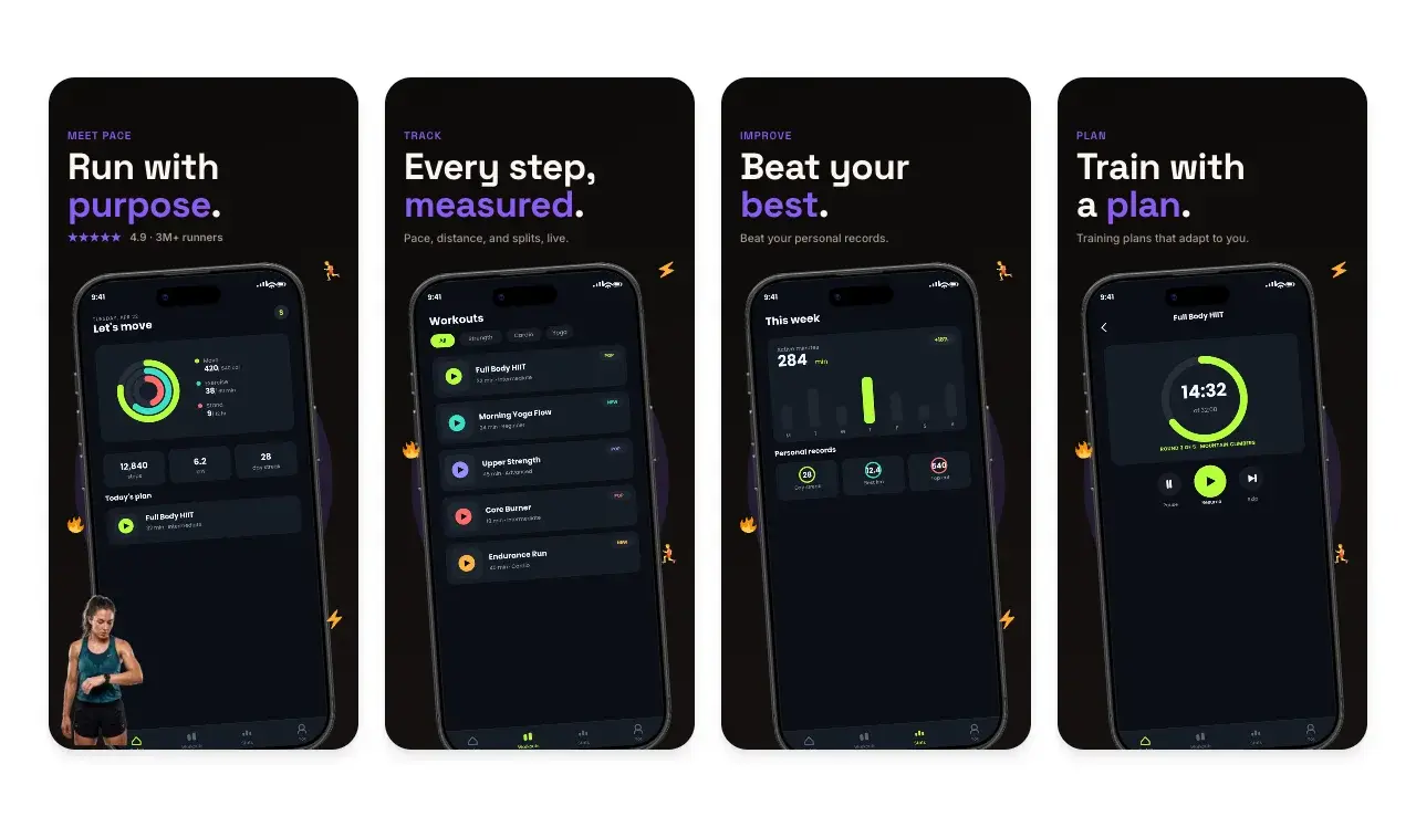
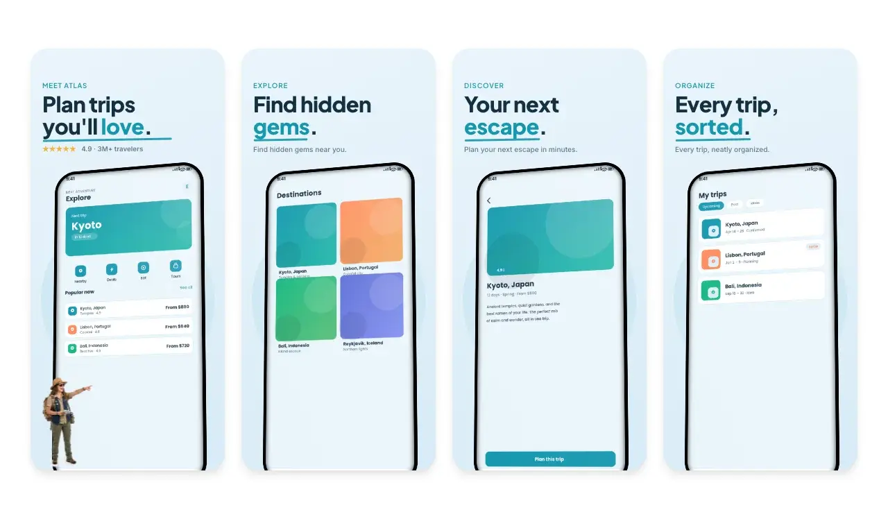
Two editable starting points from the Screenhance library, selected for this app stores guide.
Generate App Store screenshots free
Free to start. No credit card required.
Keep reading
Related, product-tested guides from Screenhance.
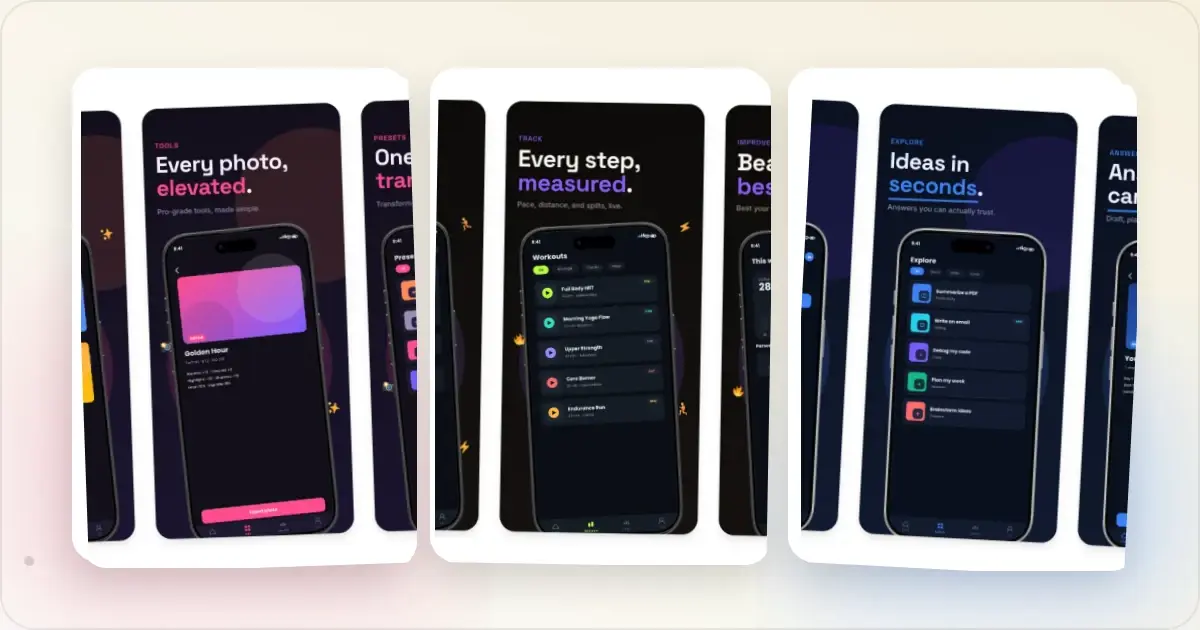
9 App Design Examples That Explain the Product Clearly
Study nine original app design concepts and the specific hierarchy, screenshots, contrast, and story decisions that make each product easier to understand.
20 Aug 2026 · 8 min read
How to Make App Store Screenshots That Convert in 2026
A practical guide to accurate App Store screenshot sizes, clear visual storytelling, localization and Product Page Optimization testing.
21 Mar 2026 · 10 min read
The State of App Store Screenshots in 2026: Requirements and Testing
A current, source-linked guide to App Store screenshot requirements, localization, Product Page Optimization, and the checks to run before upload.
4 Jul 2026 · 3 min read