
14 Best Fonts for App Screenshots and Launch Graphics
Choose readable fonts for App Store screenshots, Google Play graphics, social posts, and launch visuals, with practical pairings and editable examples.
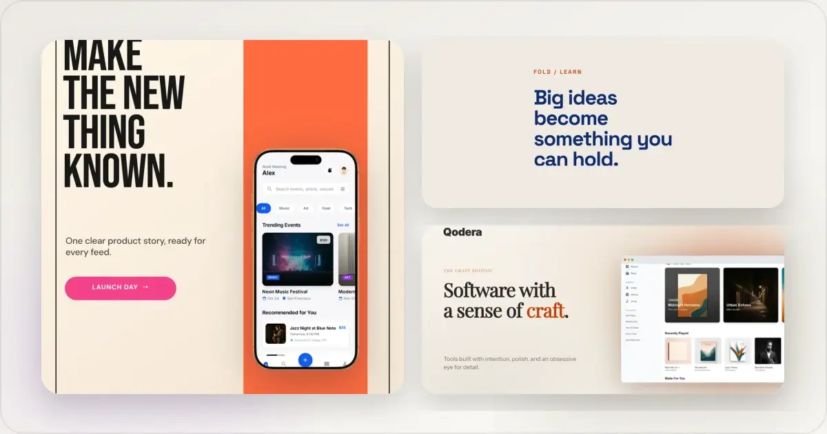
The best font for an app screenshot is the one that keeps the message readable at the size where the image will actually appear. For most product screenshots, start with Inter, Instrument Sans, DM Sans, Manrope, or Plus Jakarta Sans. Use Space Grotesk, Sora, Archivo, Poppins, or Bebas Neue when the headline needs more personality, and reserve Instrument Serif or Playfair Display for a deliberate editorial contrast.
That answer comes from reviewing the font families available in the current Screenhance editor and the product, store, social, and launch templates already using them. This is not a ranking based on font popularity. The selection focuses on four practical jobs: short benefit headlines, compact supporting copy, numbers and labels, and expressive campaign moments.
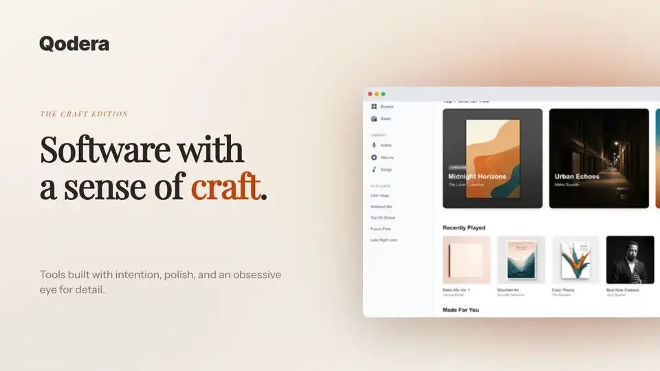
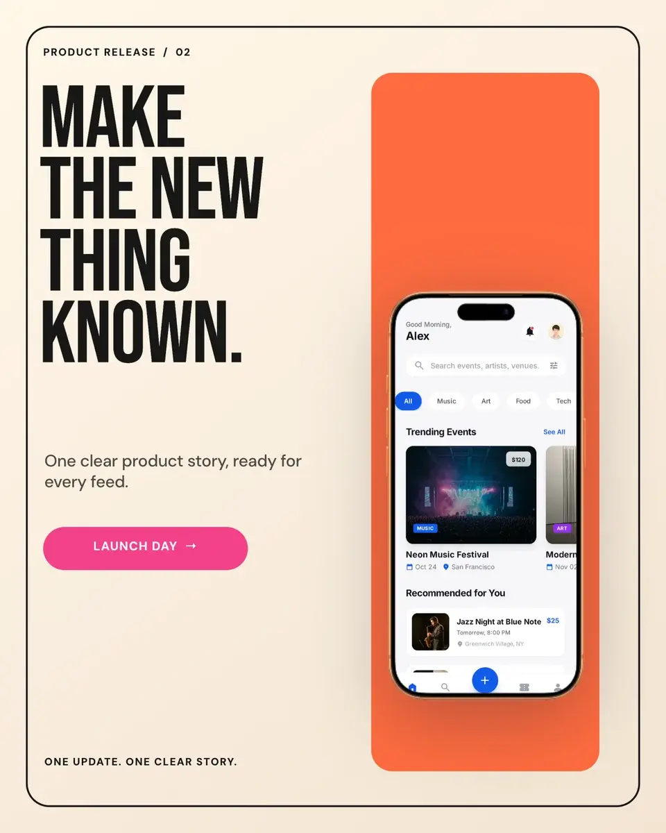
Every pictured example below is an existing Screenhance template. Click the image to open that exact editable layout.
The shortlist
| Font | Best role | Why it works in product graphics |
|---|---|---|
| Inter | Captions, labels, UI-adjacent copy | Neutral shapes and a broad weight range make it a dependable default |
| Instrument Sans | Headlines and supporting copy | Clean without feeling anonymous; useful when one family must carry the whole visual |
| DM Sans | Captions, social copy, proof cards | Compact and friendly, with enough character for marketing copy |
| Manrope | Product headlines and metrics | Open forms stay clear while the geometry gives numbers and short claims presence |
| Plus Jakarta Sans | Polished launch graphics | A softer alternative to Inter for approachable product stories |
| Space Grotesk | Bold product and developer headlines | Distinctive enough for a launch while remaining readable in short lines |
| Sora | Technical or modern feature launches | Wide, geometric forms give concise headlines a strong silhouette |
| Archivo | Changelogs and information-dense posts | Direct and sturdy when hierarchy matters more than decoration |
| Poppins | Large benefit statements | Circular forms create a friendly, emphatic headline at display sizes |
| Montserrat | Campaign headlines and labels | Clear uppercase and multiple weights suit structured promotional layouts |
| Bebas Neue | Very short launch statements | Condensed letters create scale when the message is only a few words |
| Instrument Serif | Reviews, founder notes, editorial launches | Adds a human, authored tone when paired with a restrained sans serif |
| Playfair Display | Premium or editorial headlines | Strong contrast makes a campaign feel intentionally editorial rather than generically minimal |
| Roboto Mono | Code, commands, version labels | Monospaced rhythm identifies technical material without imitating the product UI |
Try these fonts on your own product screenshot
Five dependable sans-serif fonts
1. Inter: the safe starting point
Inter is useful when typography should support the product rather than become the concept. It works for benefit captions, numbered steps, small labels, and explanatory copy around a screenshot. Use a heavier weight for the headline and a regular weight for the supporting line before introducing a second family.
The risk is not that Inter looks bad; it is that an undifferentiated Inter layout can look like every other software launch. Create identity through type scale, spacing, colour, crop, and product evidence instead of switching to an expressive font too early.
2. Instrument Sans: neutral with a little more voice
Instrument Sans can carry both headline and body roles while feeling less utilitarian than a default interface font. It is a strong choice for website visuals and social graphics where the message should feel designed but still calm.
3. DM Sans: compact and approachable
DM Sans works well for supporting copy, customer-proof cards, captions, and social posts. Its proportions make it useful when a layout has limited width. Keep small text at a comfortable size; fitting more words is not a reason to reduce legibility.
4. Manrope: clear numbers and modern headlines
Manrope gives metrics and short product statements a precise, contemporary shape. It suits launch recaps, milestone graphics, and feature announcements where a number or concise outcome needs to lead.
5. Plus Jakarta Sans: a softer product voice
Plus Jakarta Sans is useful when Inter feels too clinical but a display face would be too loud. It pairs comfortably with glass, gradient, and device-led compositions and can cover headline, subhead, and label roles in one family.
Five fonts for stronger headlines
6. Space Grotesk: product launches and developer tools
Space Grotesk is one of the easiest ways to make a short software headline feel specific. It handles bold weights, tight tracking, and stacked lines well. Keep supporting copy in Inter, DM Sans, or Manrope so the whole visual does not compete at the same intensity.
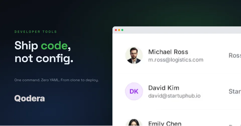
In this OG layout, Space Grotesk creates the campaign voice while the product window remains the evidence. The headline is only four words, which gives the display face room to work.
7. Sora: geometric without becoming ornamental
Sora works for feature launches, technical products, and compact campaign cards. Its broad forms need room, so shorten the headline before squeezing the tracking or reducing the type until it loses its silhouette.
8. Archivo: a strong information hierarchy
Archivo is useful for changelog cards, announcements, and layouts with several labels. It reads as deliberate without demanding an editorial concept. Use weight and spacing to separate the headline, metadata, and action instead of adding multiple decorative treatments.
9. Poppins: friendly, large benefit statements
Poppins makes a direct benefit line feel warm and confident. It performs best at a generous display size. In narrow App Store screenshots, watch the line breaks: its wide circular forms can turn a comfortable sentence into four cramped lines.
10. Bebas Neue: only when the message is very short
Bebas Neue earns its space through height and compression. It is effective for “LAUNCH DAY,” a version number, or a three-word campaign statement. It is a poor choice for a paragraph, a qualification, or copy that must remain comfortable at thumbnail size.
Two serif fonts for editorial contrast
11. Instrument Serif: customer voice and founder notes
Instrument Serif works when the content should feel spoken or authored: a real customer comment, a founder note, or one expressive launch line. Pair it with DM Sans or Instrument Sans for names, roles, labels, and explanatory copy.
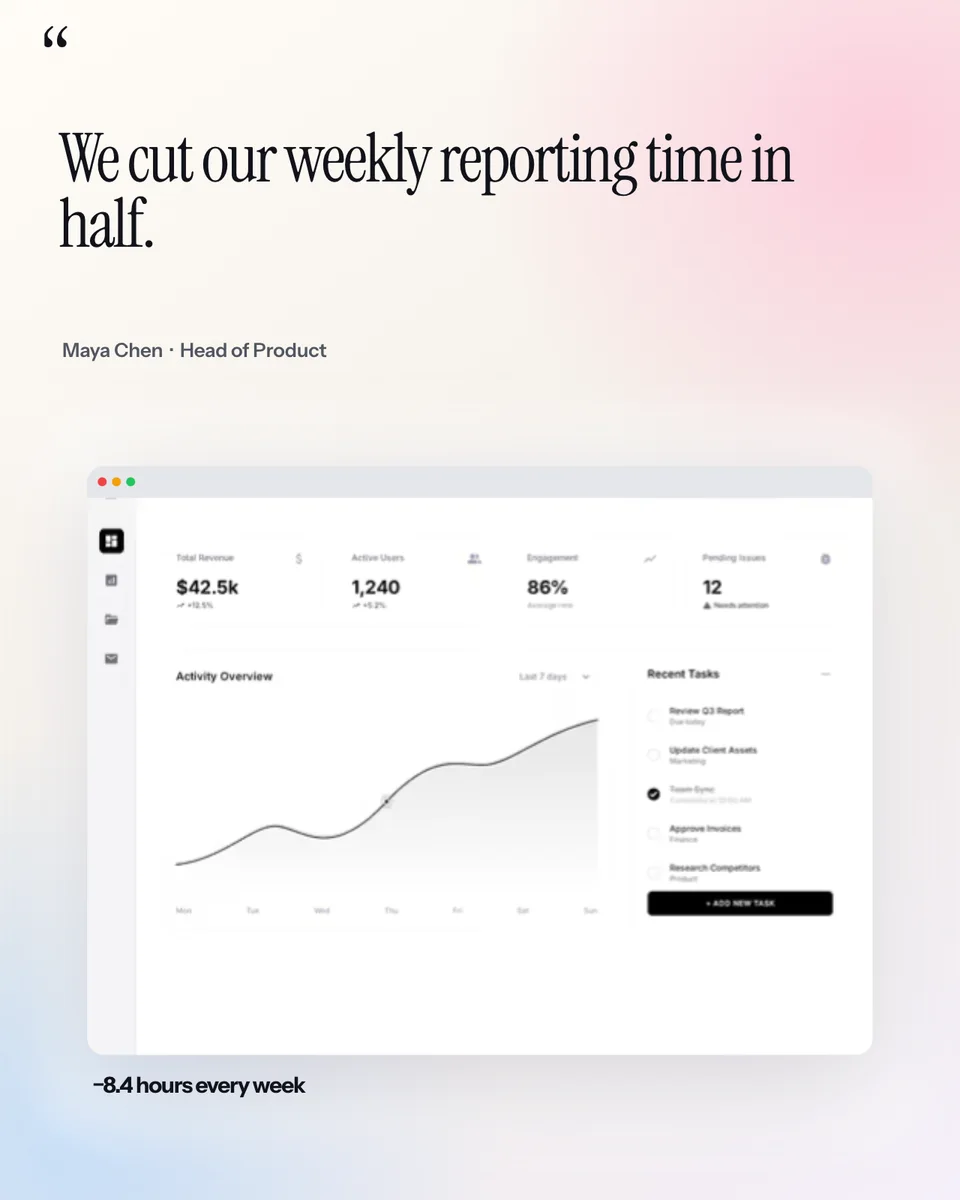
The serif is reserved for the main statement. The attribution, result, and product context stay in a quieter sans serif, so the quotation remains the clear focal point. Replace all sample names, comments, and results with material you are allowed to publish.
12. Playfair Display: premium and editorial campaigns
Playfair Display creates more contrast and formality than Instrument Serif. It suits an editorial landing-page hero, premium product launch, or publishing-related feature graphic. Give it space and avoid setting long all-caps copy in the high-contrast letterforms.
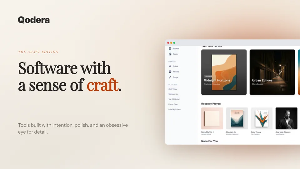
This pairing works because the two families have separate jobs: Playfair Display sets the campaign tone; Instrument Sans explains the product. The browser screenshot stays large enough to prove the visual promise.
Two useful specialists
13. Roboto Mono: code and technical evidence
Roboto Mono is appropriate for a command, code fragment, version label, or technical value. Use it where monospacing communicates meaning. Setting the entire graphic in a mono font often turns a useful technical cue into a visual costume.
14. Montserrat: structured campaign graphics
Montserrat is a practical choice for uppercase labels, event graphics, and bold promotional layouts. Its wide capitals need breathing room. For App Store captions, test the real translated string before committing to the same size and line count across every locale.
Four pairings that work without overdesigning
You rarely need more than two families in one product screenshot.
- Inter + Space Grotesk: neutral supporting copy with a distinct product headline.
- DM Sans + Instrument Serif: calm metadata and attribution around an expressive statement.
- Instrument Sans + Playfair Display: clear product explanation with an editorial campaign voice.
- Manrope + Sora: structured metrics and supporting copy with a geometric feature headline.
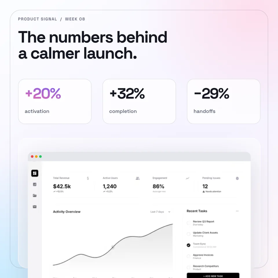
The pairing is only one part of the hierarchy. In this example, the title, three metrics, labels, and product screen also have visibly different size, position, and contrast. Typography cannot rescue a layout in which every element asks for attention at once.
Choose by destination, not in isolation
App Store and Google Play screenshots
Store screenshots are often first seen as small tiles. Use a short benefit statement, a large enough product screen, and a sans serif that survives reduction. Inter, Instrument Sans, DM Sans, Manrope, and Plus Jakarta Sans are dependable starting points. Poppins or Sora can work for a short opening claim when the line breaks remain controlled.
Build the typography inside an actual App Store screenshot set or Google Play screenshot set, then preview the full sequence rather than judging one caption at full editor size.
Social posts and launch graphics
Social graphics can carry a stronger display face because the image itself may be the campaign. Space Grotesk, Archivo, Sora, Bebas Neue, Instrument Serif, and Playfair Display can establish a clearer voice—but the post still needs a readable product crop and a caption that carries the nuance.
The Instagram mockup examples show how typography changes between the publishable creative, native-feed context, a carousel, customer proof, and a photographed scene.
Website heroes and Open Graph images
A website hero has surrounding HTML copy; an OG image has to make sense when detached from the page. A hero may use minimal on-image text and let the page headline do the explaining. An OG card often needs a short self-contained title. Use the product screenshot examples gallery to compare those layout jobs before choosing a family.
A five-step typography check
1. Write the actual headline before choosing the font. A six-word line and a twenty-word sentence are different design problems.
2. Set the final canvas and destination ratio. Do not approve typography on a generic artboard.
3. Preview at the approximate feed, store, or card size. Check the headline, then the product screen, then the supporting copy.
4. Test the longest real locale you plan to publish. Confirm that the family contains the required characters and that the translation still has room.
5. Export a draft and view it outside the editor. Check thin strokes, punctuation, numbers, line breaks, and contrast after compression.
Common mistakes
- Choosing personality before readability. The product and promise still need to survive at the final size.
- Using three or four families. More fonts create more relationships the layout has to explain.
- Shrinking copy to preserve a preferred line break. Rewrite the caption or change the layout first.
- Treating a display face as body text. Expressive forms become tiring and fragile when used for paragraphs.
- Baking essential detail into tiny image text. Put qualifications, links, and supporting explanation in the surrounding page or post caption.
- Assuming the English layout will localise unchanged. Test the actual translated copy, glyph coverage, and expansion.
Frequently Asked Questions
What is the best font for App Store screenshots?
Inter, Instrument Sans, DM Sans, Manrope, and Plus Jakarta Sans are strong starting points because they stay clear in short captions and offer useful weight contrast. The best choice still depends on the actual words, brand, product category, and preview size.
Should app screenshots use the same font as the app UI?
Not necessarily. The marketing caption and the product interface have different jobs. Reusing the brand family can create continuity, but a compatible marketing font may produce a clearer hierarchy. Keep the screenshot itself accurate rather than restyling the UI inside the marketing image.
How many fonts should one product screenshot use?
One family with two or three weights is often enough. Use a second family when it creates a meaningful contrast, such as an editorial statement paired with neutral supporting copy. More than two usually makes a small marketing canvas harder to organise.
Can I use these fonts in Screenhance?
Yes. All fourteen families in this guide are available in the current Screenhance font picker. Availability and licensing outside Screenhance depend on the font source and the tools in your own workflow.
Which font works best for numbers and metrics?
Manrope, Inter, Space Grotesk, and Sora are useful for large metrics, while Roboto Mono suits code-like values and technical labels. Check ambiguous characters, decimal points, currency symbols, and the exact number at the final size.
Apply the typography to a real product screen
Start with the destination, choose a layout that keeps the interface legible, then give the headline and supporting copy separate jobs. Open the free screenshot editor to try the fonts on your own capture, or browse the editable examples to begin with a composition that already fits the story.
Screenhance examples
Two editable starting points from the Screenhance library, selected for this launches guide.
Try these fonts on your own product screenshot
Free to start. No credit card required.
Keep reading
Related, product-tested guides from Screenhance.
How to Launch an App in 2026: The Complete Step-by-Step Checklist
The complete 2026 app launch checklist: a 4-6 week timeline across pre-launch, launch day, and post-launch, plus every store, Product Hunt, and OG asset needed.
4 Jul 2026 · 8 min read
How to Publish an AI-Built App to the App Store (Lovable, Bolt, Replit)
A practical App Store submission walkthrough for AI-assisted apps: enrollment, builds, listing metadata, screenshots, privacy details, and review preparation.
2 Jul 2026 · 5 min read
How to Write App Store and Google Play Descriptions With AI
Draft accurate App Store and Google Play descriptions with AI, using current metadata limits, a reusable prompt, human review, and localization checks.
19 Jun 2026 · 8 min read