
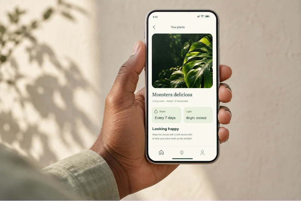
Your app in someone’s hand
For a landing page, editorial feature or portfolio: show what the app feels like in use.
Open this mockupBudgeting app · Store listing example
Soft green, a short promise with one highlighted word, and a lifted card that pulls the key number out of the screen. The same five screens become a second, bolder set for Google Play.
Open this set in the editorFictional product · Made with the App Store editor · Export follows your plan
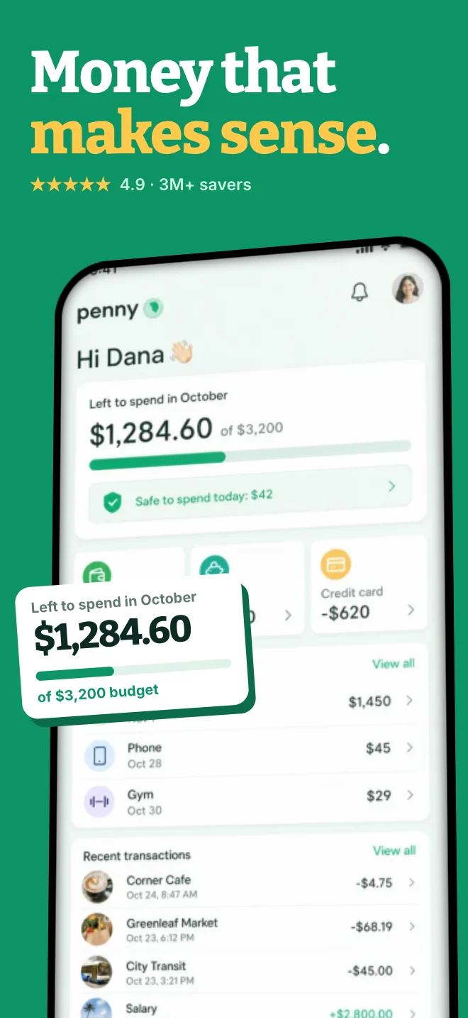
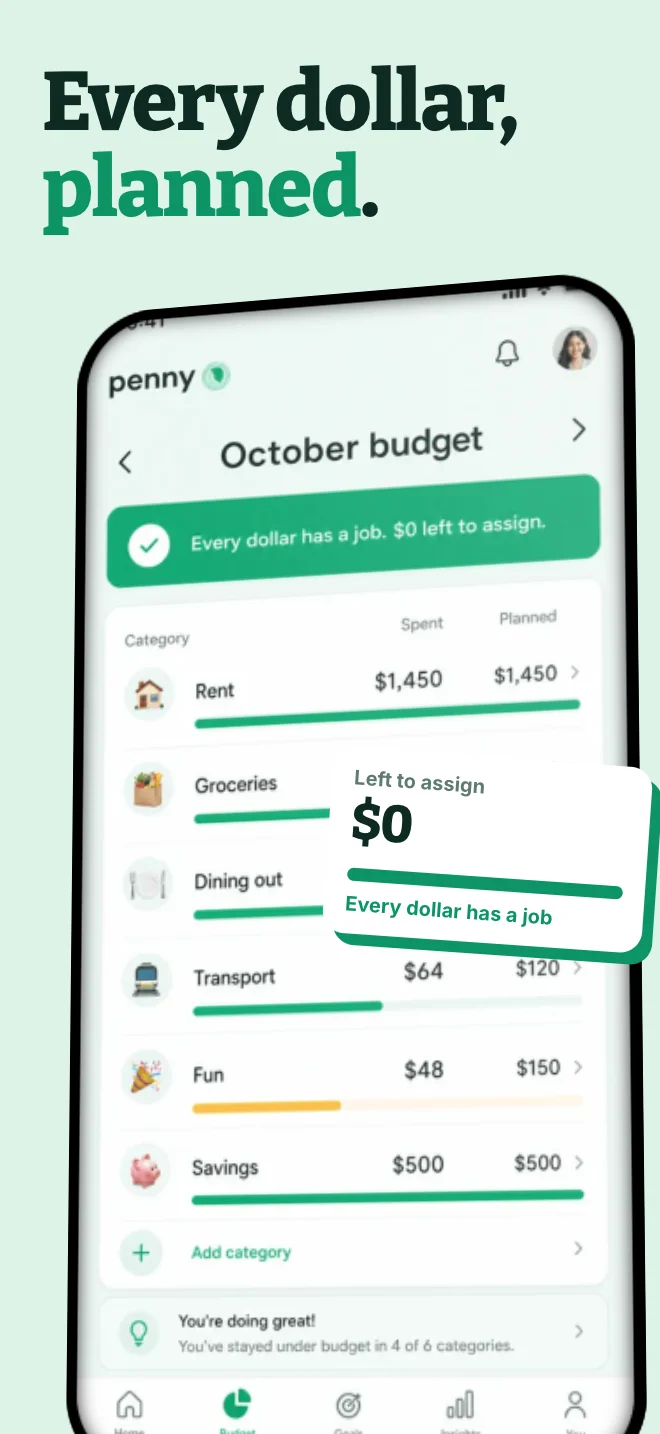
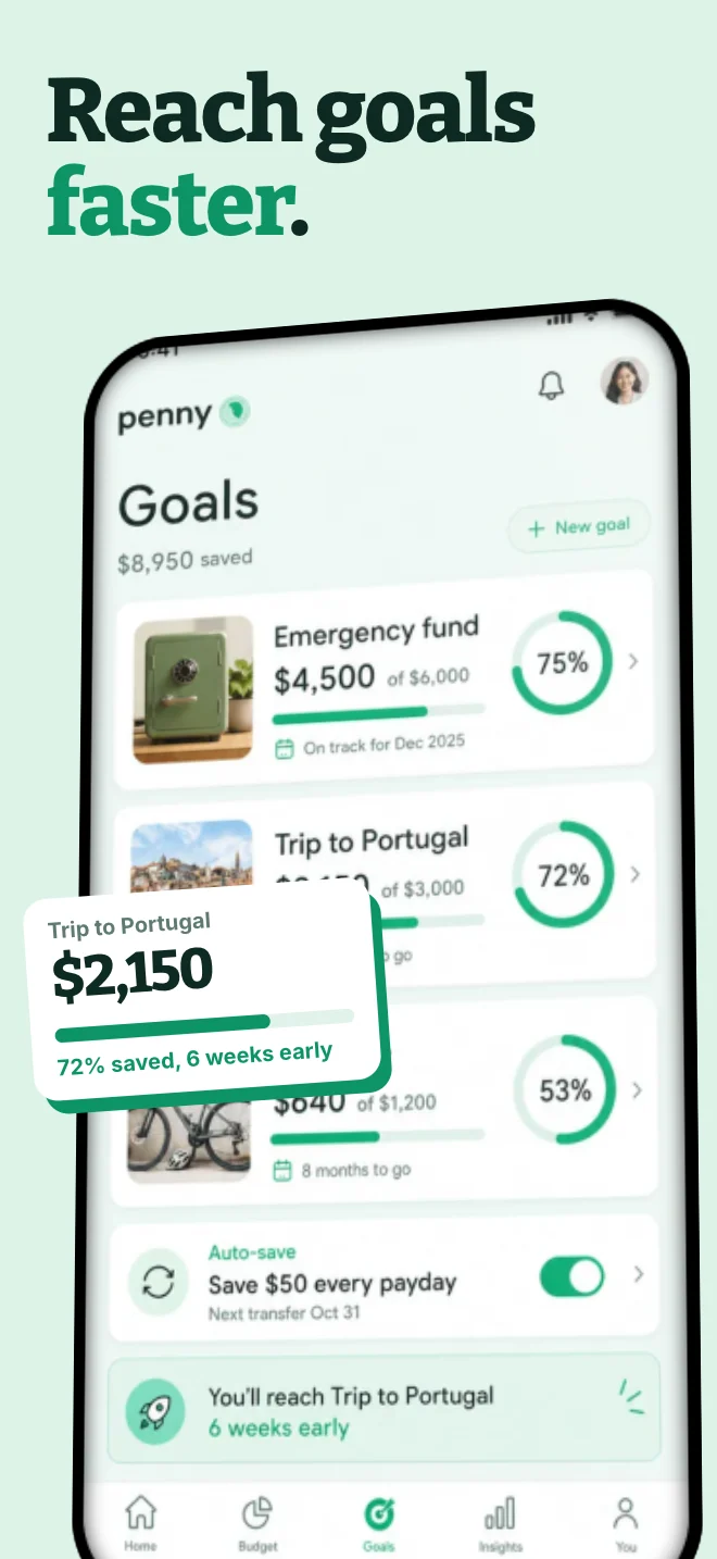
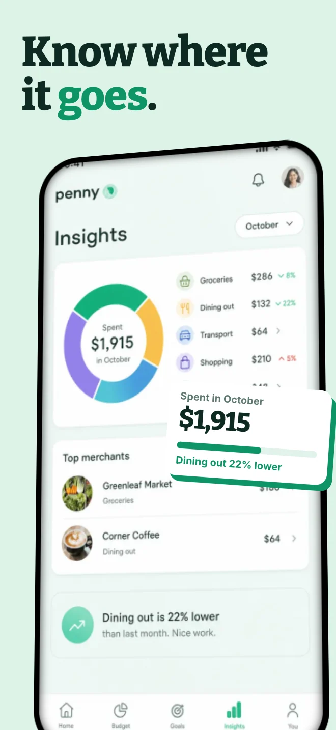
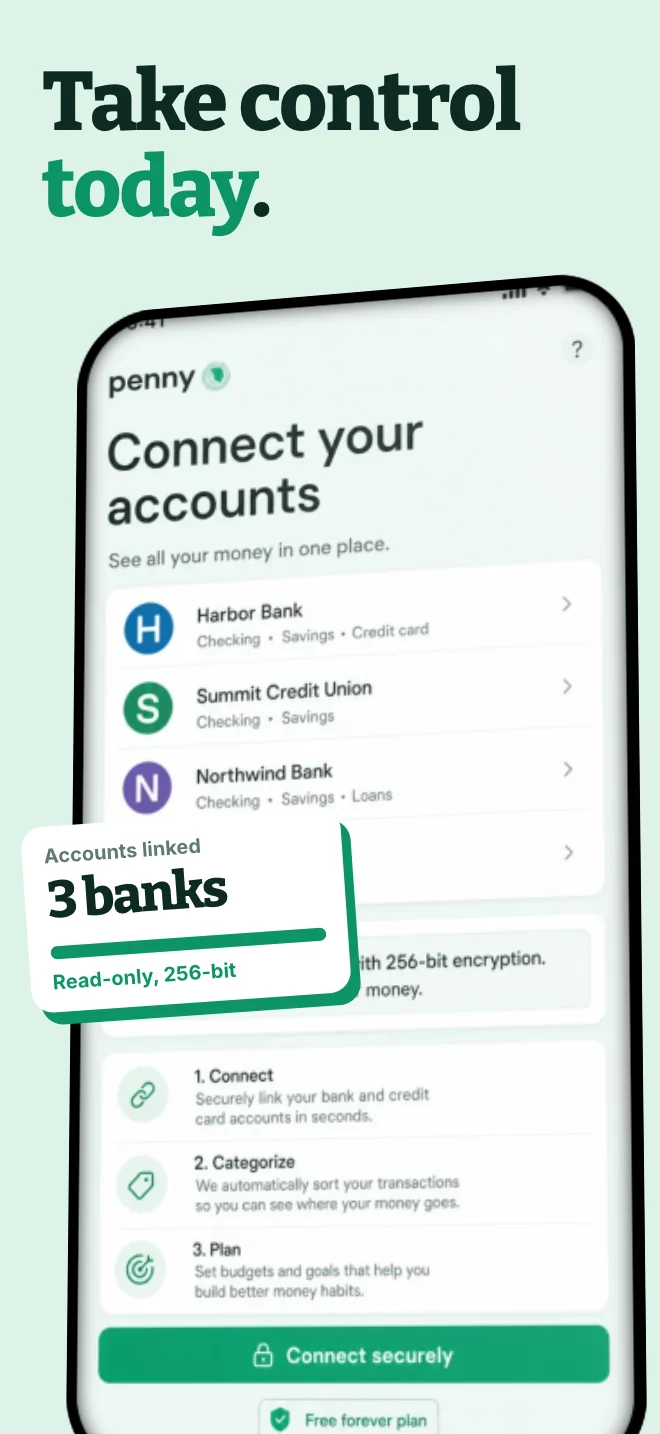
Nothing in the app is redrawn. The set frames the same screens, gives each one a single headline and pulls the most important detail forward, so the listing reads as a story instead of five captures.
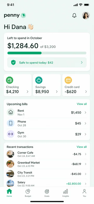
Home
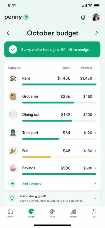
Budget
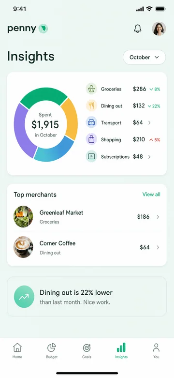
Goals
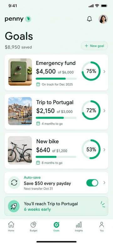
Insights
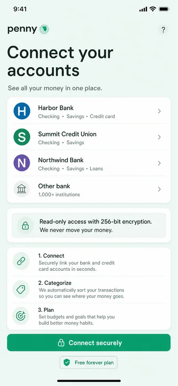
Accounts
A store listing is read in order, and the opening slides do the most work: depending on their orientation, the first one to three can appear in App Store search results. Each slide here has a single job.
The hook
The first slide carries the promise, the rating and the one number people care about: what is left to spend.
The main feature
The budget screen proves the promise. The lifted card repeats the key figure so it still reads when the slide is small.
The payoff
Goals turn a budget into a reason to stay. The card pulls one goal forward, so the slide is about a trip, not a table.
The insight
A chart and one plain sentence. The highlighted number tells the story before anyone reads the chart.
The close
The last slide answers the worry that stops a download, connecting a bank, and ends on the action.
For Google Play the five screens get a bolder treatment: one giant figure per slide on deep plum, a Pixel frame and a small data chip. Same app, a different first impression.
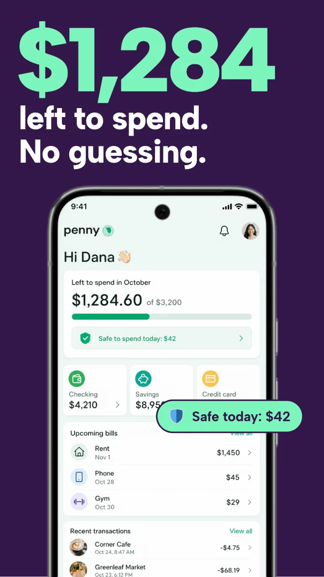
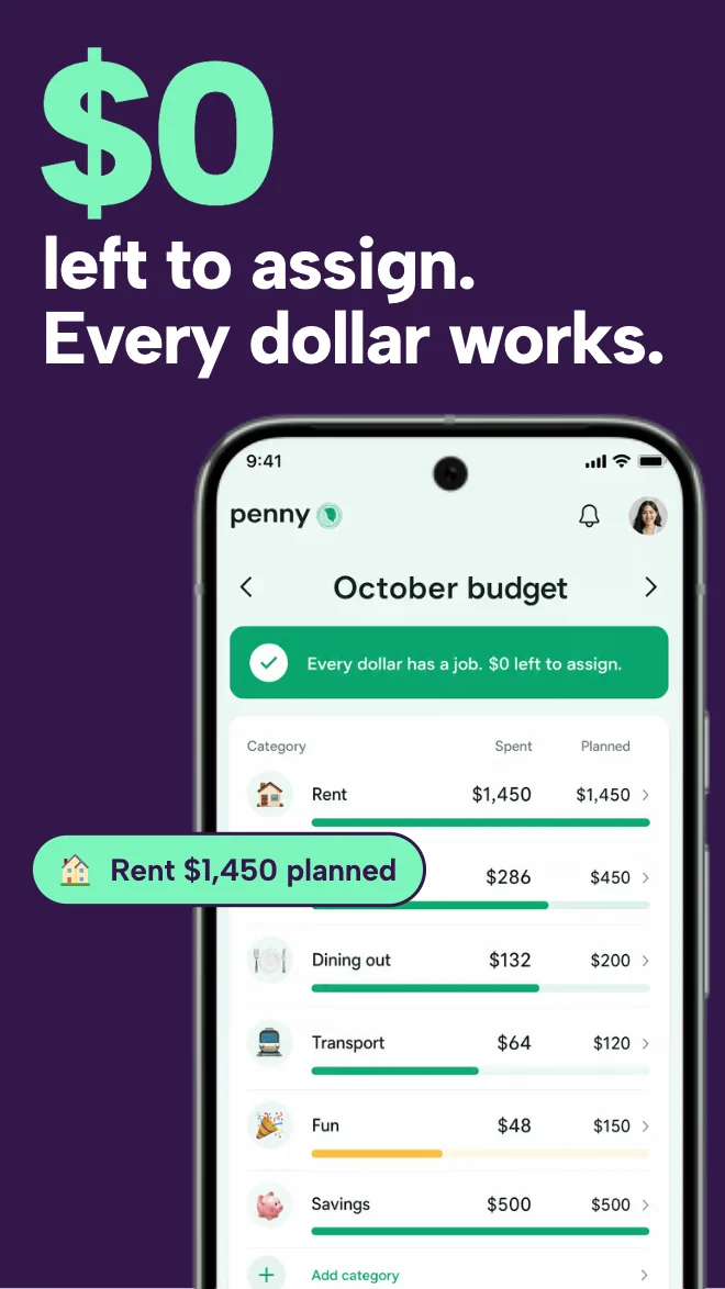
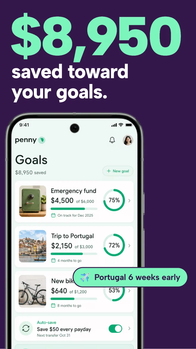
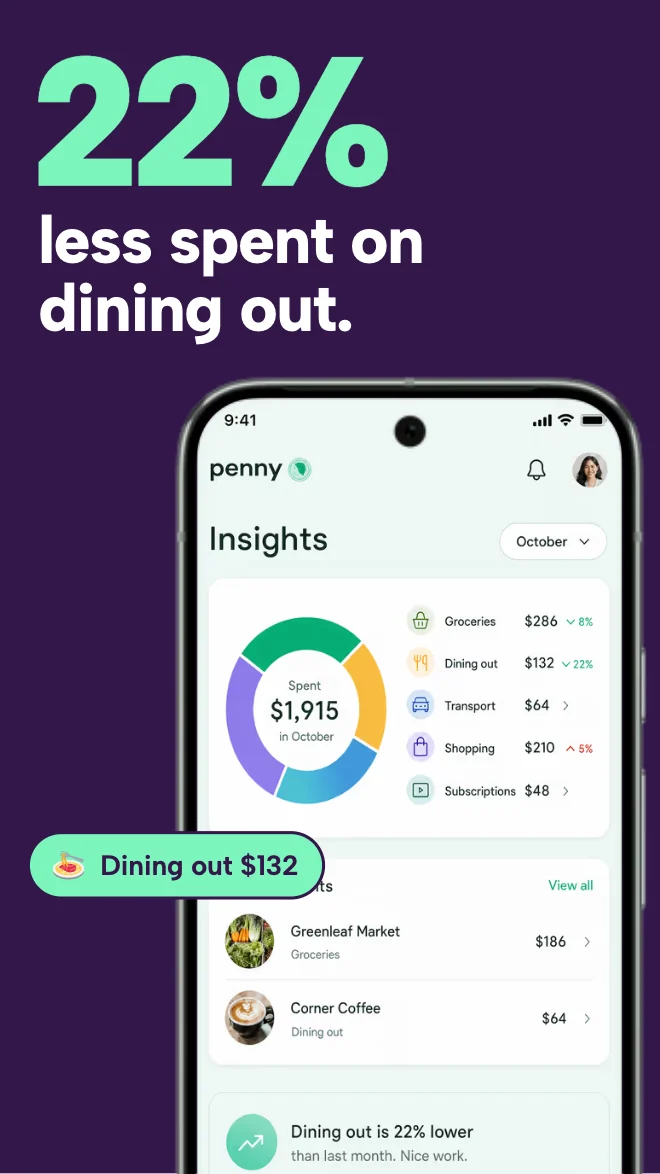
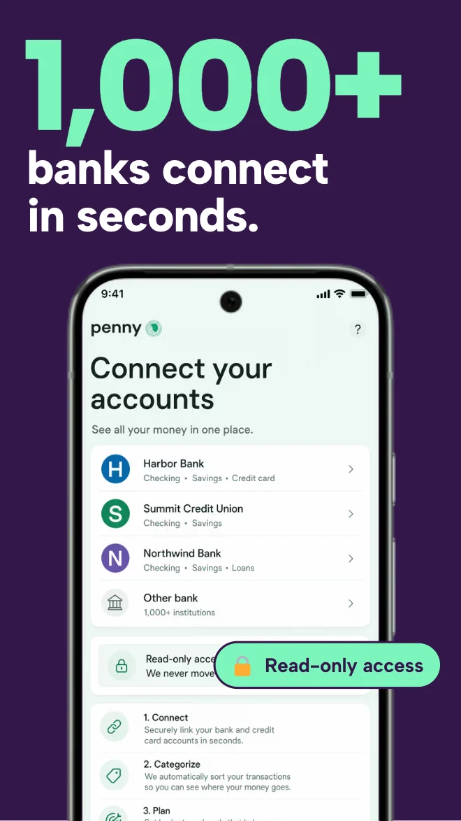
Open the set in the editor and replace the five sample screens with your own screenshots. The frames and layout stay in place.
Keep one idea per slide. Change the words, colours and fonts until the set sounds like your product.
Choose the Apple or Google Play sizes your release needs, export, and check the files against the current store requirements.
Three editable examples, each with a different use. The product screens are fictional; the mockup and export workflow are real.
For a landing page, editorial feature or portfolio: show what the app feels like in use.
Open this mockup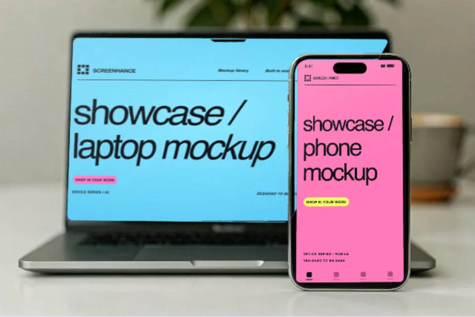
For a responsive product case study: show the desktop workflow and its mobile companion together.
Open this mockup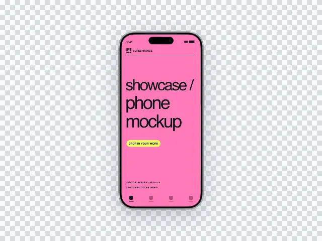
For a landing-page section with its own colour: let the website supply the background.
Open this mockupYes. Open the Penny template in the editor, replace the sample screens with your own screenshots and rewrite the headlines. Colours, fonts, frames and backgrounds can all be changed.
No. Penny is a fictional product made to show the template. The template, the editor and the exported files are real.
You choose the Apple or Google Play sizes your release needs when you export. Free exports one size and one language at a time with a watermark; the Launch Pass and Pro export the sizes and languages you pick together, without the watermark on images.
See the Pulse example: a fitness listing with one loud idea per slide →