All examples

Product mockups with a clear place in your launch.

Use a hand-held scene for context, two device sizes to explain a responsive product, or a transparent phone to fit a website’s own background. Every example below opens the composition shown.

Choose the setting for the job.

Three editable examples, each with a different use. The product screens are fictional; the mockup and export workflow are real.

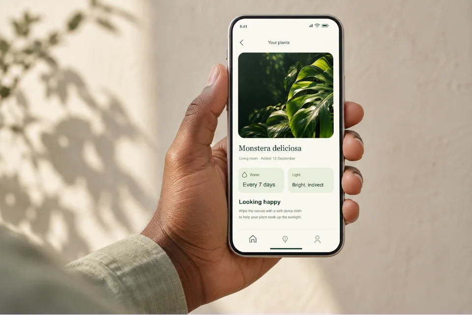
Your app in someone’s hand

Your app in someone’s hand

For a landing page, editorial feature or portfolio: show what the app feels like in use.

Your screenshot sits inside the phone’s screen. Replace it and check the top controls and bottom navigation before exporting.

Open this mockup
Browse hand-held mockups

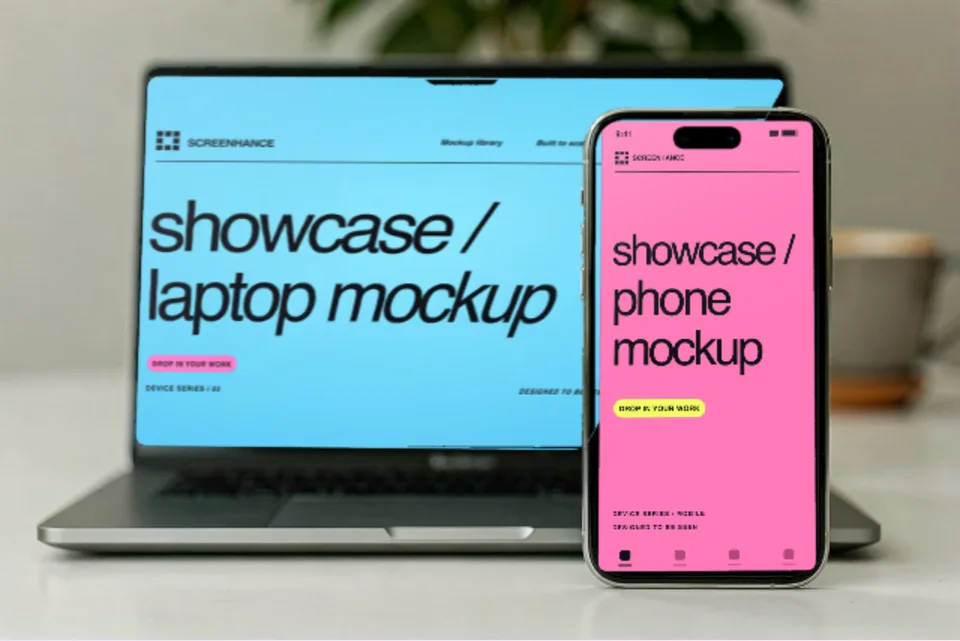
One product across desktop and mobile

One product across desktop and mobile

For a responsive product case study: show the desktop workflow and its mobile companion together.

The desktop and mobile screens are separate, editable slots. Use a landscape screenshot for the laptop and a portrait screenshot for the phone.

Open this mockup

Browse browser mockups

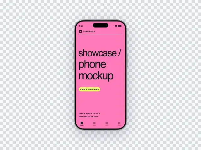
A phone that fits your website

A phone that fits your website

For a landing-page section with its own colour: let the website supply the background.

The device sits on a transparent canvas. Export a PNG for a still. If you add motion, WebM keeps the transparency in a supported browser; MP4 does not.

Open this mockup

Explore transparent exports

Check the whole screen before export

Match each upload to its slot. A landscape desktop capture and a portrait phone capture need separate images; stretching one into both makes the interface hard to read.

Inspect the phone’s top controls, bottom navigation and rounded corners. Reposition the crop if important content touches the edge, then inspect the downloaded file.

Transparent motion needs an alpha-capable format and compatible playback. Use a PNG fallback for a still, and test the WebM in the browsers used by your audience.

See a complete store listing, slide by slide →