
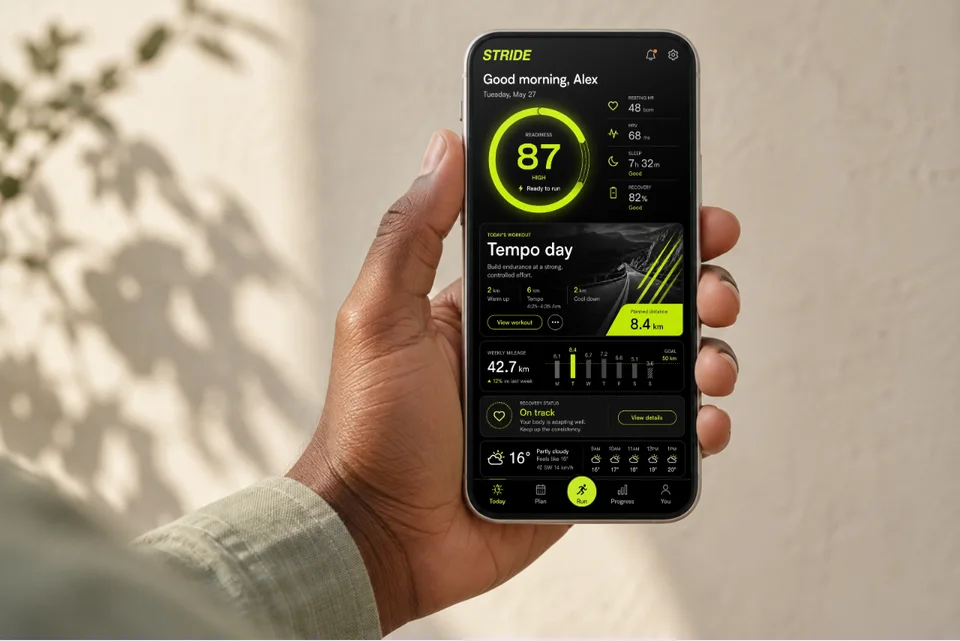
A training app in someone’s hand
For a landing page, editorial feature or portfolio: show what the app feels like in use.
Open this mockupLight surfaces, violet accents and generous breathing room. Let the task list carry the detail instead of adding competing labels.
Two product screens. Seven editable outputs. Follow the example, then replace it with your product.
Open the Tempo exampleFictional product · No AI generation needed · Export access follows your plan
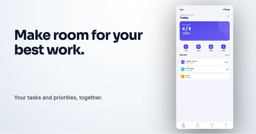
One promise, followed by the screen that supports it. The source copy stays connected across the generated formats.
“Make room for your best work.”
“Your tasks and priorities, together.”
The first slide introduces the benefit; the second makes the workflow concrete. Each store uses its own layout. Keep the caption short enough to read before someone expands the image.
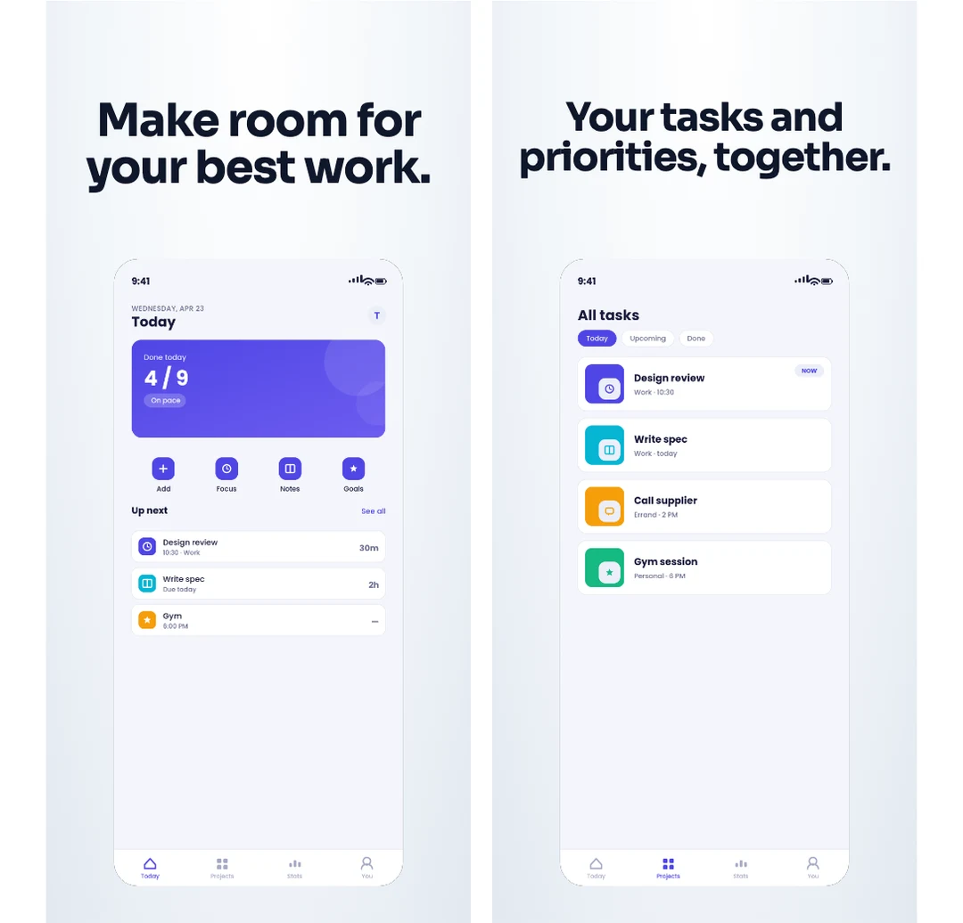
An editable portrait set. Select the Apple display size your release needs at export; the template’s original design canvas stays intact.
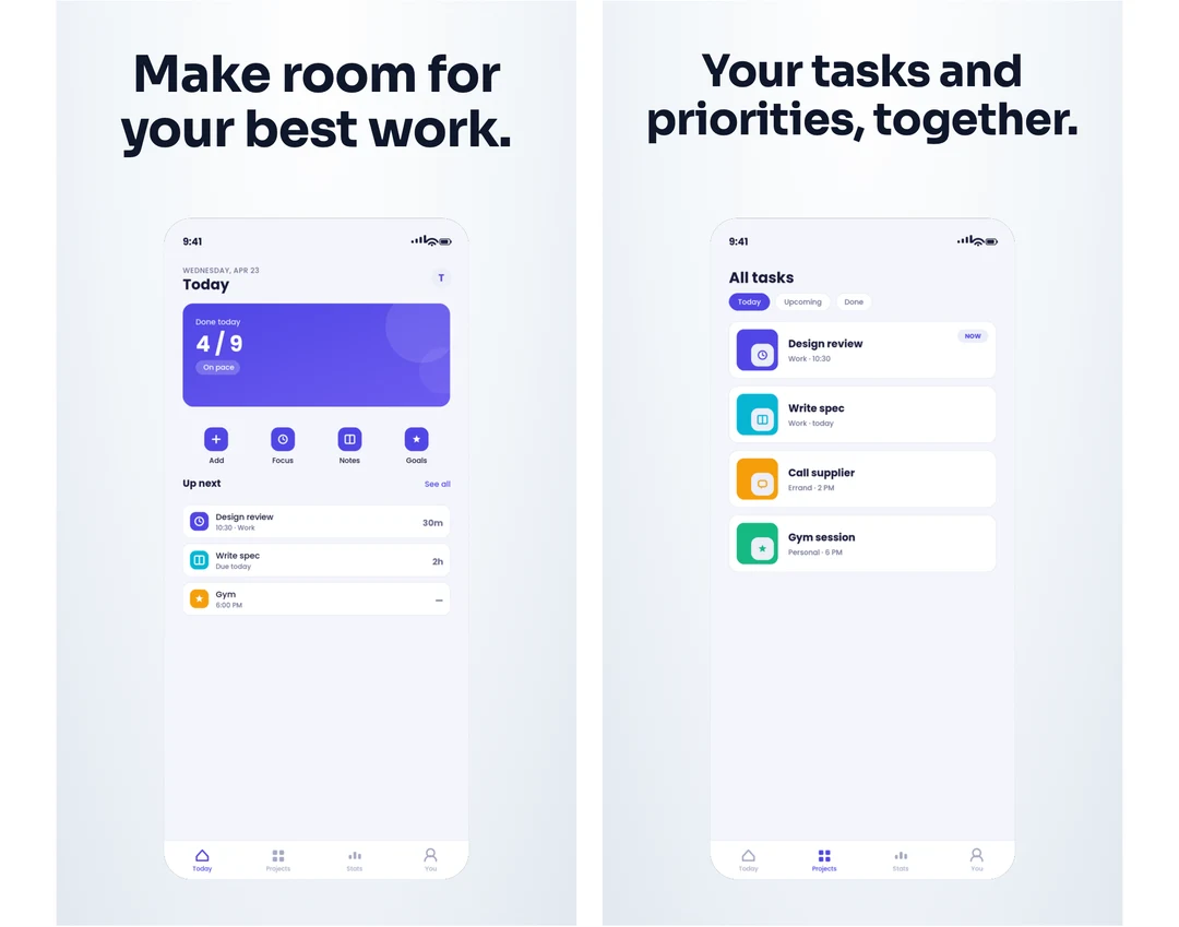
The same product story adapted to Android. Review the chosen phone or tablet export, then upload it to the matching listing.
Check the exported screenshot dimensions or adapt the captions for another locale.
These optional placements are separate from the screenshot sequence. Start at their native dimensions, keep the product readable, and review the resulting crops in App Store Connect.
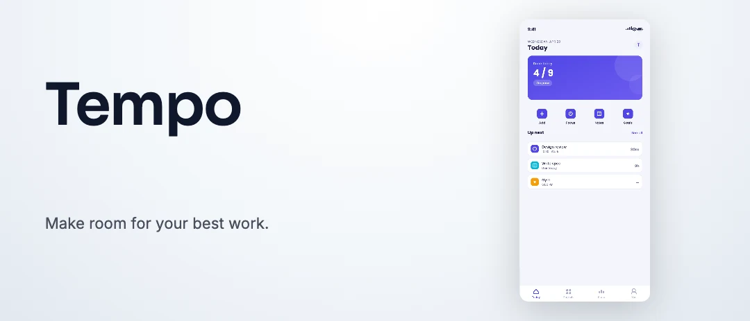
A wide composition led by the product name. The complete portrait interface fits beside the message. This shows the image artwork; supported editors also offer a poster and an MP4 loop.
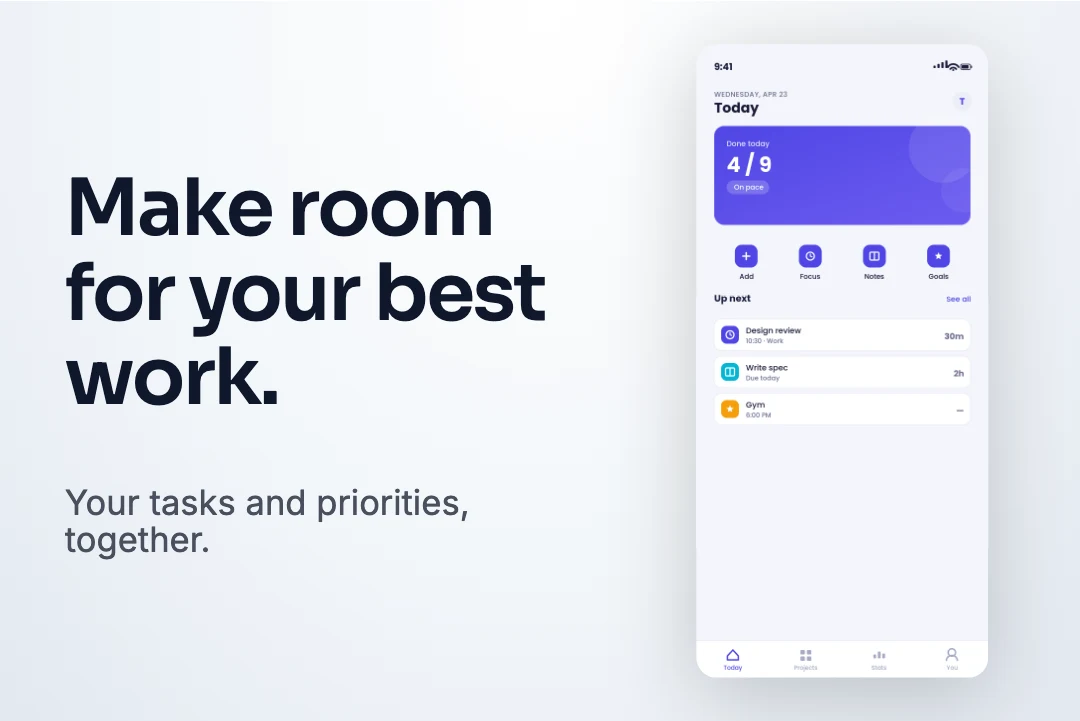
A 3:2 composition led by the benefit. Apple accepts search images up to 3840 × 2560 at the same ratio. Universal artwork uses a separate 5244 × 2950 PNG canvas.
Check the current Apple source, formats and downloadable specs. Open the full creative asset collection.
A share card for the product’s launch URL. Check the live URL after publishing; each destination can crop the preview differently.
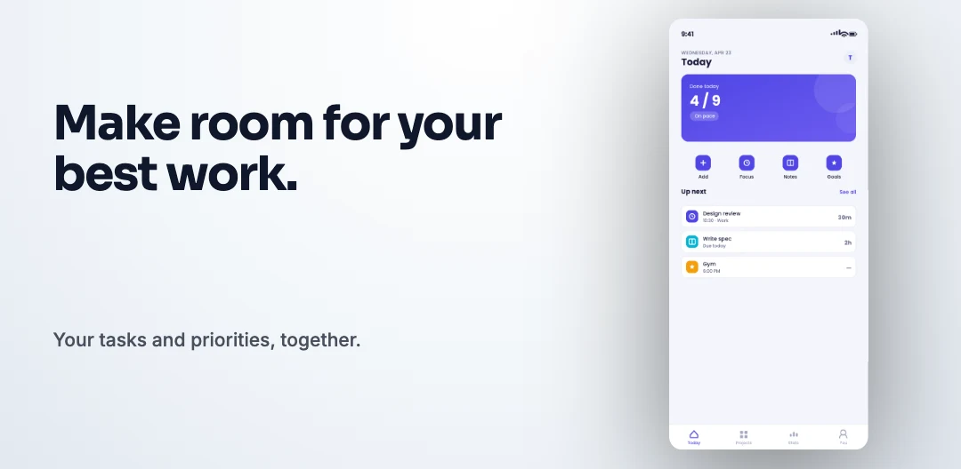
A separate landscape asset for Google Play. It uses the same promise and screen as the launch card, with its own required canvas size.
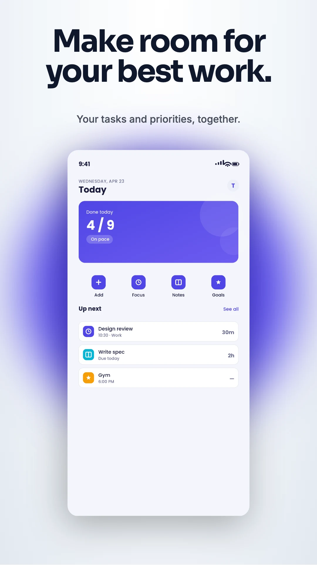
A still from the editable motion composition. Open the kit to preview the movement and choose a supported video or GIF export.
Three editable examples, each with a different use. The product screens are fictional; the mockup and export workflow are real.
For a landing page, editorial feature or portfolio: show what the app feels like in use.
Open this mockup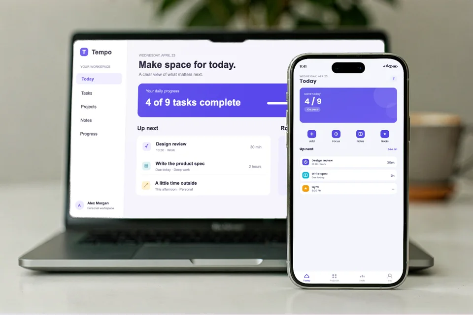
For a responsive product case study: show the desktop workflow and its mobile companion together.
Open this mockup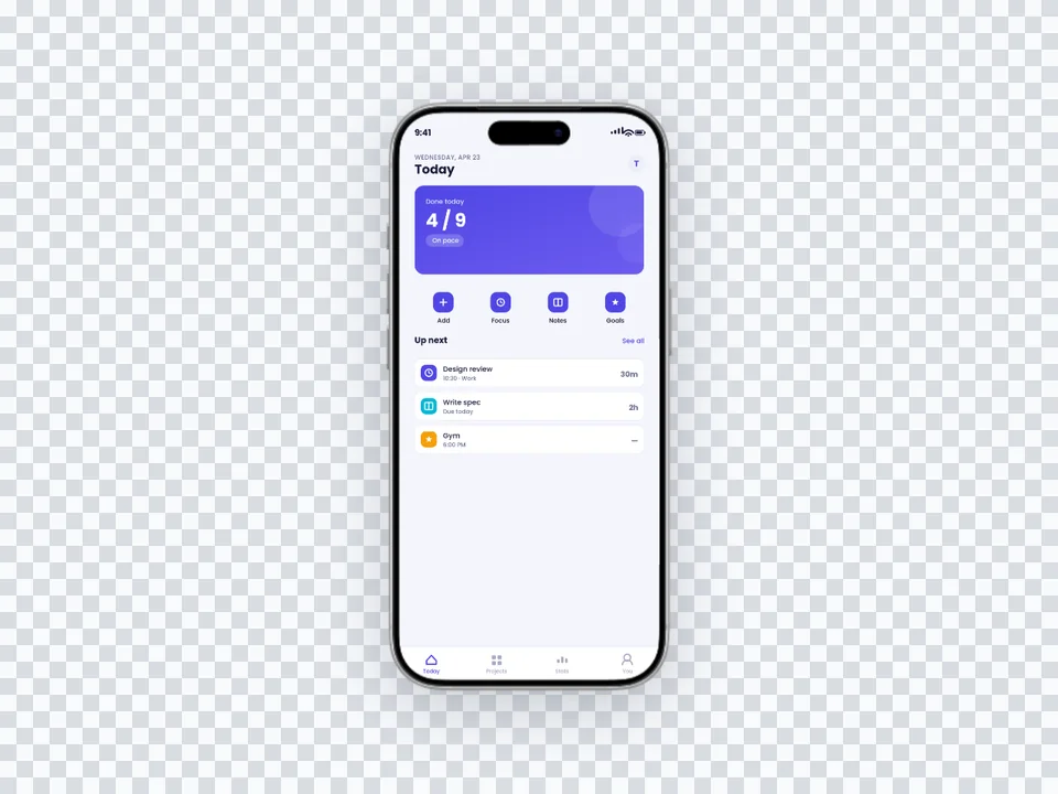
For a landing-page section with its own colour: let the website supply the background.
Open this mockupYes. Open the Tempo example, load its two product screens and supplied copy, then build the seven selected outputs. Replace the screens, text, colours and fonts with your own. An existing kit is preserved until you save it and start a new one.
No. Store screenshots form the listing’s screenshot sequence. Apple header and search artwork are optional creative placements with separate dimensions and submission rules. Universal artwork is a separate image-only placement and is not one of this example’s seven outputs.
No. This example assembles supplied copy and screens with the existing editors. Image and video export access follows your plan, and native video export also depends on browser support.