
Mockup Design Trends for 2026: What's In and What's Out
A practical review of current mockup styles in 2026, when each treatment helps the product, and which choices are worth testing with your audience.
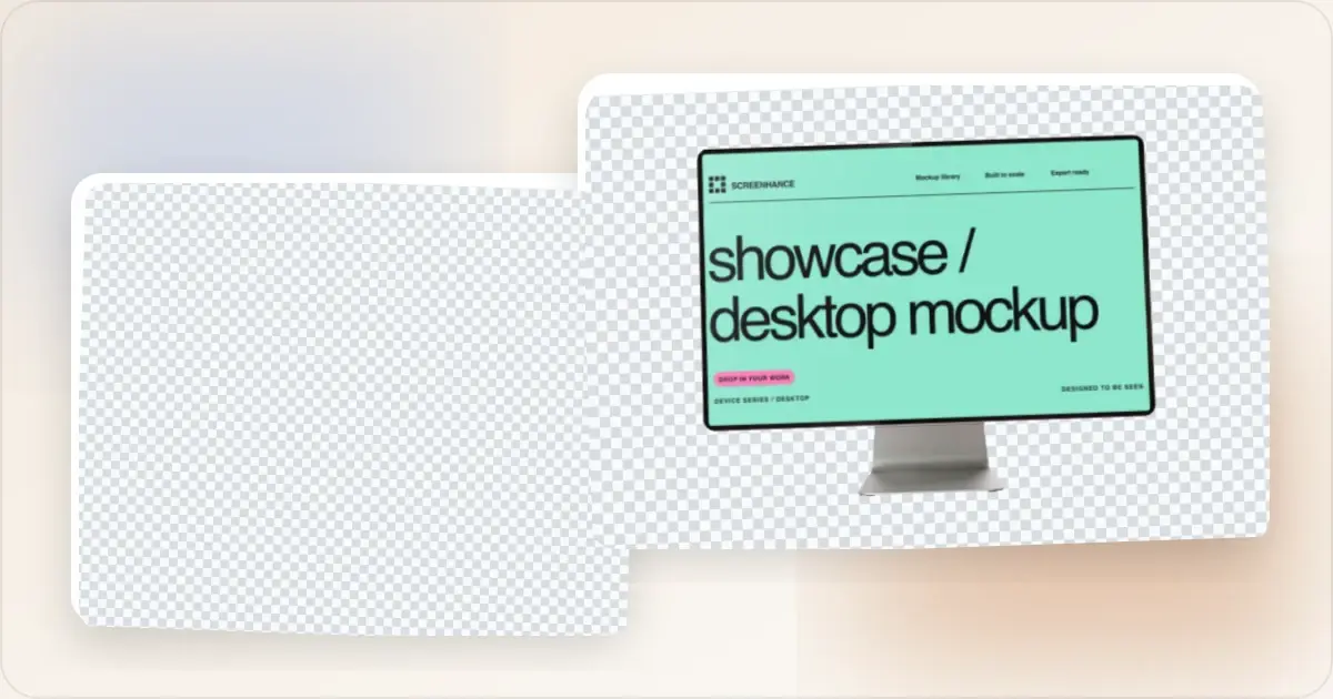
Mockup styles change, but a trend is not evidence that a particular design will perform better. Use this guide as a set of directions to consider, then choose what fits the product, audience, and brand.
Here are styles appearing in current product imagery, plus older treatments worth reviewing rather than automatically discarding.
What's In for 2026
1. Soft, Natural Gradients
One current direction uses softer gradients in place of high-intensity neon:
- Subtle color transitions
- Earth tones and pastels
- Gradients that feel organic, not digital
- Mesh gradients for depth
2. Minimal Device Frames
The trend is toward cleaner, simpler frames:
- Thin bezels or bezel-less designs
- Subtle device outlines
- Focus on the screen, not the device
- "Clay" style mockups (monochrome devices)
3. Glass Morphism (Subtle)
Frosted glass effects are still popular, but subtler than before:
- Semi-transparent elements
- Soft blur backgrounds
- Layered depth effects
- Light refraction hints
4. 3D Elements and Depth
Flat design is giving way to dimensional mockups:
- Slight perspective tilts
- Layered compositions
- Realistic shadows
- Floating elements
5. Motion and Micro-Animations
Motion is increasingly used alongside static mockups for interactions that are difficult to explain in one frame:
- Subtle hover effects
- Animated product demos
- GIFs showing key interactions
- Video mockups for social media
6. Dark Mode First
Dark backgrounds are one visible direction:
- Black and dark gray backgrounds
- High contrast with product UI
- Glowing accents
- Dark mode product screenshots
7. Authentic, Realistic Content
Another useful direction is replacing "Lorem ipsum" and careless placeholder data with realistic, safe examples:
- Realistic-looking user data
- Actual product screenshots (not idealized versions)
- Imperfect, human-feeling content
- Real testimonials and metrics
What's Out in 2026
1. Isometric Everything
Full isometric scenes are less common in the references behind this guide and can feel generic when used without a clear reason:
- Overused
- Generic
- Like 2019
2. Busy Pattern Backgrounds
Geometric patterns, confetti, and busy backgrounds are worth simplifying when they compete with the product:
- Distracting from the product
- Hard to read
- Trying too hard
3. Thick Device Bezels
Older device frames can misrepresent a current product when the hardware context matters:
- Thick bezels
- Home buttons
- Dated device shapes
4. Neon Gradients
Purple-to-pink neon gradients are familiar enough that they may not create a distinctive brand treatment:
- Feels 2020
- No longer attention-grabbing
- Associated with crypto/NFT era
5. Stock Photo Backgrounds
Generic images of people at laptops or in offices can be weak choices when they do not explain the product:
- Generic
- Don't add value
- Distract from product
6. Over-Designed Compositions
Too many elements competing for attention:
- Multiple overlapping devices
- Text, badges, and callouts everywhere
- Visual chaos
The Minimalist Shift
The overall trend is toward simplicity:
- Fewer elements
- More whitespace
- Product as the hero
- Subtle enhancements only
Your mockup should make your product shine—not compete with it.
Platform-Specific Trends
Twitter/X
- Dark backgrounds dominating
- Single-device focus
- High contrast for feed visibility
- Professional, muted colors
- Browser frames over phone frames
- Light mode still acceptable
Product Hunt
- Colorful but not chaotic
- Consistent gallery style
- Motion/GIFs gaining traction
- Follow the Product Hunt launch checklist for visual preparation
App Store
- Clean, minimal backgrounds
- Focus on UI, not frames
- Lifestyle shots declining
- Use an ASO screenshot tool to apply modern trends to your app store visuals
Treatments Worth Reconsidering
A perspective-heavy multi-device fan can make every screen too small to read. If the point is one feature, a single-device hero usually gives that screen more room. A multi-device composition still makes sense when the message is genuinely about cross-platform availability; preview it at the real rendered size before choosing.
Glossy reflections and dramatic space backgrounds add strong stylistic signals. Keep them only when they support the brand and leave the product legible; remove them when they are compensating for an unclear screenshot. A restrained shadow may be enough to separate the device from the background.
Clay 3D renders are easy to reproduce, which can make an unmodified preset feel generic. They remain useful when the device is contextual rather than informational. When the screen itself is evidence, use a frame and angle that preserve the real screenshot at a readable size.
Where Mockup Design Is Heading Next
One emerging workflow uses generated backgrounds tuned to the screenshot's color palette. That can speed up exploration, but it does not replace art direction or rights review. Keep the background restrained, check that it fits the brand, and make sure it does not imply a setting or product capability that is not real.
Another pattern starts with a high-quality static frame and progressively adds a short loop after the page is usable. This can reduce the initial cost compared with loading a large video immediately, but it does not eliminate the performance cost or guarantee a conversion lift. Measure Core Web Vitals and the page's actual goal, respect reduced-motion preferences, and keep the static frame useful. Build that frame in a mockup generator and add the motion layer downstream.
A third direction is density-aware delivery. One 1920x1080 export may be wasteful on a narrow screen and soft in a large, high-density placement. Generate the variants your layout actually needs and use srcset and sizes so the browser can choose an appropriate file. Verify the chosen resource in browser developer tools rather than assuming a fixed number of variants is correct.
Related Reading
- Best Free Mockup Tools in 2026 - Tools that support these trends
- How to Make Your Screenshots Go Viral on Social Media - Social media best practices
- Visual Branding for Startups - Building consistent brand visuals
Frequently Asked Questions
What mockup style is trending in 2026?
Minimal compositions, soft gradients, restrained device frames, and selective motion are visible directions. Treat them as options, not requirements; the most useful mockup still makes the product clear and fits the brand.
Are isometric mockups still popular?
Isometric mockups are still useful for architecture, systems, or intentionally illustrative work. For a product screen that needs to stay readable, a subtle tilt or straight-on frame often preserves more detail.
Should I use dark or light backgrounds for mockups?
Choose the background that gives the screenshot enough contrast and fits the brand. Test both light and dark versions when the asset will appear in several contexts; neither is a universal default.
How do I keep my mockups looking current?
Use current-generation device frames, avoid overused trends like neon gradients, keep compositions simple, and focus on showcasing your actual product rather than elaborate design elements. A screenshot beautifier can help you apply modern styling quickly.
Do mockup trends actually affect conversion rates?
A style change can affect comprehension or brand perception, but there is no reliable conversion range for updating a mockup. If the asset is important to a signup page, test the old and new versions while holding the surrounding copy and layout steady. Measure the full journey, not just clicks on the image.
Should I follow mockup trends or stick to my brand style?
Use trends to explore options that already fit the brand—gradient direction, frame style, or motion versus static. A coherent visual identity and a legible product screen are more durable criteria than novelty.
How long does a typical mockup aesthetic stay current?
There is no fixed lifespan. Refresh an asset when the product UI or device is inaccurate, the crop no longer fits its placement, performance is poor, or the visual system changes. A distinctive, clear composition can remain useful long after a novelty treatment has faded.
Are generic mockup styles worse than branded ones for SEO?
No. A generic visual style is not a Google spam violation or a documented ranking penalty. For search, focus on a useful page, crawlable image URLs, descriptive alt text where appropriate, good performance, and imagery that genuinely supports the content. A branded mockup can improve recognition, but do not claim that engagement or time on page automatically feeds back into ranking.
When is the right time to refresh a mockup?
Refresh when the underlying UI no longer matches the product, the asset no longer fits its placement or brand, its performance is hurting the page, or a controlled test gives you a reason to change it. Review important assets during normal product and brand updates rather than following an arbitrary calendar or a competitor's redesign.
Conclusion
The mockup trends of 2026 favor simplicity and authenticity. Let your product be the star, use subtle enhancements, and avoid the dated styles that make your work look like last year. A modern mockup generator makes it easy to follow these trends without design skills.
Stay current, but don't chase every trend. Timeless simplicity beats trendy complexity.
Screenhance examples
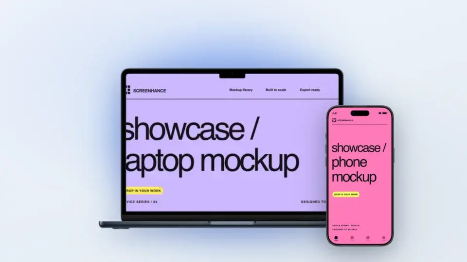
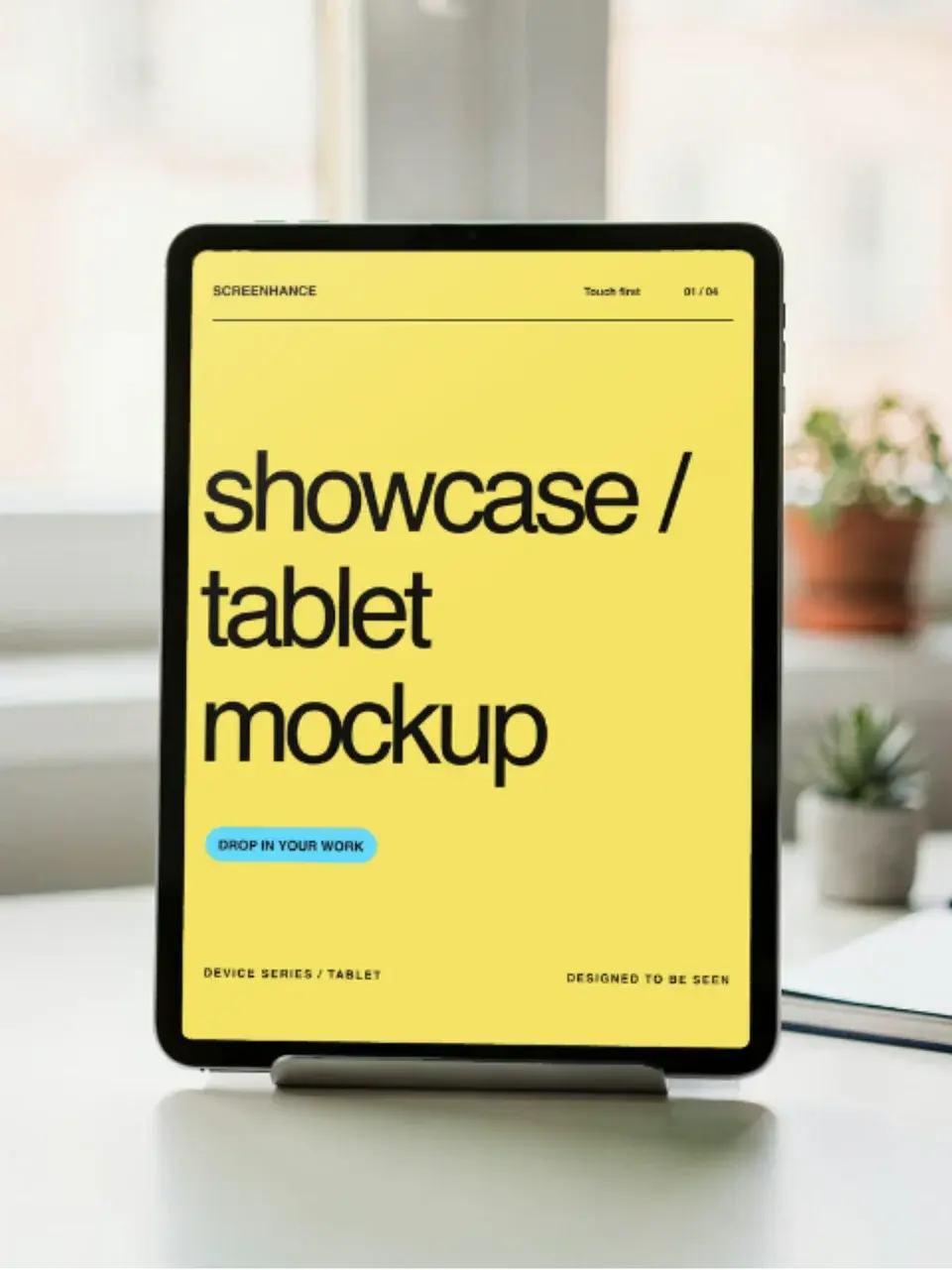
Two editable starting points from the Screenhance library, selected for this mockups guide.
Make a free device mockup
Free to start. No credit card required.
Keep reading
Related, product-tested guides from Screenhance.
Apple Watch Mockup Guide: Framing watchOS Apps in 2026
How to create Apple Watch mockups that sell a watchOS app: choosing 46mm vs 42mm, capturing clean watch screenshots, and the iPhone-plus-Watch layout.
29 May 2026 · 6 min read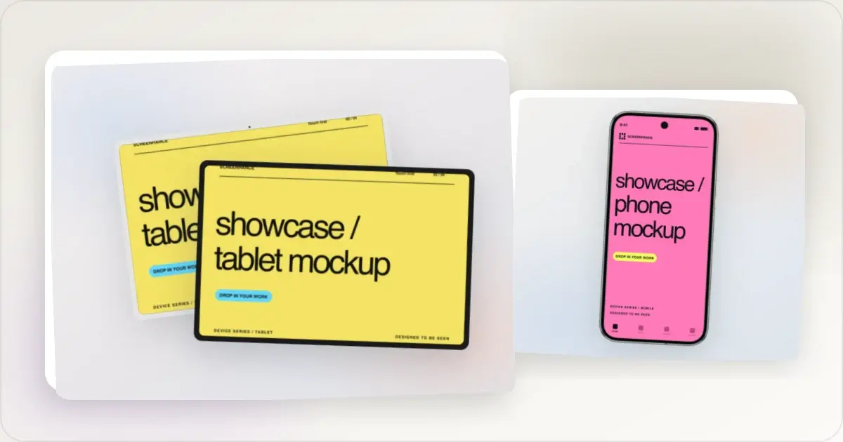
Google Pixel Mockup Guide for Android Marketing in 2026
Choose and use a Google Pixel frame for Android marketing, compare it with a Galaxy treatment, and prepare accurate Play Store visuals.
29 May 2026 · 5 min read
AI Mockup Generators in 2026: Where They Help and Where They Fail
A practical guide to AI mockup generators: when generated scenes help, when real product screenshots matter, and how to build a repeatable launch workflow.
13 May 2026 · 6 min read