
How to Create SaaS Hero Images That Convert
Create accurate, responsive SaaS hero images that show the product clearly and support the landing-page message.
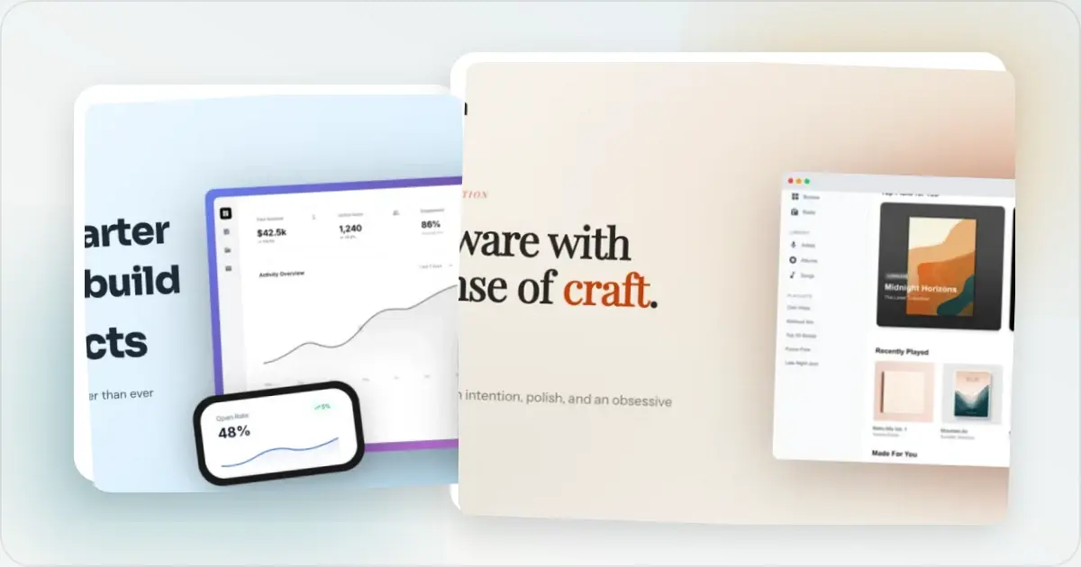
Your hero image has to explain the product quickly enough for a visitor scanning the page.
Most SaaS landing pages waste this opportunity with generic stock photos or raw screenshots. Here's how to do better.
Why Hero Images Matter
The hero section is usually visible without scrolling. Its image can help visitors connect the headline to the actual product, but its effect depends on the surrounding copy, audience, and page performance.
A great hero image answers: "What does this product actually do?"
The 3 Types of SaaS Hero Images
1. Product Screenshot in Device Frame
A direct approach for SaaS products with a visual interface.
Best for: Web apps, dashboards, tools with visual interfaces How to do it:- Take a screenshot of your best feature or overview
- Place it in a browser frame or laptop frame
- Add a subtle background (gradient or solid color)
- Ensure it's readable at the hero size
2. Multi-Device Composition
Shows your product works across platforms.
Best for: Products with mobile apps, responsive tools, cross-platform software How to do it:- Combine laptop, tablet, and phone frames
- Show the same product on each device
- Use depth and layering to create visual interest
- Keep backgrounds consistent
3. Floating UI Elements
Deconstructed interface elements that feel dynamic.
Best for: Design tools, no-code builders, complex products How to do it:- Extract key UI components from your product
- Arrange them in a floating, 3D-style layout
- Add shadows and depth
- Keep it clean—don't overdo it
Technical Specifications
Desktop hero images:- Choose a source canvas that matches the actual layout rather than treating one pixel width as a universal minimum
- Export enough source resolution for the largest rendered size and target device density
- Compress the image and compare visual quality against page-weight and loading goals
- Create separate mobile versions
- Key content should be visible at 375px wide
- Test on actual devices
What Makes Hero Images Convert
Show the Actual Product
Visitors want to see what they're signing up for. Stock photos of happy office workers don't tell them anything.
Focus on One Key Feature
Don't show every feature. Pick your most impressive capability and make it the star.
Use Realistic Data
Dummy data with "Lorem ipsum" looks fake. Use realistic-looking (but fake) content that helps visitors imagine using the product.
Match Your Brand
Colors, style, and vibe should match your overall brand identity. Inconsistency creates distrust.
Make It Skimmable
Visitors won't study your hero image. Key information should be apparent at a glance.
Common Hero Image Mistakes
Raw screenshots without contextFloating screenshots look unfinished. Add device frames and backgrounds.
Too much complexityShowing your entire app creates confusion. Crop to the important parts.
Low resolutionBlurry images can make interface text difficult to read. Export enough pixels for the rendered size and provide responsive variants instead of serving one oversized file everywhere.
Stock photosGeneric imagery doesn't communicate what your product does.
Outdated UINothing kills trust faster than a hero showing an old version of your product.
Step-by-Step Process
1. Identify your best view - What screenshot best represents your product's value?
2. Clean up the UI - Hide notifications, use good dummy data
3. Take a high-res screenshot - Higher than you think you need
4. Add device frame - Use a hero image generator to add browser, laptop, or phone frames depending on product type
5. Choose background - Gradient that complements your brand
6. Add depth - Subtle shadows make it pop
7. Export and optimize - Match the rendered size, choose an efficient format, and inspect the compressed result
Worked example: a release dashboard on desktop and mobile
Imagine a release-tracking app whose landing-page headline is “See what is ready to ship.” This is an illustrative design brief, not a customer result or a conversion test.
The source screenshot contains navigation, a release table, a status summary, and an activity feed. Shrinking that whole screen into a phone-width hero makes the evidence hard to read. The useful evidence is the release name, its readiness status, and the remaining blocker.
| Decision | Desktop composition | Mobile composition |
|---|---|---|
| Product evidence | Show the release table with its status column | Crop to one release and its blocker |
| Frame | A restrained browser frame gives web-app context | Use a tighter browser crop if a full frame crowds the content |
| Text | Keep the headline as live page text beside the image | Put the same live headline above the image |
| Example export | 1600 × 900 for a slot up to 800 × 450 CSS pixels at 2× density | 720 × 900 for a slot up to 360 × 450 CSS pixels at 2× density |
| Review question | Can a viewer find the release and its status? | Can a viewer read the blocker without zooming? |
Ready to create stunning visuals?
These export sizes belong to this example layout; they are not universal hero dimensions. If your page renders the image at a different size, calculate the source size from that slot. More export pixels improve sharpness but cannot rescue text that is too small in the composition.
In the screenshot editor, prepare the crop and add a callout only if the interface needs explanation. Use the browser mockup generator for the framed version. Preserve the source capture so future product updates can replace it without reconstructing the surrounding design.
Before publishing, preview both compositions in the actual page. Check the status label, crop, image weight, and space reserved while the image loads. Responsive image candidates handle different resolutions; a different mobile crop needs art direction, as explained in web.dev's responsive-image guide.
A/B Testing Your Hero
Don't guess—test. Try variations of:
- Different product screenshots
- Various device frames
- Multiple background colors
- With and without text overlays
Run each variation long enough to collect comparable data, and change one variable at a time so the result is interpretable.
What Separates a Hero That Converts From One That Decorates
A decorative hero is pretty. A converting hero is a wordless answer to the question "what is this?" The difference usually comes down to information density. Decorative heroes show you the outside of a product—a closed laptop, a polished render, a vague abstract shape. Converting heroes show you the inside: a screen with real content, a workflow mid-action, a chart with numbers that look familiar enough to belong to your industry. Visitors land on a page already skeptical. They are not looking for art direction. They are looking for proof that the thing in the screenshot actually does what the headline claims.
The second separator is specificity. A generic dashboard screenshot tells visitors that you built a dashboard. A screenshot showing one focused interaction—a query running, a deal closing, a deployment shipping—tells them what the dashboard is _for_. Focused heroes commit to a single use case and let everything else fade. If you sell a tool with several features, the hero can lead with one and introduce the others below the fold.
The third is honesty. Visitors can tell when a screenshot has been over-art-directed. Perfectly aligned avatars, suspiciously round metrics, names like "Jane Smith" and "Acme Inc"—these red flags accumulate into a vague sense of "this isn't real." Use plausible data. Mix in a name that sounds like a person, not a placeholder. Show a notification badge with the number 3 instead of 99. Small concessions to reality go further than another polish pass on the gradient. A SaaS screenshot maker helps you stage these details without breaking your brand system.
Hero Image Patterns by SaaS Category
Developer tools can use terminal aesthetics and code-forward composition when those are surfaces the intended audience actually uses. A CLI or IDE screenshot is more informative than a generic dashboard when that is where the product's value appears. B2C consumer SaaS can use mobile-first framing when the primary experience is on a phone. Choose colour and composition to match the product rather than relying on a category-wide aesthetic. Vertical SaaS (legal tech, dental software, construction tools) benefits from recognisable context. A dashboard with representative, privacy-safe records and a familiar workflow can communicate the intended use more clearly than a generic chart. AI products often need to make an otherwise invisible process understandable. One option is to show a representative input and output side by side, or a conversation with a concrete result. A hero image generator gives you the staging; the framing decision is on you.Related Reading
- Landing Page Mockup Generator - Create polished landing page mockups
- How to Display Screenshots on Your SaaS Landing Page - Landing page best practices
- The Complete Guide to Browser Mockups for Web Apps - Browser frame details
- 7 Screenshot Mistakes That Make Your Product Look Amateur - Common mistakes to avoid
Frequently Asked Questions
What size should a SaaS hero image be?
Start from the largest size the image will actually render, account for high-density displays, and provide responsive variants. Compress the result in WebP, AVIF, or another suitable format and verify legibility on the target devices.
Should I show my actual product in the hero?
Showing the actual product can answer questions that generic stock photography cannot. Use a current, representative UI state when the interface is important to the buying decision.
How do I make my hero image load fast?
Use a suitable modern format, provide responsive sizes, reserve the image's layout space, and compress while checking the rendered result. Do not lazy-load an image that is likely to be the page's above-the-fold LCP element.
Should I use a static image or animation?
Static images load faster and work everywhere. Animations (GIFs, videos) can showcase features but hurt performance. Test both—often a well-chosen static image wins.
What aspect ratio works best for SaaS hero images?
16:9 is a common starting point for wide product visuals. If you're showcasing a mobile-first product, consider a 4:3 or square crop that gives the phone mockup more room. Test the full hero at common viewport heights; an ultra-wide image can become too shallow or compete with the headline depending on the layout.
How often should I refresh my hero image?
Refresh when the pictured UI changes meaningfully, when the positioning changes, or when a controlled page test gives you a reason to try another composition. A recurring audit can catch stale screenshots, but the cadence should follow your release schedule.
Should I A/B test animated heroes against static ones?
Yes, but isolate the variable. Don't change the screenshot, copy, and motion all at once. Test the same hero composition in static and animated versions, measure the outcome that matters to the page, and account for loading and accessibility differences.
Do I need separate mobile and desktop hero variants?
Use a separate mobile composition when the desktop crop becomes unreadable or hides important content. You may only need responsive image sizes and adjusted positioning for simple layouts; denser compositions can benefit from distinct art direction.
How do I keep my hero image from going stale between product redesigns?
Use a hero image generator that lets you swap the underlying screenshot without rebuilding the composition. Treat the hero like a template: the frame, gradient, and layout stay constant; the screenshot inside is a variable you update whenever the UI ships meaningful changes.
Conclusion
Your hero image is your landing page's first impression. A polished product mockup builds trust and shows visitors exactly what they're getting.
Invest enough time to make the image accurate, legible, responsive, and fast.
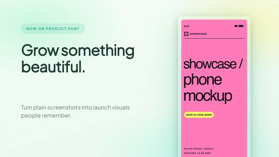
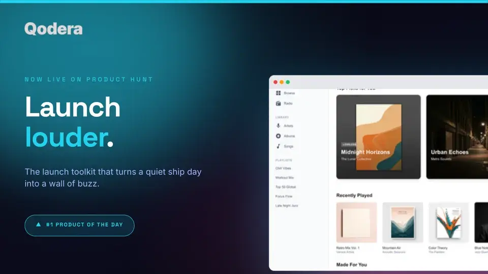
Screenhance examples
Two editable starting points from the Screenhance library, selected for this launches guide.
Ready to create stunning visuals?
Free to start. No credit card required.
Keep reading
Related, product-tested guides from Screenhance.
Hero Image Mobile Optimization: Display Beautiful Visuals on Every Screen
Most hero images look great on desktop and terrible on mobile. Here's how to build responsive hero visuals that work beautifully on every screen size.
7 Feb 2026 · 8 min read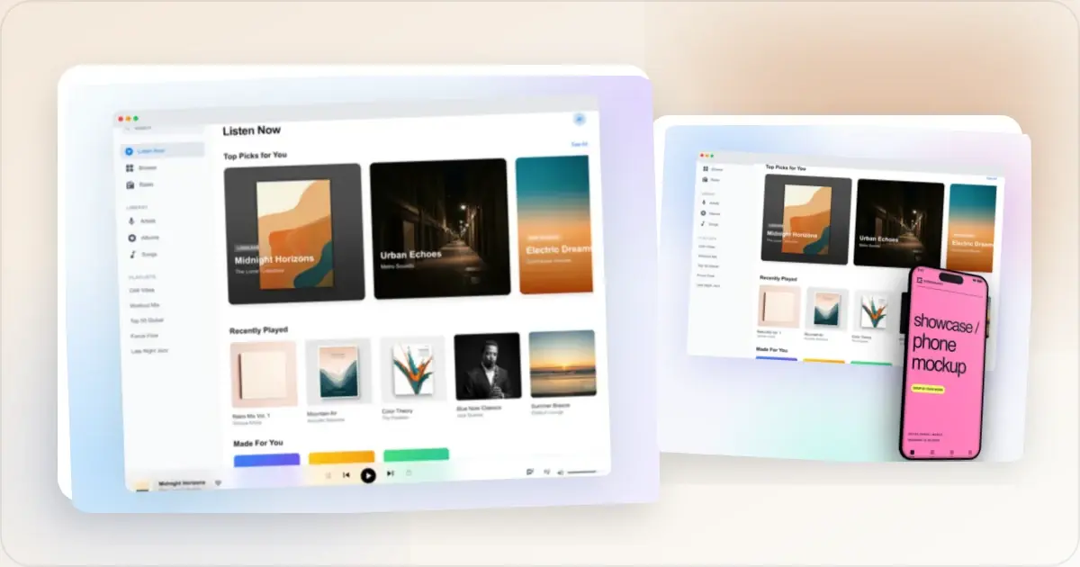
How to Design Feature Section Screenshots for Your SaaS Landing Page
Feature sections sell your product, but most SaaS teams use raw screenshots that look amateur. Here's how to design feature screenshots that convert.
7 Feb 2026 · 10 min read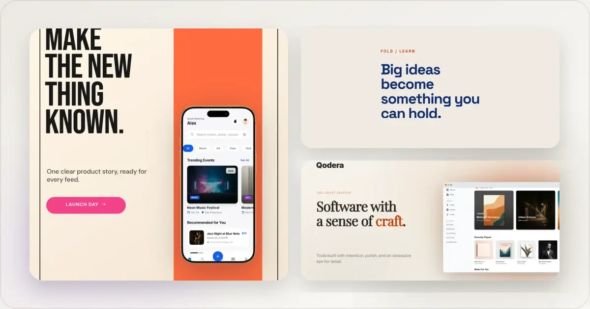
14 Best Fonts for App Screenshots and Launch Graphics
Choose readable fonts for App Store screenshots, Google Play graphics, social posts, and launch visuals, with practical pairings and editable examples.
1 Sept 2026 · 10 min read