
How to Create Beautiful Notion Cover Images
Create a clear custom Notion cover from a screenshot or mockup, choose a useful crop, and keep the page readable across desktop and mobile.
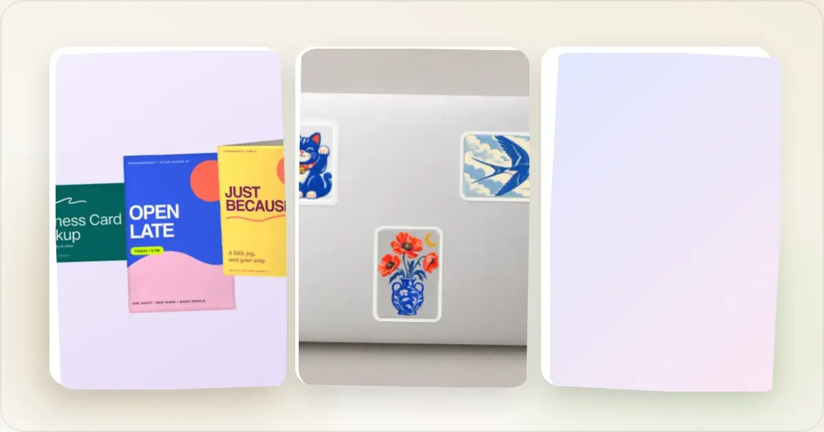
Custom covers can give related Notion pages a consistent visual system and make them easier to distinguish. They are useful decoration, not a measure of how professional or well organized the underlying workspace is.
Here's how to create them.
Why Cover Images Matter
A cover image can:
- Creates visual hierarchy
- Makes pages memorable
- Shows professionalism
- Improves navigation (you recognize pages faster)
For client-facing docs, team wikis, or personal dashboards, covers make a difference.
Notion Cover Dimensions
Recommended size: 1500 x 600 pixelsThis works well across desktop and mobile. The visible area changes based on window size, so keep important content centered.
Safe zone: Keep key visuals in the center 1200 x 400 pixel area.Cover Image Ideas
For project pages- Screenshot of the project in a device mockup
- Key metrics or dashboard view
- Project logo with gradient background
- Tool icons or logos
- Abstract gradients with text
- Relevant screenshots
- Aesthetic gradients
- Minimal text headers
- Themed images matching your style
Using Screenshots as Covers
Product pages and project docs look great with actual screenshots:
1. Take a screenshot of your product/project
2. Add it to a device frame (MacBook or browser works well)
3. Add a gradient background
4. Export at 1500 x 600 pixels
5. Upload to Notion
This creates a professional, contextual header.
Design Tips
Keep it simpleNotion covers are small. Complex images get lost. Stick to:
- Simple gradients
- Minimal text (if any)
- One focal point
If your Notion workspace has a theme (dark mode, specific colors), match your covers to it.
Consider contrastYour page title appears over the cover. Make sure there's enough contrast for readability.
Stay consistentUse similar styles across related pages. Same gradient direction, same device frames, same color palette.
Quick Workflow
For screenshot-based covers:
1. Capture your screenshot
2. Upload to an image generator or mockup tool
3. Add device frame + gradient background
4. Export at 1500 x 600
5. Upload to Notion as cover
Once the template is saved, reuse it rather than rebuilding the grid for every page.
Free Resources
Gradients- Use your mockup tool's built-in gradients
- Or create simple ones in any design tool
- Simple Icons (simpleicons.org)
- Heroicons
- Browse Notion template galleries
- Check Twitter for #NotionTemplate posts
For Teams
If you're setting up a team workspace:
- Create a cover template
- Define brand colors for gradients
- Use consistent device frames
- Document the style guide
This keeps everything cohesive as the workspace grows.
Cover Image Patterns That Work
Three simple patterns adapt well across personal workspaces, team docs, and public templates.
The screenshot-in-device pattern. Drop a screenshot of the product or page into a browser mockup or iPhone frame, centre it on a soft gradient. Best for product docs, changelogs, and project pages where the cover should hint at "what this is about." The gradient-and-text pattern. Full-bleed gradient with the page title typeset in a serif or geometric sans. Best for handbooks, team wikis, and meeting templates where there's no obvious visual. The emoji-on-tint pattern. One large emoji on a flat tint colour. Best for personal pages where you want fast scanning and clear category cues (book for reading, briefcase for work, etc.). Pair with consistent tints across categories so the sidebar reads as colour-coded.Mixing patterns without a system can create visual noise. Start with one pattern for a related group of pages, then introduce another when the distinction helps navigation.
Cropping for the Notion Header
Notion's visible crop changes with the viewport and page layout. Start with a wide source image and preview it on desktop and mobile. Two useful checks:
- Keep the most important visual element near the horizontal centre, where it is less vulnerable to responsive cropping.
- Leave at least 80px of padding on the left, where the page icon and title overlay sit.
If your cover is a wide composition (e.g. three device mockups side by side), arrange so the centrepiece survives even when the sides get cropped on mobile.
Frequently Asked Questions
What's the ideal size for a Notion cover image?
1500×600 pixels is a practical wide starting size. Because the visible crop changes by viewport, preview the uploaded cover and reposition it if needed. Export screenshot-heavy covers as PNG; compare JPEG and PNG for photos or gradients and use the smallest file that still looks clean.
Can I reuse the same cover across multiple pages?
Yes. Related meeting notes can share one cover while project pages use another, creating recognizable visual groups. Give unrelated sections a distinct treatment when that helps readers tell them apart.
Do animated GIF covers work in Notion?
Notion supports GIF covers, but they autoplay on every page load and can become distracting. Use them sparingly — maybe one celebratory cover on a launch retrospective, not your daily standup template.
How do I keep covers consistent across a team workspace?
Create a private "Brand assets" page with approved cover images attached as files. When teammates create new pages, they upload from this central page rather than designing from scratch. Document gradient hex codes and the device frame preferences in a short style guide on the same page.
What's the fastest way to make a new cover?
Start from a saved template in a social card generator, set a 1500×600 canvas, replace the screenshot or icon, check the responsive crop, and export. A reusable template removes repeated layout work without promising a fixed creation time.
Notion Cover Strategies for Different Workspace Types
The right cover style depends entirely on who else looks at the workspace and what they need to find quickly.
Solo personal workspace. Optimise for fast scanning. Emoji-on-tint covers tied to category colours can help distinguish sections. Screenshot-based covers are optional; use them where the visual context is useful to you. Two-to-five person team workspace. Optimise for cohesion without rigidity. Pick one cover _style_ (gradient + serif text, or screenshot-in-browser, or solid colour + emoji) and document the rule on a single "Brand basics" page. Allow teammates freedom on colour and content within that style. The result reads as a consistent brand without slowing anyone down. Public template or course workspace. Optimise for clarity. A browser mockup or iPhone mockup can show what the template helps someone build. Use a generic gradient only when it supports the category system better than a product preview. Client-facing workspace. Optimise for safety. Use approved brand colours and neutral framing, and avoid internal product UI or sensitive data. Emoji use is a brand choice, not a universal rule.Common Notion Cover Mistakes
These five checks catch common cover problems.
Using Notion's default Unsplash photos for important pages. They're recognisable to anyone who's used Notion for more than a week. The "wow you really put thought into this workspace" effect goes away the moment a visitor recognises the default landscape photo. A heavy cover on a light page. A large animated cover adds load and distraction to a page with little content. Use the simplest asset that supports the page and check its file weight before upload. Mixing source orientations without checking the crop. A square cover, a wide cover, and a portrait cover can each be cropped differently in headers, share previews, and database cards. Preview those contexts and standardize the source shape when consistency matters. Skipping the preview decision on database items. Database galleries can display page covers as card previews. If that view matters, choose a consistent preview treatment and check how rows without a cover fall back in your database settings. Letting covers go stale. If a cover shows product UI, update it when the pictured interface no longer matches the page. Review high-visibility covers as part of a normal content or brand audit rather than following an arbitrary calendar.Related Reading
- Screenshot Size Guide: Dimensions for Every Platform - Image dimensions reference
- The Complete Guide to Browser Mockups - Browser frames for cover images
Conclusion
Notion covers are small details that can improve hierarchy and consistency. They cannot fix a confusing workspace, but a simple system can make related pages easier to recognize.
Start with your most-used pages. Screenshot-based covers with device mockups work great for product and project pages. A social card generator can help you create covers at the right dimensions with polished backgrounds and frames in seconds.
Screenhance examples
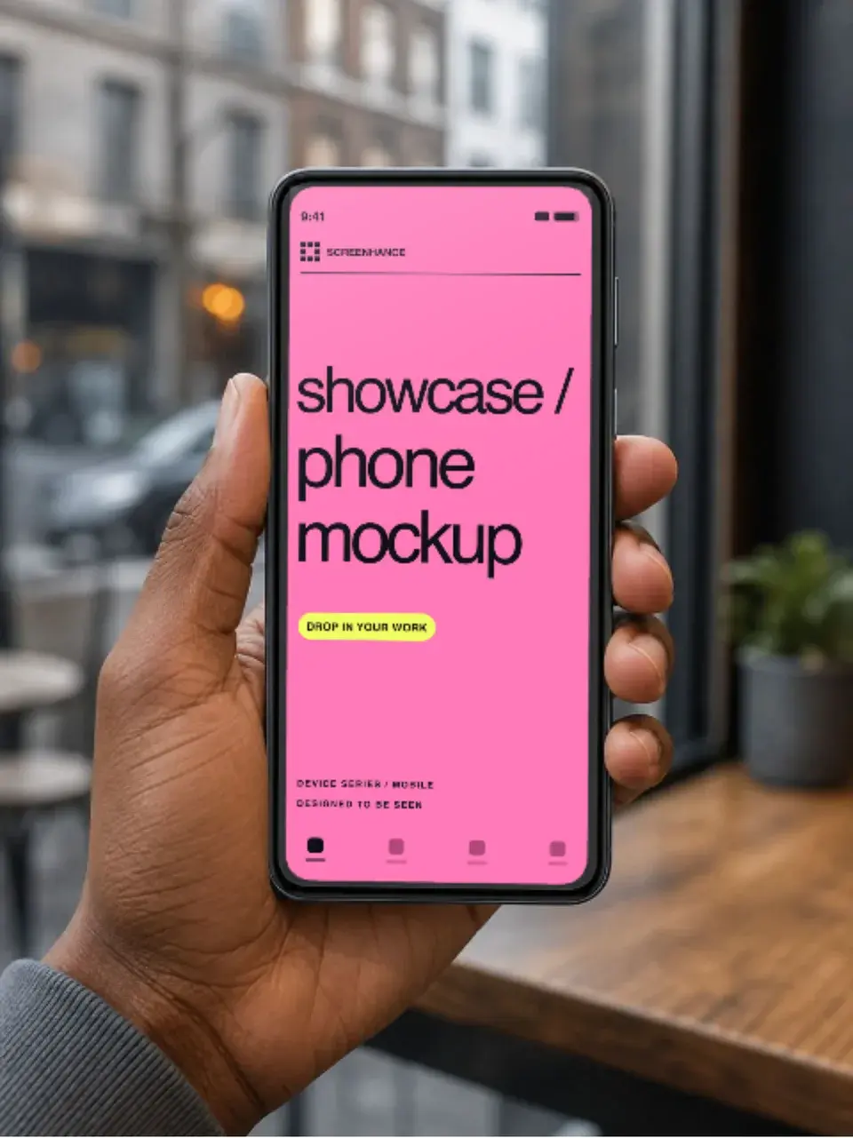
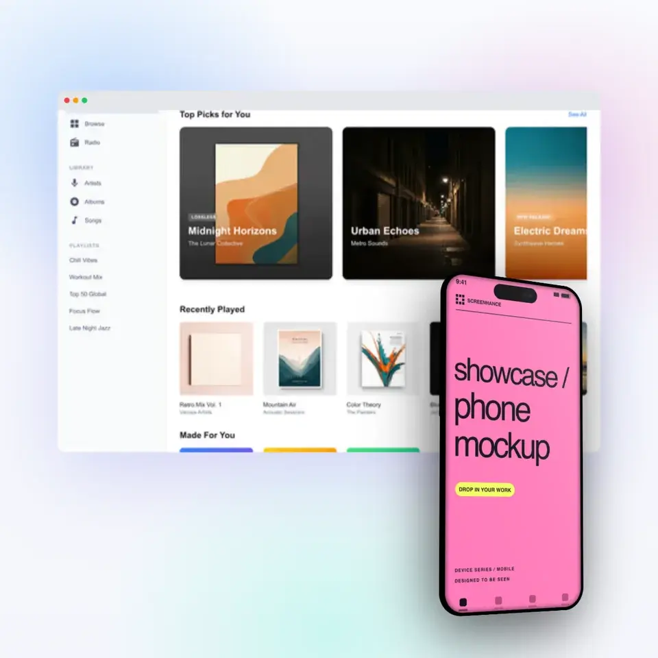
Two editable starting points from the Screenhance library, selected for this mockups guide.
Ready to create stunning visuals?
Free to start. No credit card required.
Keep reading
Related, product-tested guides from Screenhance.
Apple Watch Mockup Guide: Framing watchOS Apps in 2026
How to create Apple Watch mockups that sell a watchOS app: choosing 46mm vs 42mm, capturing clean watch screenshots, and the iPhone-plus-Watch layout.
29 May 2026 · 6 min read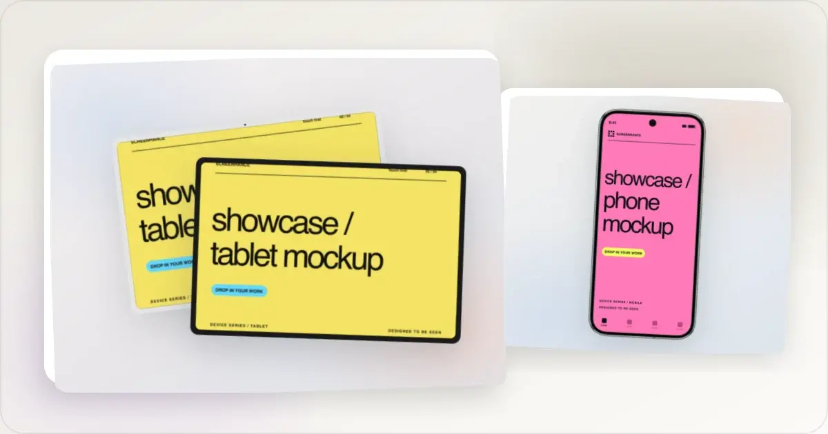
Google Pixel Mockup Guide for Android Marketing in 2026
Choose and use a Google Pixel frame for Android marketing, compare it with a Galaxy treatment, and prepare accurate Play Store visuals.
29 May 2026 · 5 min read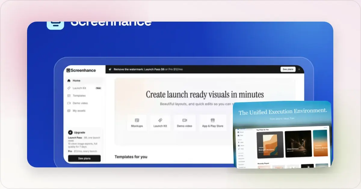
AI Mockup Generators in 2026: Where They Help and Where They Fail
A practical guide to AI mockup generators: when generated scenes help, when real product screenshots matter, and how to build a repeatable launch workflow.
13 May 2026 · 6 min read